1
Steph W. from SEOPressor

👋 Hey there! Would you like to try out this New AI-Powered App that'll...
...help you check your website and tell you exactly how to rank higher?

78
score %
SEO Score
Found us from search engine?
We rank high, you can too.
SEOPressor helps you to optimize your on-page SEO for higher & improved search ranking.
By vivian on November 20, 2015
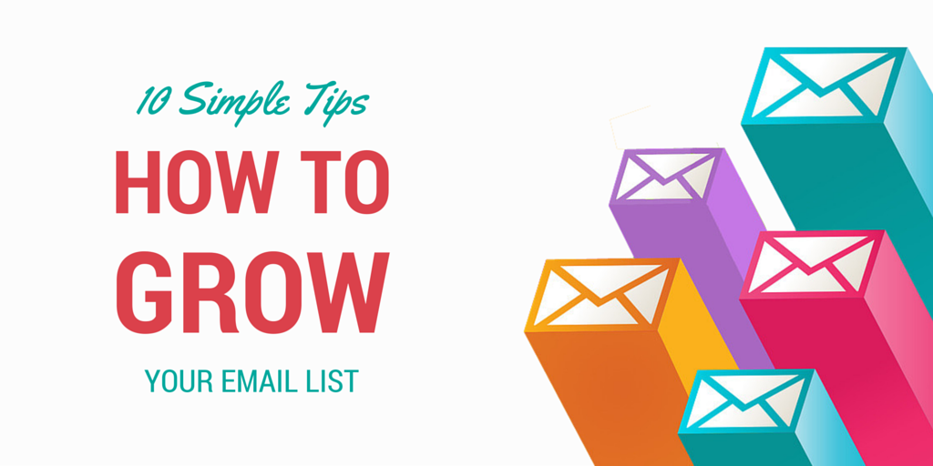
Getting people to willingly opt-in to your email list is a very tricky business. Back when we first started content marketing about half a year ago, we barely have any clue on how to do it.
Like most other marketers, our main method of enticing people to subscribe is by using squeeze pages in form of exit pop-ups, as well as giving away blog offers.
We A/B tested a lot of stuff – from giving different kind of freebies, writing different type of messages and even the squeeze page layout.
While not exactly raking in tens of thousands of subscribers a month, we did manage to multiply our opt-in ten times the amount we get when we first started. Conversion rate almost quadrupled, from an average value of 1.48% up to 5.71%!
So here’s how we started our email marketing campaign and also some of the tips how we manage to achieve those figures:
Giving away free downloadables in exchange of an email address is a bread and butter opt-in technique. But it’s not as simple as it sounds. To increase the effectiveness of your offer, it have to be related to the reader’s’ current interest.
When we first started we only have a couple of them so we gave out the same E-Book for every blog post. As you can imagine, the conversion rate is abysmal. We barely convert even 3% of our traffic from our subscribers!
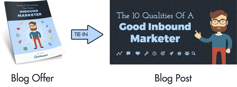
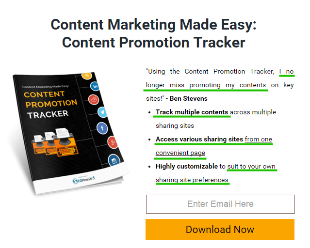
That’s when we decided to switch to unique blog offers. It doesn’t have to be a 30 page E-Book each time as long as it’s related to the article and deliver value to the visitor.
The results is simply astounding – some of our unique blog offer even managed to get up to 50% conversion rate!
A trend among marketers is to make use of crafty and witty opt-out message (also known as negative CTA) on exit pop-ups – You either accept the proposal or risk going on a guilt trip (or worse, feeling stupid) by declining. It seems like a bold technique and since even the top dogs are using it, it has to be effective!
We tried it out and pit it against our regular E-book download opt-in to see how it fares. The opt-out message does converts at a rate of 2.34%, but it’s not as good as the E-book pop-up which gets 3.9% conversion rate.
So we concluded that while crafty opt-out messages does work, giving away free downloadables still works better.
One of the most important part of a successful squeeze page is its presentation. You can have the best E-book as an offer but nobody will opt-in if you don’t present it well.
Needless to say the title and the message is important. But one of the most effective way of presenting an offer is by supporting it with user testimony.
Testimony from satisfied users can illustrate the benefit they gain from an offer. It also serve as a proof that people does actually find value in the offer.
You can easily acquire testimonies by letting your peers test an offer and give their honest opinion on how they found it useful. You can also get feedback from readers in the comments section or social media to replace a more generic copy you have initially.
It’s easy to fall in the trap of getting excited with your offer that you just can’t help but to boast about how well-made and complex the offer is.
Features, while might sound impressive and shows the effort put into the creation of a product, is not as relatable to the prospects as compared to the benefits they can gain from using it.
To take it to yet another level, it’s important to address the benefits to specifically solve certain problems the readers are having. You can even set it up in your contents – teach your readers something beneficial and give the tools to help them achieve it.
While focusing on the benefit is important, another aspect that shouldn’t be overlooked is to make them actionable. It means that your offer should include steps necessary for the readers to act upon in order to achieve the benefit.
An actionable piece of offer should include 3 main features:
A practical offer should take into consideration constrains of the target audience like budget, tools and manpower. Avoid giving big corporate solutions if you are targeting small business owners.
Another useful trick to increase opt-in rate is by displaying more than just one squeeze page. At first we only displayed just one squeeze page at the end of each article.
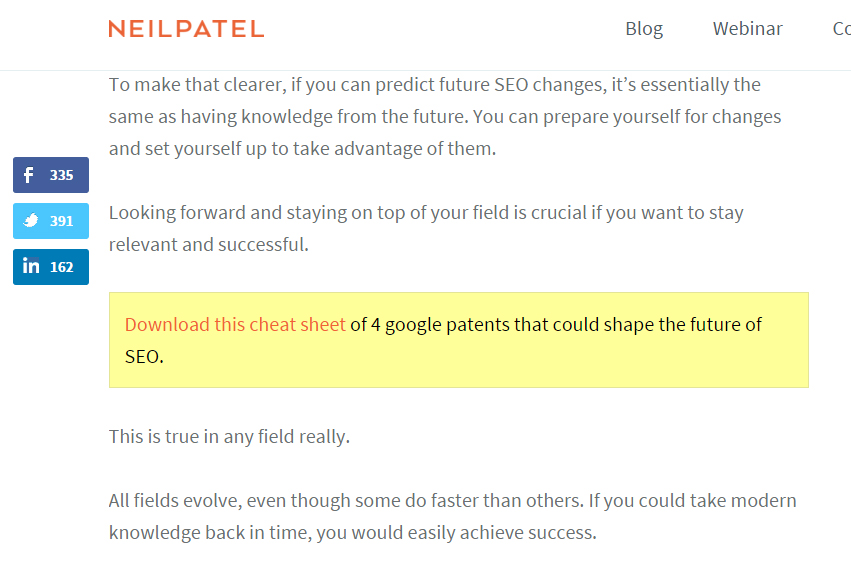
Including an extra squeeze page in the middle of an article proves to increase opt-in rate. This is quite a popular tactic, widely used by influencers such as Neil Patel and CoSchedule.
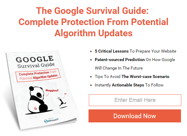
Although I mentioned that an offer doesn’t have to be a huge E-book with tens of pages each time, we found out that E-books does perform much better than the average offer. Of course, like what’s stated in point number 1, you have to use the ones related to the article it’s displayed on.
Instead of writing E-books to be given as offer for an article, you can also do it the other way around. Start with writing an in-depth E-book, and then break the points into several parts and plan your article based on those parts. That way, the E-book can be reused multiple times as offer in several articles.

Giving up your email address already takes a lot of consideration. The least you can do is to reduce barriers that might make it harder for your visitors to opt-in. Among the examples of things that might make your visitors stumble along their way to opt-in:
Do you really need the user’s first name, last name, home address and the name of their first pet? Having to fill all these extra information can be quite inconvenient and some users just can’t be bothered.
To be fair some of the information might be useful. For example, getting names will help personalize emails you send to your subscribers. But there’s no need to be greedy. Your first priority should be to seal the deal as quick as possible and in that case, securing just the email would suffice. You can always get the rest of the details later.
Signing up shouldn’t punish your visitors by sending them through multiple different pages just to complete the registration. Some marketers do this to increase the exposure of their other products or even getting sales right away.
Again, this is just being greedy. In inbound marketing, building relationship should be prioritized over pushing out sales. Make it easy for them to start and slowly approach them later.
Email verification and Captcha can be useful to prevent spam and build quality leads. But overusing them will just annoy your visitors away.
While you might not want ditch them all together, it helps if you choose only one to be implemented. Instead of making Captcha’s mandatory for every attempt, set them to show up only once every little while. This will both help protect your list as well as making it less annoying to your visitors to opt-in.
There’s a lot of opinion on how should you design your opt-in page. Some thinks that it’s best to create a plain and simple design, while others suggests to make good use of eye-catching colors and flashier design.
So once again, we tried both and put them to the test.
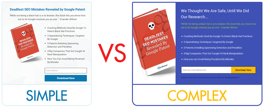
And the winner is.. *drumroll*
Although the differences isn’t really huge (about 20% improvement), it’s enough to settle the dispute.
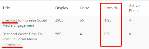
An easy way of creating a relevant blog offer out of every article is just by summarizing the key points and wrap them up to be presented in a certain format. For example:
While it can sometimes help by repackaging a content in a more digestible form, generally these type of blog offers fares poorly. This might be because there are no added value gained by the readers as they are basically the same points only presented differently. Of course in certain contents, the convenience is something people need, it doesnt make a good all-around practice.
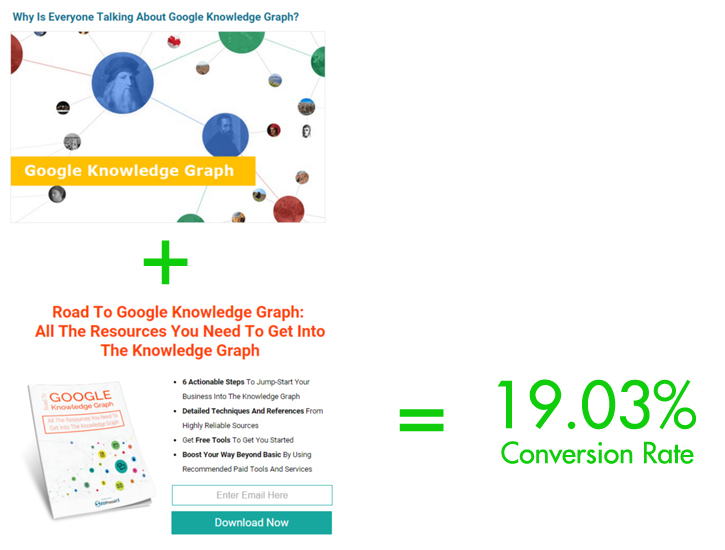
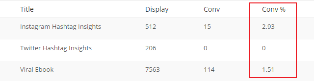
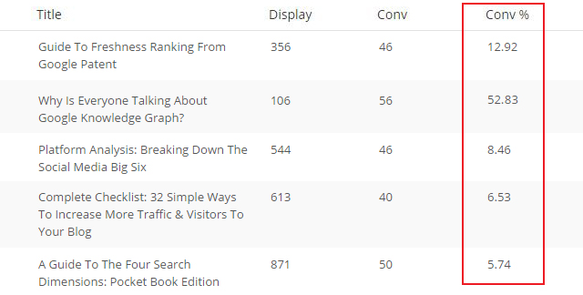
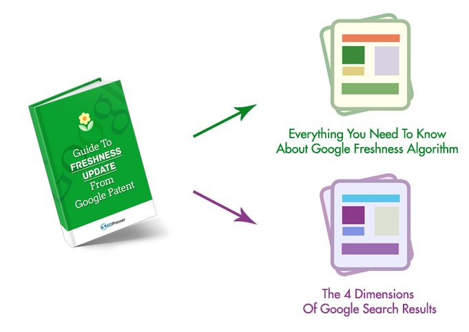
Instead, what is shown to work best are offers that’s complementary to an article. An example is one of our article on Google Knowledge Graph. The article talks about the benefits of Knowledge Graph and the offer teaches how you can get it. This particular offer currently sports a whopping 19.03% conversion rate!
All in all this is how we managed to grow our email list. What works for us might not work for you but the key to getting it right is to never stop testing. I certainly hope you’ll find these tips helpful in order to design your own tests or as a starting point.
For us we never stopped testing out new things to improve our current practice. So if you have your own tips and findings on growing your list, do share them!
Related Links:
Updated: 25 April 2024

Do you want to
Grow Your Traffic FAST?

Generates 5,000 words in minutes
Publish 60+ content in a month
Rank in the SERP’s Top 10
Gotcha.

Generate 5,000 words in under 5 minutes
Publish 100+ blog posts monthly
Rank in the Top 10 with SEO-optimized content
Drive 500K organic traffic
Rank in the Top 10 now with Longform AI
Save 67% today (As low as $14.69/mo)

Subscribe and receive exclusive insider tips and tricks on SEO.
Delivered to you right from the industry’s best SEO team.
Copyright © 2024 SEOPressor. All Rights Reserved.
Powered by Semantics BigData Analytics (SBDA).