1
Steph W. from SEOPressor

👋 Hey there! Would you like to try out this New AI-Powered App that'll...
...help you check your website and tell you exactly how to rank higher?

88
score %
SEO Score

Found us from search engine?
We rank high, you can too.
SEOPressor helps you to optimize your on-page SEO for higher & improved search ranking.
By jiathong on June 24, 2015
One of the most important elements of your brand is its visual look. Your customers are going to identify you by your logo.
Some logos become so strong that they don’t even require the accompaniment of the company’s name – take Nike for example.
If you see the swoosh symbol, you automatically know that it’s Nike.
However, before creating the look of your brand, you need to understand how the psychology of color works, and how important it is to choose the right color for your own branding.
This is extremely crucial as it will help you to gain more potential customers and eventually turn them into your loyalty customers.
But the question is, how important are colors in branding?
The purchase is based on the first impression of how they perceive and feel about your brand.
The statistics clearly show how important it is to choose the right color for your own brand.
And I’m sure you don’t want to just pick any random color when it comes to designing your company’s logo or website design!
Which is why, this has to be done carefully with proper research and if you’ve chosen the wrong color, it is going to hurt your company brand identity.
The following is a short breakdown of the color theory, which will help you use color more effectively in order to strengthen your brand’s identity:
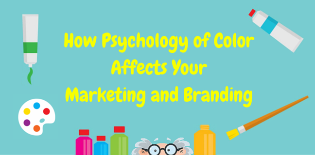
Understanding the Psychology of Color from Marketing and Branding Perspective
There are some companies that undervalue how important the psychology of color is when it comes to branding. They assume that if the colors look good, then that’s all they really need to worry about.
The thing is, most consumers will judge products or services based on the colors that are used. This, of course, is because colors greatly influence the moods and feelings of individuals.
The following are a few examples of how colors can provoke certain emotions:
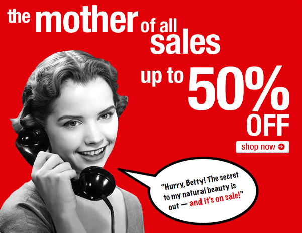
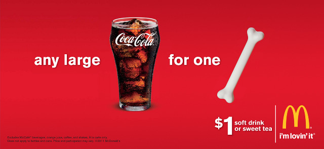
is probably still one of the best marketing color you can use to attract more attention. It’s associated with passion and excitement as well as with creating a sense of urgency, making it an excellent color option for limited time promotions or clearance sales.
Example 1
Example 2

Example 3

The color red is also linked to your appetite, which is why many fast food restaurants make use of the color in their branding.
In fact, the biggest fast food chains in the world use red in their logos, such as McDonald’s, Burger King, KFC, Pizza Hutz, and Dominoes, just to name a few.
For example:

is related to feelings of tranquility, peace, and reliability. You won’t see many fast food restaurants using blue in their logos due to the fact that it is linked with curbing your appetite.
However, because it is related to reliability, dependability and trust, you’ll find that almost every major social media network uses blue as their primary branding color, including the top three social platforms – Facebook, Twitter, and LinkedIn.

is associated with nature, health, tranquility, and power. Its association with nature is pretty obvious and is one of the main reasons why you see companies or organizations that have to do with the environment using the color green in their branding; for example, the Environmental Protection Agency.
A good example of a company that uses green to show its power is John Deere. They produce farm machinery and lawn machinery (there’s that nature link) that they want to associate with power, which is why all of their lawn mowers and tractors are painted green.

is linked to royalty, respect, wisdom, and luxury. It’s why the color is often found on the garments of kings and queens hundreds of years ago. The color is also said to stimulate creativity and problem-solving.
Hallmark is a company that uses purple in order to elicit feelings of nostalgia and luxury – they even incorporate a crown into their logo! Asprey of London is another excellent example.
They have been supplying royal families with crowns, scepters and more since the 1700s, making their use of purple even more appropriate.
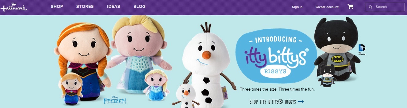
Hallmark is a company that uses purple in order to elicit feelings of nostalgia and luxury.
– These two colors are very cheerful and are known for promoting optimism. They are also known for creating a certain feeling of anxiety, which is used by companies to incite impulse buying.
Yellow is also said to catch the eye quicker than any other color. It’s one of the reasons why this is also a color often used by many companies to signify optimism, enlightenment, and happiness.
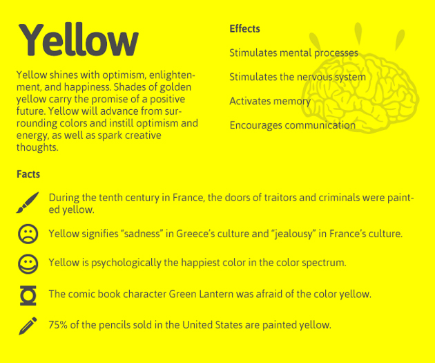
Yellow instill optimism, energy, as well as creative thoughts.
A very good example would be the one below. Yellow Pages have come up with such a creative marketing campaign to promote their new mobile app.
As you can see, the color and the design of this campaign is aligned with their corporate identity.
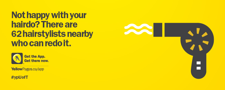
Yellow pages use a genius idea to promote their new mobile app.
Another great example would be from Mooze Design. It is an advertising agency in Rotterdam, the Netherlands that daringly chooses yellow as their background color, and uses it so well. This is definitely impressive!
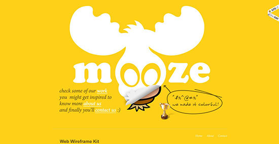
Get inspired instantly with what they do.
The color orange can be found in the branding of many sports teams – optimism is a big part of sports since only one team can be a champion in any given year.
You can find orange in teams such as the Phoenix Suns, the Cincinnati Bengals, the San Francisco Giants and more.
Cincinnati Bengals

San Francisco Giants
is a tricky color since it can be overwhelming if used too often. However, its use is associated with authority, boldness, elegance, and tradition.
For example, Adidas is probably one of the most famous manufacturers of sports clothing and sports shoes.
And as you can see from their logo, Adidas has three black stripes on everything that they produce. According to Adidas, the purpose of choosing the color black is for motivating the youth to engage themselves more actively in athletics.
“Impossible is Nothing”
White is linked to purity, simplicity, safety, and cleanliness, as well as sparking creativity due to the fact that it can be perceived as a clean slate.
One of the most well-known brands to use white is Apple. Their use of white for their branding is so successful that if you see someone with a white phone or a white notebook, odds are you’ll assume it’s an Apple product.
Besides, their use of white makes complete sense too – they market their products as being very simple to use.
For example, their computers do not need to be upgraded, nor do users need to worry about viruses.
They also market heavily towards creative types – the Mac has always been the computer of choice for film editors, graphic designers and more.
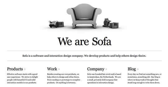
Below is another great website that uses white as their background.
Now let us look at some of the ways of choosing the right color scheme.
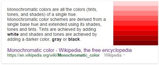
1) Monochromatic – This color scheme consists of using a singular color in various shades and hues. It helps to create a minimalistic and sleek look that is very easy to the eye – it’s a color scheme often used by brands online.
2) Complementary – This color scheme makes use of the two hues that are positioned exactly opposite of each other on the color wheel. It allows you to use a wider range of colors and is often used in print media.

Complementary color
Here, the example would be if you choose the color blue, then the opposite is orange (complementary color). In many circumstances, these two colors are paired together to draw attention and to achieve a greater impact. However, this should be used in moderation.
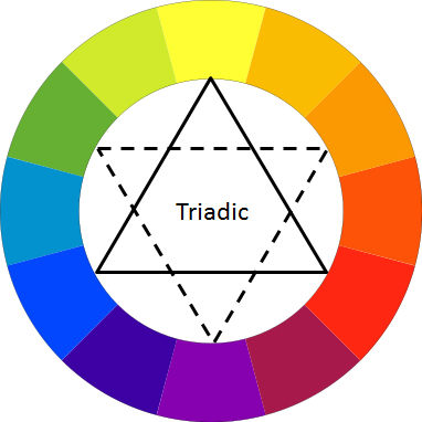
3) Triangle color scheme – This color scheme uses three colors that are equally spaced on the color wheel to create a harmonious effect. Web designers looking to create a bold look often choose this color scheme.
In addition to choosing the appropriate colors for your branding effort, knowing how to use color coordination on your website is vital for your conversion rate.
There is a psychological principle known as the Isolation Effect that should be employed. It states that an item that sticks out like a sore thumb will be more likely to be remembered.
So, if the background of your web page is one color, the call-to-action should be a color on the other side of the color wheel – also known as the complementary color – so that it stands out.

It’s important to understand that the meaning of color differs from one culture to another. While one color may have a positive connotation in one culture, that same color may have a negative connotation in another.
It’s something you need to be aware of, and to be very careful of, if you have a global brand.
The last thing you want to do is to accidentally offend an entire culture by using a color that is inappropriate for a certain product.
The following table explains the meaning of colors in different countries:

If you don’t think that the psychology of color will have that great of an effect on your branding effort, then take for example Pepsi‘s infamous mistake in South East Asia, which resulted in them losing the dominant market share to Coke.
They decided to change the color of their vending machines to a light “ice blue.”
Unfortunately for Pepsi, light blue is associated with death and mourning in that region.
The psychology of color is something that needs to be considered over and over again – especially when you make changes to your branding, or you are expanding to different parts of the world – or even different parts of the country.
As you can see, there’s a lot more to creating the visual look of your brand than just choosing colors that look good. Choosing the right color for your branding is incredibly important for creating an effective brand and you need to make sure that you keep that in mind at all times – especially if you plan on expanding your business globally.
Color is an important complementary aspect to your marketing efforts. But copywriting is another important aspect that if boosted by the color of your choice, can amplify your effort by ten folds.
Now, how can you make sure that you’re choosing the correct topic or the correct keyword? A tool like BiQ can give you all the answers, even to the questions you do not know you have.
Just one sigle word of your choice – related to your product or campaign of course – into BiQ, press enter and you’ll be presented with list after list of keywords that thousand and millions of others are searching for.
You can also get the insight on what popular questions people are searching about and what trending searches is happening around the world.
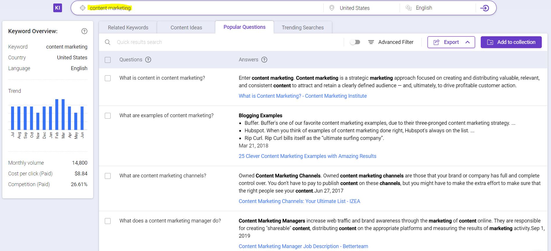
That is some very powerful data that you can hold on to together with the choose of a correct correct, to boost your marketing efforts to the next level.
Related articles you might like:
This post was originally written by Ben and published on Jun 24, 2015. It was most recently updated on Aug 17,2018.
Updated: 17 April 2024

Do you want to
Grow Your Traffic FAST?

Generates 5,000 words in minutes
Publish 60+ content in a month
Rank in the SERP’s Top 10
Gotcha.

Generate 5,000 words in under 5 minutes
Publish 100+ blog posts monthly
Rank in the Top 10 with SEO-optimized content
Drive 500K organic traffic
Rank in the Top 10 now with Longform AI
Save 67% today (As low as $14.69/mo)

Subscribe and receive exclusive insider tips and tricks on SEO.
Delivered to you right from the industry’s best SEO team.
Copyright © 2024 SEOPressor. All Rights Reserved.
Powered by Semantics BigData Analytics (SBDA).