Steph W. from SEOPressor


...help you check your website and tell you exactly how to rank higher?

81
score %
SEO Score

Found us from search engine?
We rank high, you can too.
SEOPressor helps you to optimize your on-page SEO for higher & improved search ranking.
By vivian on September 25, 2017
Have you ever been in a situation where you need to ‘pinch and zoom’ in order to resize website content while browsing on your mobile phone?
It’s likely that you have landed on a webpage that is non-mobile-optimized. It is not only a disappointing, but also a frustrating experience. In non-optimized mobile landing page experience, texts are strenuous to read, images are challenging to click, and links and buttons are almost impossible to click.
Now, consider your mobile website. Imagine potential consumers landing on a webpage on your website only to realize that it has extremely poor mobile landing pages. It is likely that your visitors will be spending much not much time on it, leave alone purchasing from you. This makes it vital for you to create mobile landing pages that are optimized for conversions.
In the wake of this development, Google restructured their search results depending on mobile optimized sites. This has made several companies across the world to update their online mobile presence.
Even though Google emphasizes on mobile landing page optimization, you should take it upon yourself to optimize your site for mobile as it is increasingly becoming an important part of a successful digital marketing strategy.
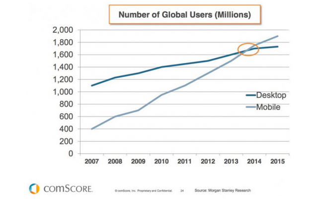
Looking at the huge volume of website’s traffic is from mobile users, it is crucial for us to create user-friendly mobile landing pages.
With that in mind, we’ve rounded up several key elements you need to keep in mind so you can create effective landing pages:
Being brief and straight to the point when creating your mobile landing page content is highly advisable. This is because visitors tend to quit when they have to scroll for unlimited text on your wall.
You have to avoid buzzwords and jargon that do not add any values to communicating the importance of your services or products to your customers. Additionally, eliminate any information that doesn’t meaningfully contribute to describing offers.
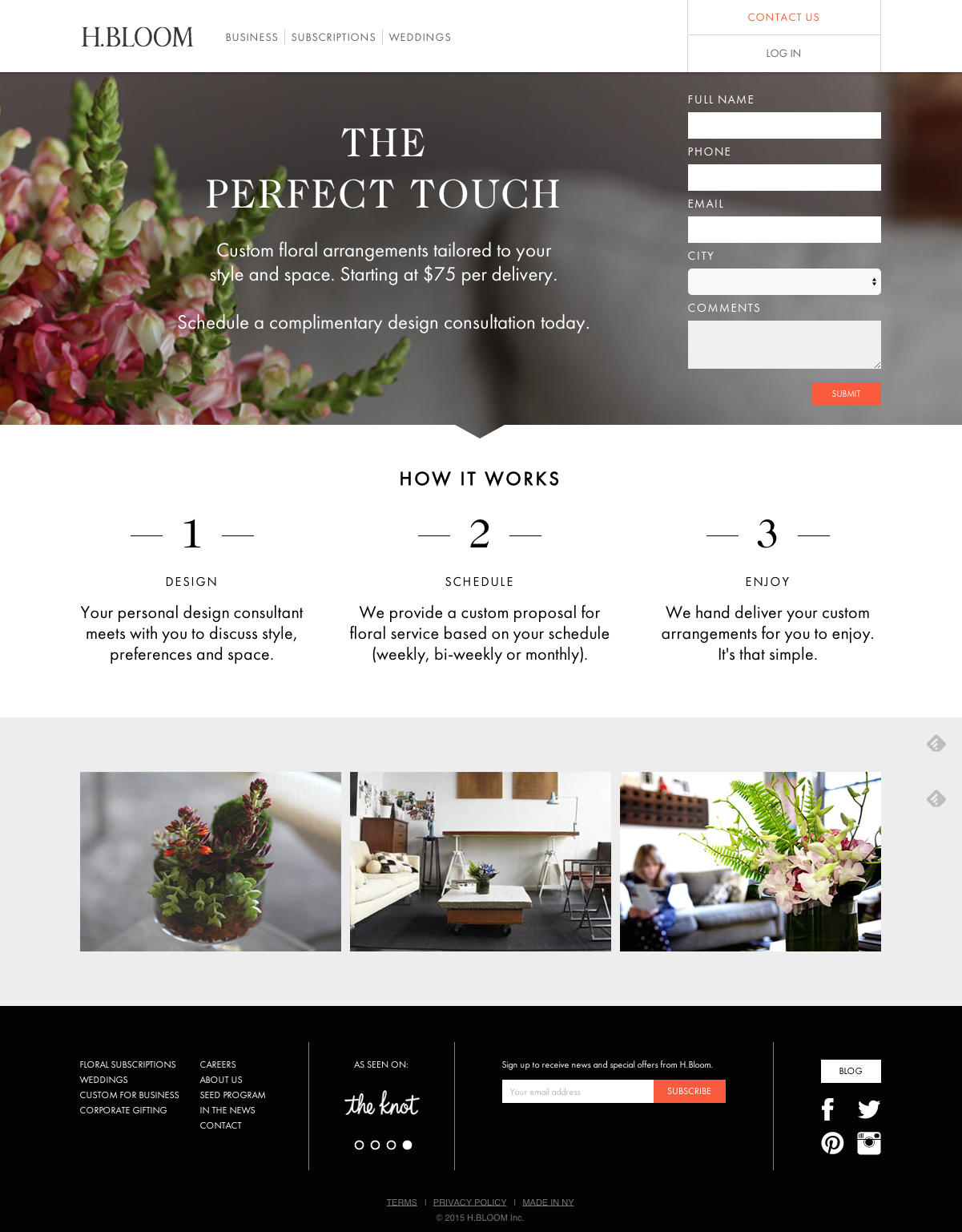
H.BLOOM is a great example of clear and concise landing page. It has a straightforward description of what you’ll get when you fill out the form.
Best mobile landing pages should be very clear and concise. Use as many as five words in your headlines in describing what your site all about, or how your services or product can benefit the user. This may a challenge, but it is not impossible.
You can try using bullet points in case you have to add further benefits or details of your product or service. However, ensure that each point is brief and clear.
When using images, ensure that they are directly related to what you are offering on the page. Graphics that look cool but add no value in helping consumers in comprehending your offers are just taking up the limited space.
This may sound like a no-brainer, but then again, you wouldn’t believe the number of mobile landing pages you come across that contain tiny text that forces mobile users to pinch, zoom, and scroll in order to read the text block.
Generally, as a rule of thumb, make sure your content text font size never gets smaller than 14 pt. This allows you to have a decent number of text per line that won’t over-stress the eyes of your mobile landing page visitors. On the other hand, do not make your text too large because you may risk making your landing page much longer than expected, hence more scrolling.
Ensure that there is enough spacing between your lines, and you will be on the right track to making sure that you are creating readable mobile landing pages. Keep in mind that you only have a single shot at first impression, so do not leave your users wondering whether they require eye checkup or not.

Although the visual cue is well done in this landing page, but the form itself is really cramped. This will make it hard for visitors to read the information.
You do not want to create mobile landing pages that look crammed. This make you landing page hard to read, thus poor user experience.
Once mobile users land on your page, make sure that they have an immediate access your company’s phone number. As instant communication is usually a major concern to mobile consumers, for that reason emphasis on the importance of click-to-call number is crucial.
For instance, if you’re running a locksmith business and someone happens to lock themselves out of their house or car, chances are that they need immediate help. If your mobile page is listed among the first in their search results and your number is not appearing on your mobile landing page, you will have just missed out on a potential consumer.
Adding a short, clear and accessible click-to-call phone number to your mobile landing page allows customers to contact you immediately.
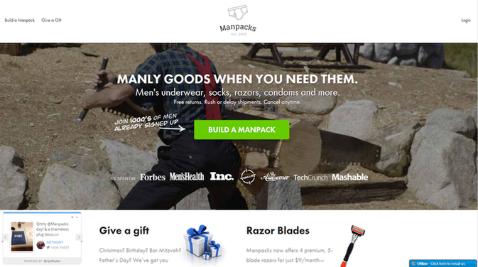
Ideally, placing a CTA along with your heading is also a great idea because it is one of the first elements that your visitors will see.
Given that the main purpose of your landing page is conversion of visitors into quality and efficient leads, focus on clear and persuasive CTA.
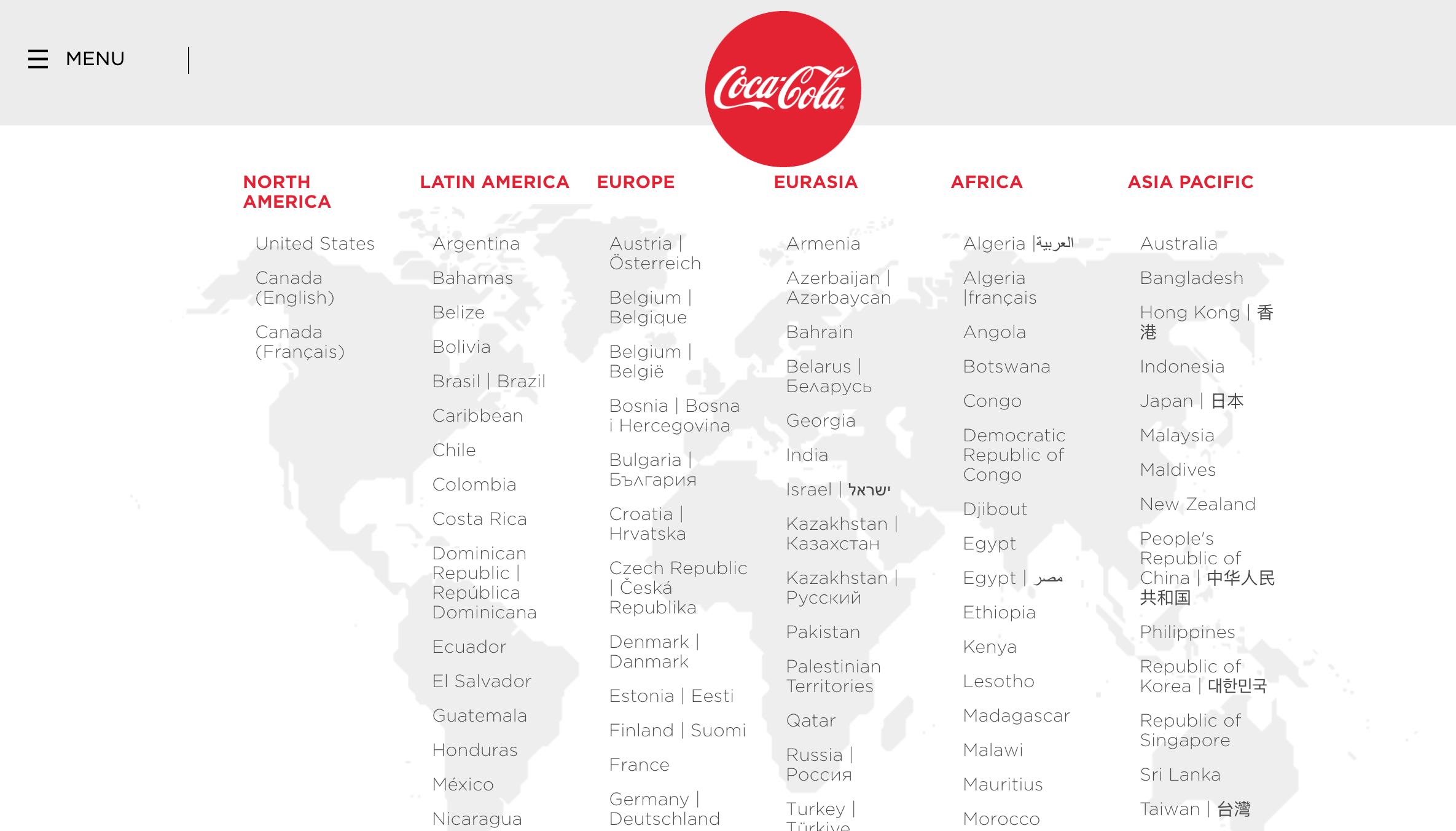
Geo-targeting of mobile users is crucial in mobile landing page that converts. Given that mobile users respond to geo-targeted places within their 20-mile radius. Geolocation can be characteristically determined within 20-mile radius depending on their IP address.
Considering an IP address (geoIP), a number of details of website visitors can be determined – country, state/province, metro area, ZIP code, city, longitude, latitude and more. Definitely, if the content is locally personalized to convert this will be a gold mine for you.
IP geo-targeting is more precise for broadband IP addresses compared to cellular networks. Even if it’s not perfect, this data is significant for defaulting contact fields and dynamic suggestions.
Create mobile landing page that converts by using geo-targeting data for locally relevant content by:
Do you actually need mobile users to fill form fields with 6 to 8 pages when they are signing up for something on your site? Too many form fields may clutter your mobile landing page, and upset the consumers.
For more visitors to convert, you must simplify and shorten the process of conversion – whether they’re meant for signing up, promo codes, purchase, free trials, or subscriptions. The secret is to get your visitors to complete the form before allowing them much time for change of mind.
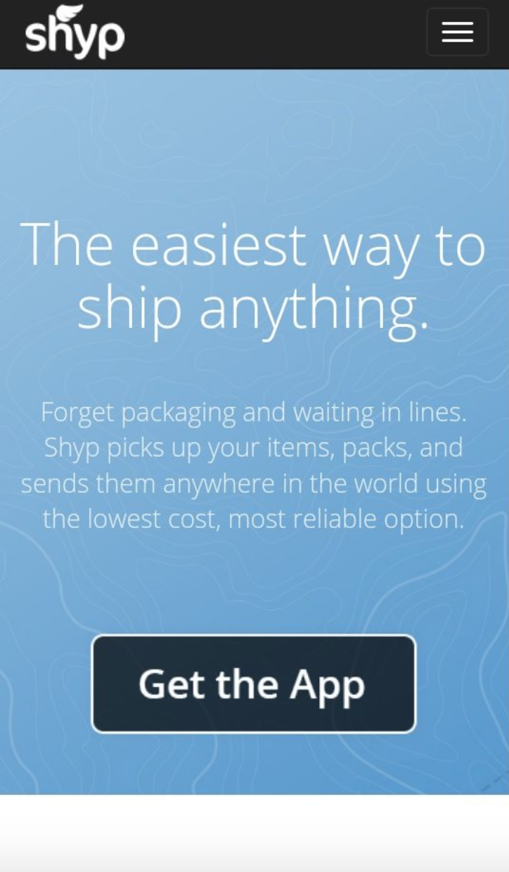
Shyp understands that the best mobile landing page field forms should be super short.
Target about 4 or less form fields. Ideal form for mobile landing page, you should aim for 50% less fields of your desktop site (1 or 2 fields is ideal). Any additional field can potentially lower your rate of visitors’ conversion by 50%.
Do not have fields that are not required unless the collection is post-conversion. Alternatively, if it is a must for a landing page form to have several fields, you can consider having two-step form procedure since it gives an impression of lesser steps to a mobile consumer.
Ensure that any form on your landing pages only collects the most essential information. For instance, you possibly require email address of the user for eBook downloads, free trials, promo codes, newsletter, and everything else. However, their name, phone number and address may not be that important.
What are you trying to achieve with a mobile landing page? Definitely is to get visitors to do something on your landing page. So what is the need of having a call to action on the page if it is barely visible and not goal oriented?
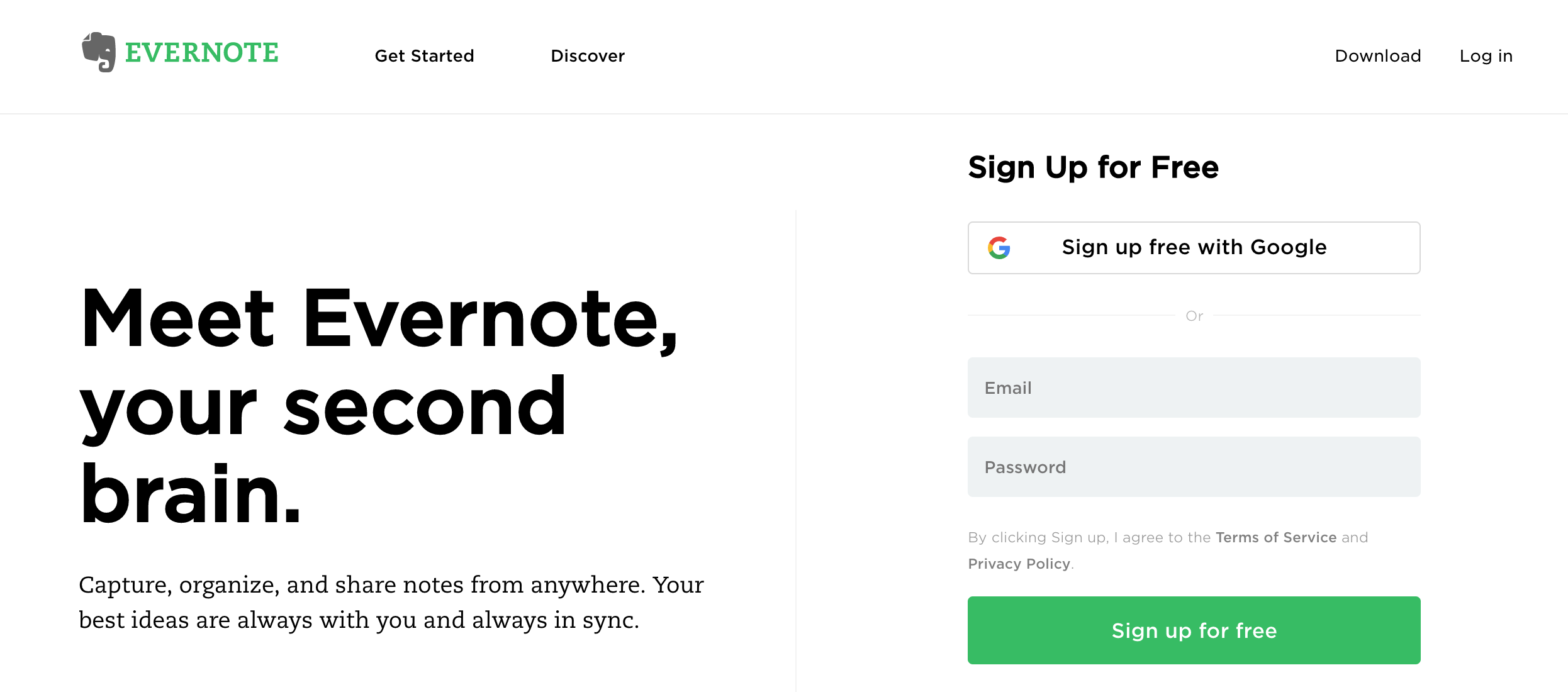
If you’re trying to get users to take a specific action, make sure your message is clear and the CTA is prominently displayed, like how Evernote does it.
CTA can be broken down into three types: buttons, forms, or hyperlinks. CTAs have to be clear, strong, and immediate because they ought to be one of the features a visitor notices.
CTA should be prominently displayed (consider contrast), so that it is clearly distinguish from the moment the user lands on your mobile page. The visitor should often tell the next step to take.
You do not want to confuse your consumers with several options. In case you have a number of goals, you can create separate mobile landing pages for each goal. However, if you must have more than one CTA, ensure that your main CTA is highlighted, after which you can blend in the non-main ones with the rest of your design.
For best mobile landing pages, page loading speed is a crucial factor. The longer your visitors have to wait for your landing page to load, the more probably they will give up and move to your competitors site. Every second counts.

The most common slowdown factors for mobile landing pages are request numbers (loaded scripts, images, etc.) following file size (number of bytes). In other words, a consolidated JavaScript file is preferred to a number of small single files.
Avoid using technologies such as Flash and other plugins that normally take much time to load or may not be compatible with some mobile devices.
Even though the ideal mobile landing page sizes differ based on content, you should aim at creating mobile landing pages of around 20 kilobytes. The smaller the size, the quicker the loading time.
When you’re creating mobile landing pages, keep in mind that all the users accessing your landing page will be using different types of connections. Some might have 4G networks, others will be on 3G, and some Wi-Fi connections. A mobile landing page that loads faster in a 4G LTE connection may take forever on a 3G connection.
Hence, if you create mobile landing pages that load faster terrible connections, they will be even quicker on strong high speed connections leading to higher conversions. Test the loading speed to create mobile landing pages that optimize conversion.
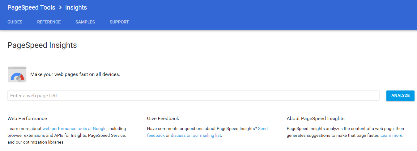
PageSpeed Insights tells your page performance and gives suggestions on the aspects that you can further optimize.
If you are not in a position to fix landing page loading time, there is negligible point in concentrating on the issues listed. Poor loading time can be also resolved by:
To sum up, here are some key elements you need to keep in mind when designing a mobile landing page that converts.
In addition to applying these tips, you should also get the opinion of your mobile users to identify usability and other issues. Then, fix these issues. You’ll be surprised how effective your landing pages will become.
How do you find these 7 tips to a high-converting mobile landing page? Does it work for you? Share your thoughts with us at the comment down below!
[This blog post was originally written and published by Joanne on Sep 20, 2017. It is most recently updated by Howard on Jun 3, 2020.]
Updated: 27 January 2026


Save thousands of dollars (it’s 100x cheaper)

Zero risk of Google penalty (it’s Google-approved)

Boost your rankings (proven by case studies)
Rank High With This Link Strategy
Precise, Simplified, Fast Internal Linking.
