Steph W. from SEOPressor


...help you check your website and tell you exactly how to rank higher?

82
score %
SEO Score
Found us from search engine?
We rank high, you can too.
SEOPressor helps you to optimize your on-page SEO for higher & improved search ranking.
By jiathong on December 27, 2018
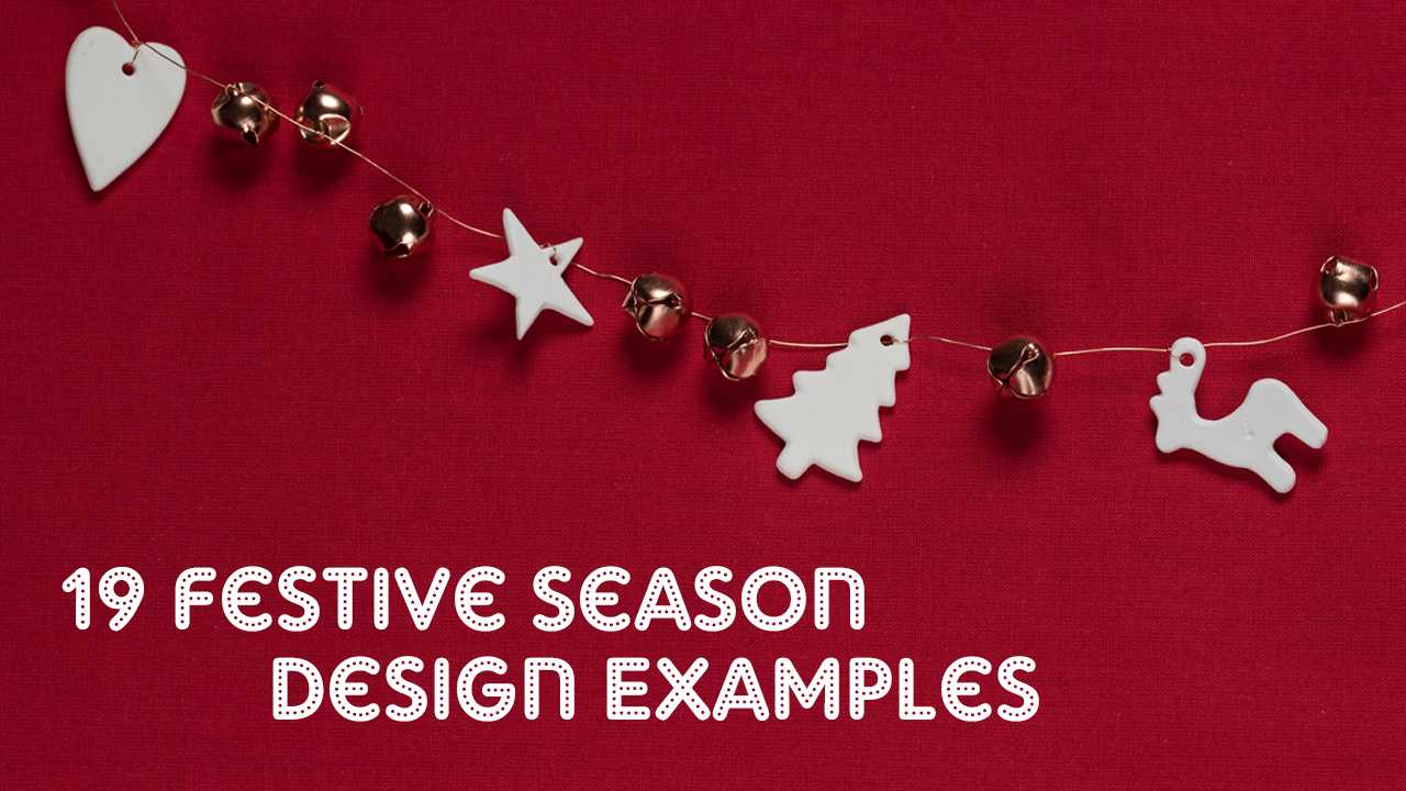
With the festive season behind and the new year coming, let’s look back to the Christmas of 2018 for some beautiful, smart and engaging website and email design examples for the festive season.
Let’s start with some emails.
We got an absolutely adorable email from deepcrawl with a very good boy proudly taking up space at the header.
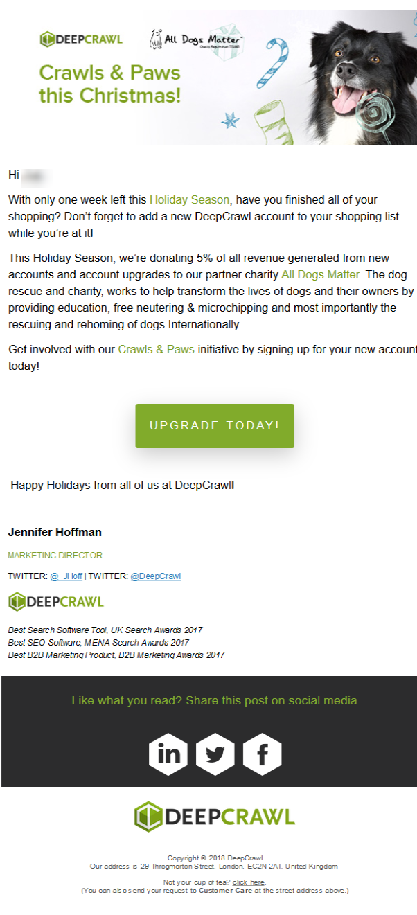
This fairly simple email’s charm lies in their action, the company has teamed up with a charity organization All Dogs Matter, thus the theme of the header.
By keeping the background blank, with an eye catching header, readers are more likely to read the information that is actually written.
Pair that up with an eye catching Click-To-Action in the thematic green. I’d say this is a pleasant email that I don’t mind reading.
Here’s another email example from Canva, an image creation and editing tool, and they made damn sure that they got their point across.

This fairly long email showcases 3 ways together with a gif for each (although my accompanying screenshot is not one) on how the tool can be useful for you to step up your design game this festive season.
With a big Click-To-Action right under each recommended tool, this email is both actionable and convincing.
What screams Christmas more than a big sale? Well, I’m sure Best Buy would agree with me. They have loaded up their homepage with daily deals they’re calling the Doorbusters.
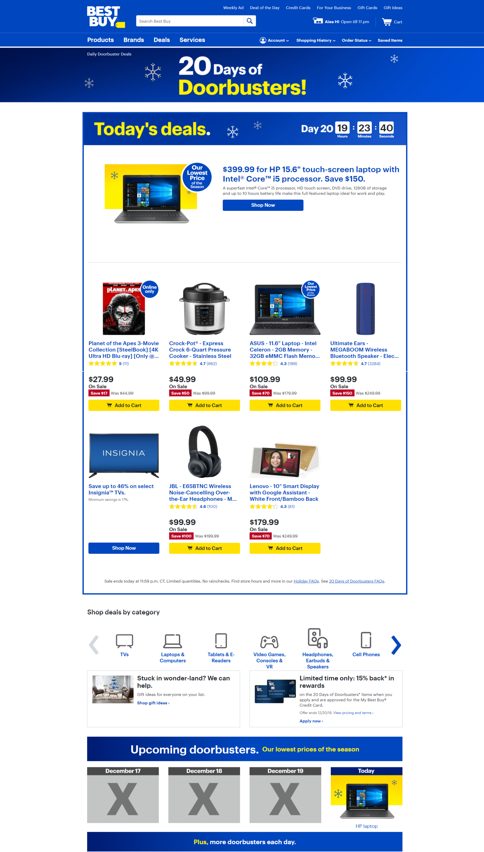
They started with a couple of snowflakes at the header to set in the festive mood, then BAAM, here’s today’s deal. More deals down there, and yup, more deals are coming.
Their customers reaching their homepage is most probably not interested in any Christmas jingle they have unless it’s a Doorbusting-deal, which they promptly delivered.
Here’s another department store decking out their homepage with deals for the festive season. Costco’s homepage isn’t all that festive but they do boast a couple of holidays themed banner blocks with some strong copywriting emphasizing on the festive sales.
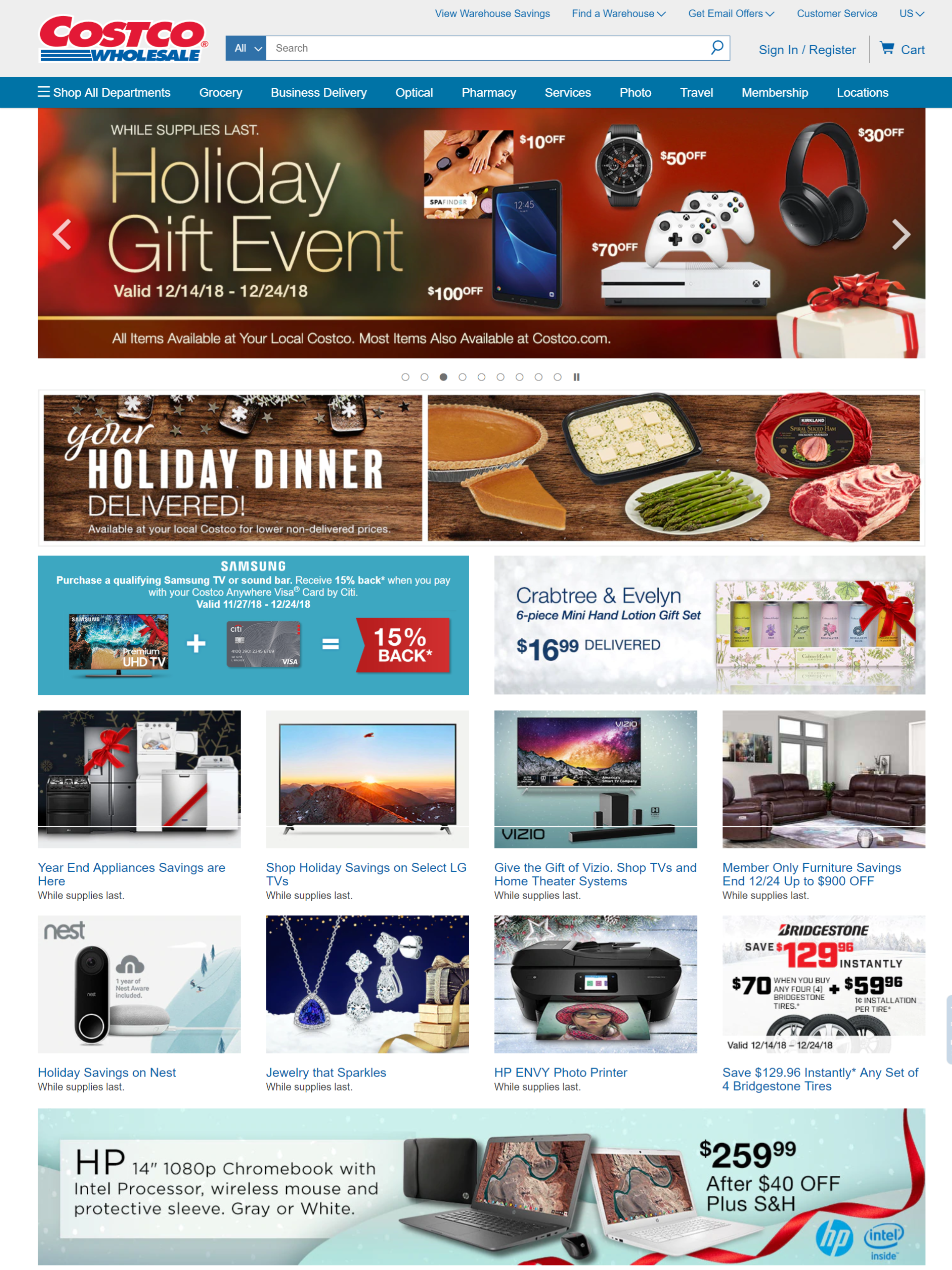
A few shiny red ribbons and a cut-down price seems to be the extent of their Christmas effort. But hey, the customers are here for the deal, right? So as long as they get the point across, it can be considered a job well done.
Nordstrom has put in a recognizable effort for the festive season, with a huge banner of models decked from head to toe in their Christmas gears, occupying the center of the homepage. Let’s go gifting, it says.
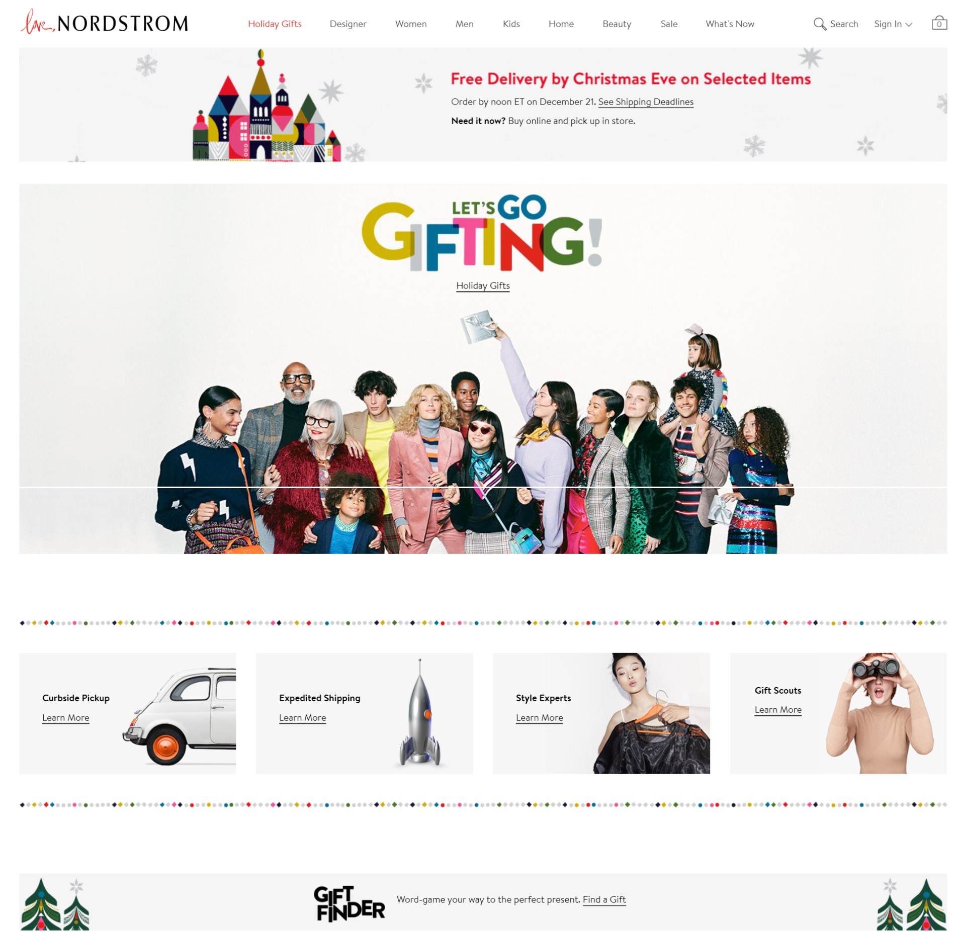
Topped with a banner informing shoppers with their free shipping deal, the team at Nordstorm is doing everything they can to entice any visitors into gifting and buying. Neat blocks are featured at the lower part of the web page showcasing their unique services and prompting visitors to learn more.
It seems like their philosophy of the design is the more you know, the more you shop.
Sears seems to have taken the same strategy as Best Buy, nothing is a better alert for the coming festive seasons other than SALES.

Instead of the word sales Sears has chosen the word blowout as a recurring keyword to emphasize on the price cuts and special Christmas items being offered.
With an eye popping yellow-green gradient as the theme color.
Now let’s look at some examples from the Brits. Selfridges created this custom gif to celebrate the festive seasons with the slogan saying Selfridges Rocks Christmas.

A well-made gif like this that blends your brand character while not forgetting the festive theme can be a nice eye catcher for your website visitors.
Another luxury department store from the UK drenched their website in red and orange with a big banner announcing the big festive sale occupying the center of their homepage.
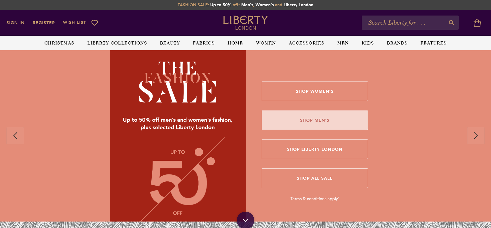
They used simple call-to-actions to quickly redirect visitors attention to their vast catalogue of fashion items. The design is simple, elegant and effective, and true to the spirit of the festive season.
John Lewis, famed for their yearly Christmas ads has a nice red and green themed design for this festive season. Let’s just say they take the festive season pretty seriously.
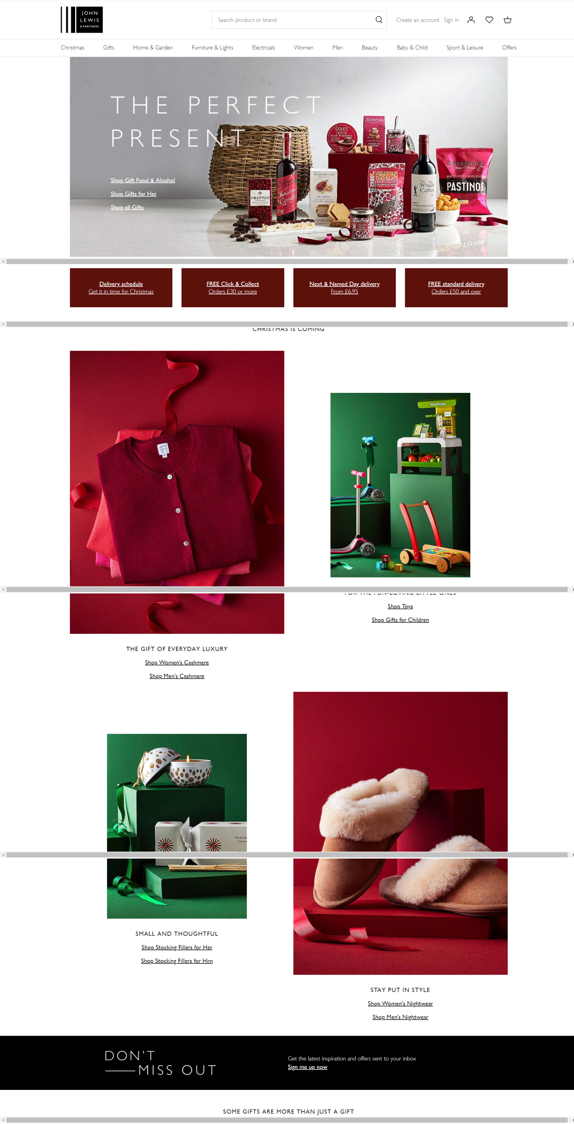
A nice array of Christmas Themed items are posed at the center of the website shocatalogow John Lewis is your perfect place for your Christmas shopping. The recurring blocks plus click-to-action is once again present, diverting traffic from to main page to catalogue pages with shopping options.
Big W the Australian department store boasts a fancier website design for Christmas, with shiny gold stars slowly falling from the top of the page. Perhaps it’s to compensate for their summer Christmas?
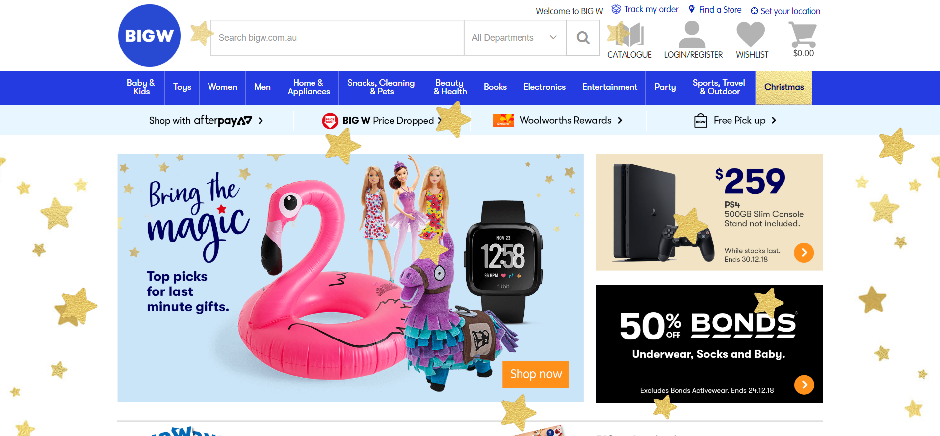
Blocks are utilized to neatly showcase different items and sales they currently have. Which makes navigation simple and easy for visitors.
Picture speaks louder than words, which is very true for this AT&T’s Christmas banner.
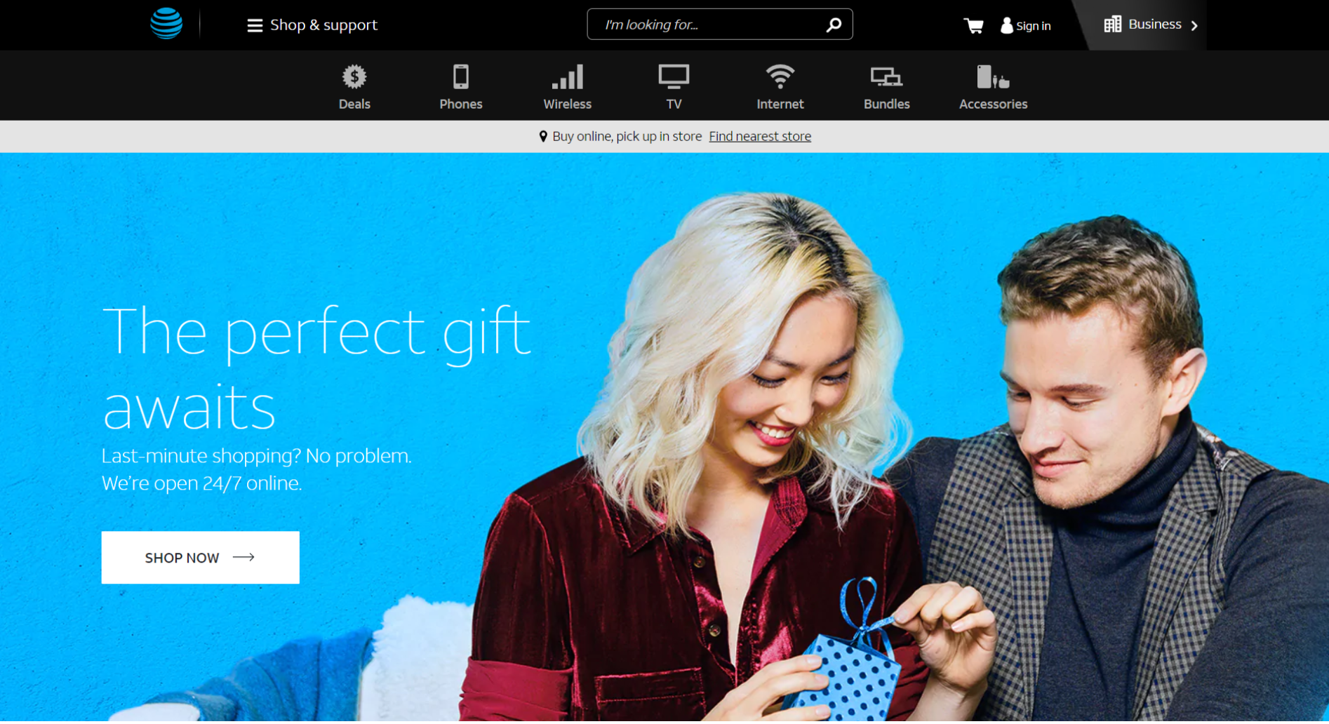
With a backdrop of AT&T’s iconic blue, a couple snuggled while the female happily untying her present. Christmas is all about sharing and giving back and showing appreciation. AT&T took that and turn it into a nice poster with a simple and straightforward accompanying copy.
Verizon had an eye-popping gif that makes you excited about holidays.
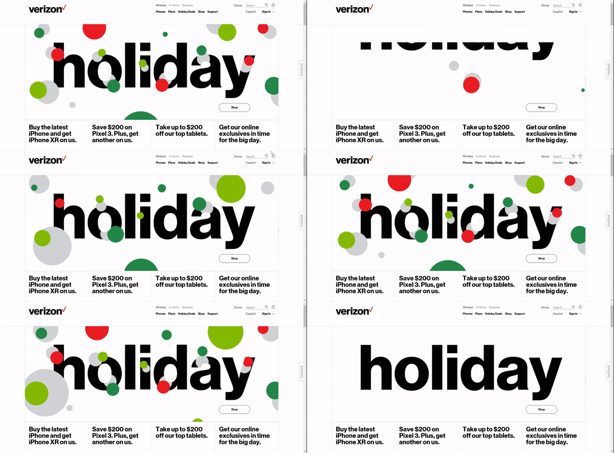
They’re using this technique of exciting the visitors, make them feel happy about the holiday and splurge on some slightly less expensive than usual gadgets. Hey it’s the holiday, I should treat myself better right? There goes your dollars. I’d say, good job Verizon.
Dell’s homepage showcases some heart warming pictures that will make you go awww which they smartly incorporated into the screen of their gadgets.
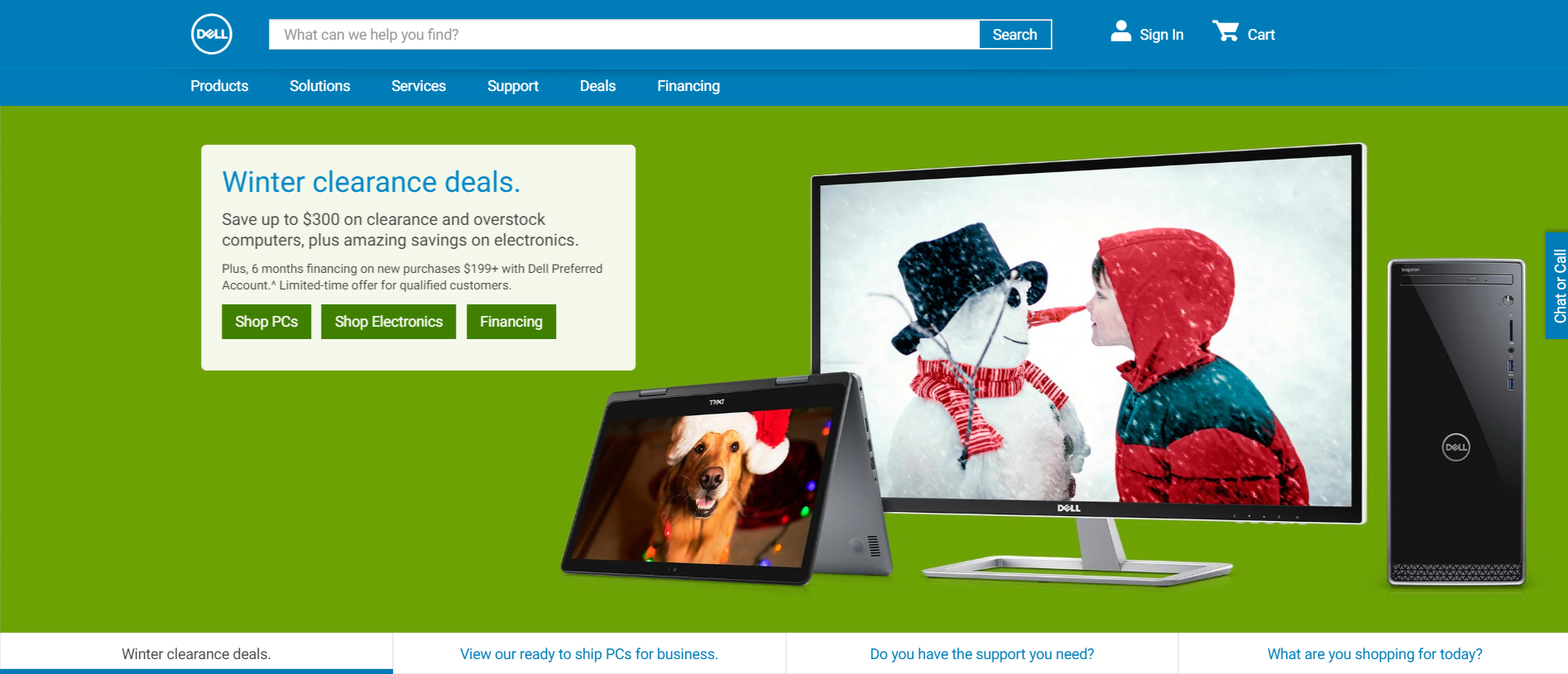
Tabs are readily available at the bottom of the banner to redirect visitor to their catalogue and also offer helps if they need it.
The Data Guardian from Kaspersky the Green Bear is decked in Santa costume to greet visitors while blending in to the festive fireworks-esque backdrop.

No matter if you agree that green is a good color on a bear or not, you cannot deny that watching the bear mascot dressed up in seasonal costumes is kinda cute. I’m sure it puts a smile on the face for the visitors familiar with the mascot.
I personally adore the minimalist Christmas theme designs at the Microsoft homepage.
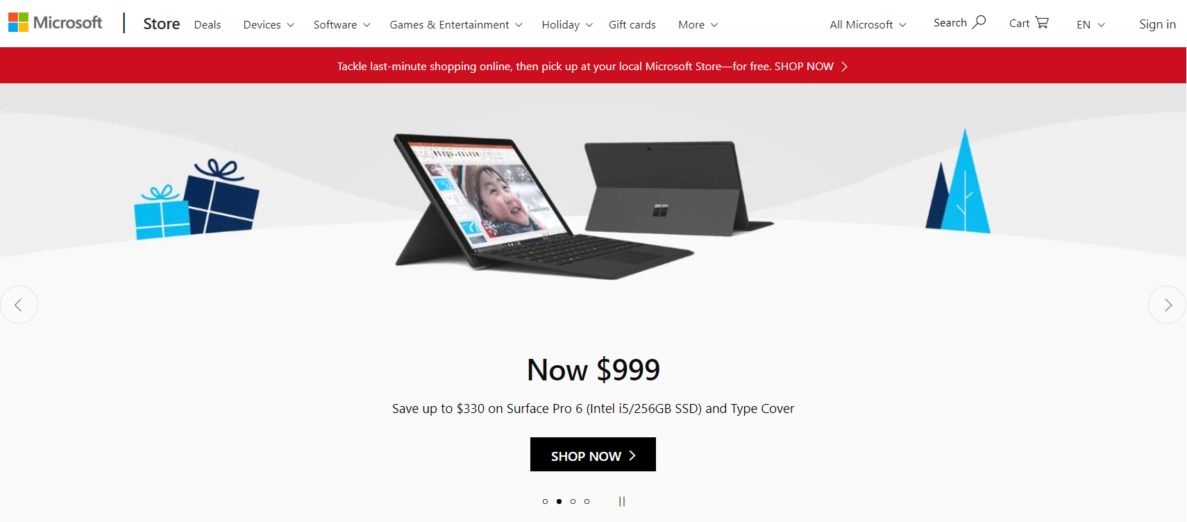
The image of the blue gift boxes and Christmas Trees surrounding a Microsoft Surface does kinda make me wanna get one too.
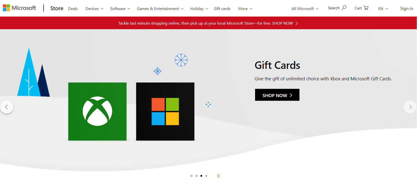
They even have some blue snowflakes just hanging out at the background, pretty cute isn’t it?
To be honest, Ohama Steaks doesn’t even have to work that hard, with those slabs of juicy meat on display, I’m ready to order in a hunger frenzy Christmas or not.
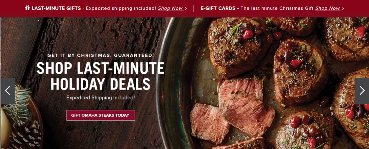
If you’re not really feeling hungry, but is instead looking for some easy way to send a gift to your loved ones, Ohama Steaks’s got that covered too.
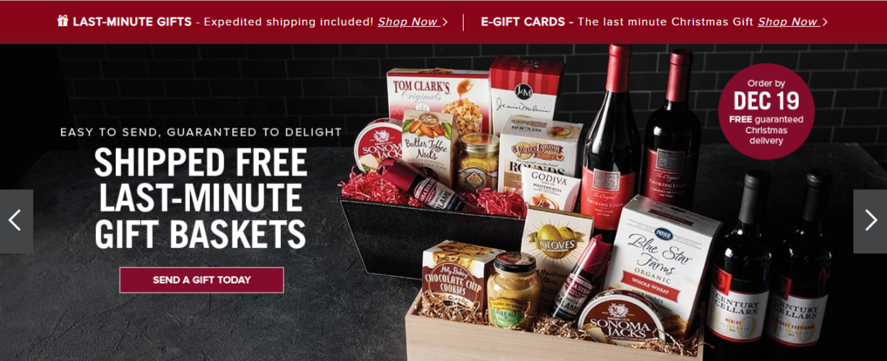
Various gift baskets are ready for order and shipped out just right in the time for Christmas for a loved one, as shown on the banner anyways.
What’s a Christmas without some fermented grape juice? Some good wine will make everything from good to better right?
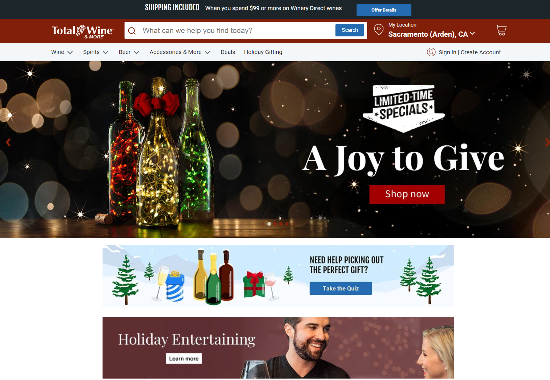
Although I’m not sure those whether those lights in the bottle is drinkable, they do looks festive enough to have a place on the Christmas dinner table. Coupled up with their Limited-Time Specials, I’m pretty ready to open up my wallet for Total Wine.
Coca- Cola decided to have a more romantic take on their Christmas spread for their homepage.
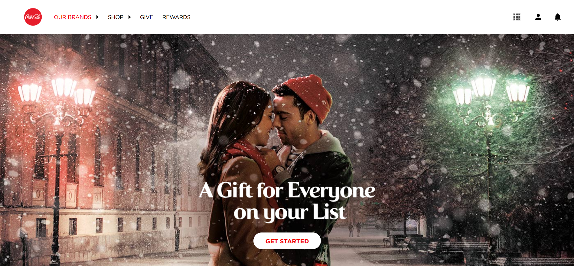
Featuring a couple embracing each other tenderly in the snow, that actually looks like a dramatic still from a romance movie. Since carbonated drinks like Coca-Cola does have a younger consumer group, this romantic display would probably speaks volume to their consumers, evoking a sense of romance and warmth in the chilly festive season.
Sainsbury’s holiday set up is pretty simple. The only inkling to any festive season in full swing is the copy saying Don’t forget… Make sure you have everything for Christmas with a bright red Click-To-Action saying shop now.
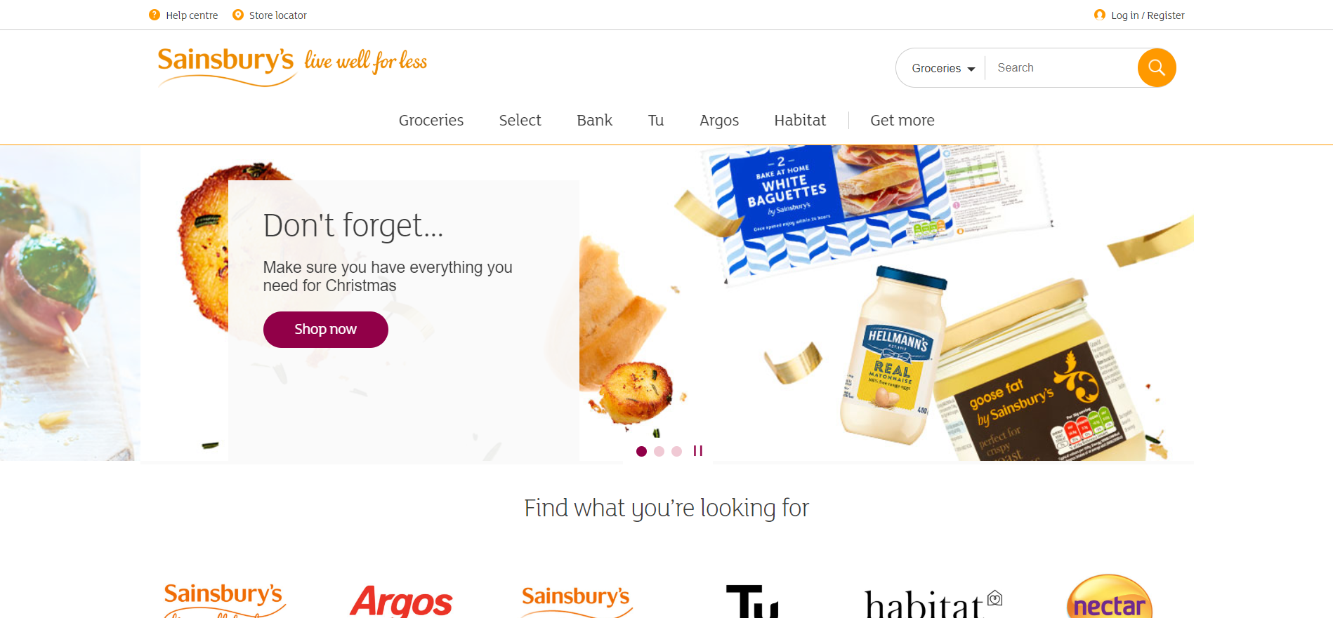
They do have special Christmas meals that are available for order for your Christmas season to make up for their lack of decorations. I guess when you’re as well know for Christmas as Sainsbury’s, having just enough Christmas themed design to your website is really enough.
Hallmark deserves a category all for itself because the name Hallmark basically equals to festive season, familial warmth and Christmas. They are that company that just reminds you of holidays and spending quality time with loved ones.

From a sleigh loaded with gifts on a Christmas red backdrop to stockings lining up the copy banner, Hallmark truly embraced the holiday spirit and went all out. At the bottom of the page, they even encourage their customers to tag them on Instagram to share some Christmas celebration love. Hallmark owns Christmas.
The holiday season is a crucial period for businesses be it an e-commerce or traditional retailers. With more than $691.9 billion sales recorded for the last two months of 2017 according to the National Retail Federation, marketers, designers, entrepreneurs, sales person are doing their best to have a piece of that holiday sales frenzy.
With the world population being more and more online, a business’s website homepage is often the first point of contact for a customer with a brand. Getting that festive season atmosphere while simultaneously pushing a sale is the first step in telling the customer that they are welcomed to do their holiday shopping with you.
Christmas is over for 2018, but it’s never too early to start planning for Christmas 2019. If you’re targeting global customers, there’s still a lot of festive celebrations out there that can be your sales booster. So start planning now and get inspired by the festive designs we shared.
Have you come accrossed some beautiful, quirky or unique festive designs? Let us know at the comment section below, we would love to see them too!
Updated: 30 April 2026


Save thousands of dollars (it’s 100x cheaper)

Zero risk of Google penalty (it’s Google-approved)

Boost your rankings (proven by case studies)
Rank High With This Link Strategy
Precise, Simplified, Fast Internal Linking.
