Steph W. from SEOPressor


...help you check your website and tell you exactly how to rank higher?

81
score %
SEO Score
Found us from search engine?
We rank high, you can too.
SEOPressor helps you to optimize your on-page SEO for higher & improved search ranking.
By allysa on May 6, 2015
Banner blindness is also known as ad blindness, or banner noise.
Without looking away from here (do not cheat), can you answer the following questions?
Well, you probably couldn’t answer these questions or didn’t even realize there were banners on this page until I’ve mentioned them.
If you could answer the questions then good for you. But for the majority of people that couldn’t answer, that’s banner blindness. You’ve just experienced banner blindness. And it’s completely normal.
Banner blindness is an occurrence where web users consciously or subconsciously ignore banners in a website. This phenomenon happens because web users are exposed to so much banner ads every day that their brain automatically ignores them before even judging whether they’re useful or not.
If you advertise or promote your products and services online, the answer is yes, banner blindness is affecting your business. Constant exposure to display ads has turned them into “background noise” for most Internet users, radically reducing the effectiveness of your advertising.
That’s probably not news to you, but look at these stats and you’ll be amazed how much banner blindness is actually affecting you.
[Tweet “Only 14% of Internet users remember the last ad they saw, and just 2.8% thought the ad was relevant”]

If that’s not enough to give you pause, consider this: according to Solve Media, you are more likely to complete a Navy SEAL training or summit the Mt. Everest than you are to click on a banner ad.
Even that handful of clicks you do receive may not be as valuable as you think. GoldSpot Media’s Fat Finger Report says 38% of clicks on mobile banners are accidental. And, comScore reports that 85% of display ad clicks come from just 8% of Internet users.
In short, it’s probably worse than you thought. Fortunately, the right strategies can help you boost the visibility and performance of your online advertising. Though you can’t eliminate the impact of banner blindness, you can mitigate it.
[bof_display_offer id=7987]
Most of the strategies for defeating banner blindness and getting your content noticed relate to visibility. Here are some of the most effective techniques.
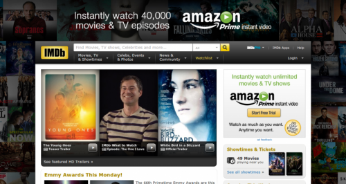
Homepage skin ads like the one above are great alternate ad placement that will surely grab the attention of readers.
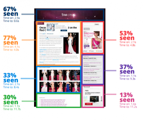
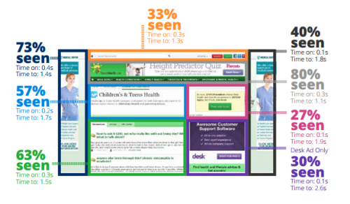
Credits: Infolinks.com
We’re all accustomed to seeing banners in certain places, such as the right sidebar on a web page. That predictability has conditioned most Internet users to “tune out” the content in that location consciously or subconsciously. Placing ads in unexpected or higher visibility locations can change all that.
A 2014 InfoLinks study revealed that 156% more people saw content at the top of the page than content at the bottom of the page. Integrated ads are even more visible: the same study indicated that integrated advertising content was seen by 451% more people than a banner ad on the same page.
[Tweet “Study indicated that integrated advertising content was seen by 451% more people than a banner ad on the same page.”]
Study respondents indicated that these ads were easier to notice because they were “both unobtrusive and attention-grabbing.”

(Facebook’s newsfeed ads are great examples of integrated advertising content)
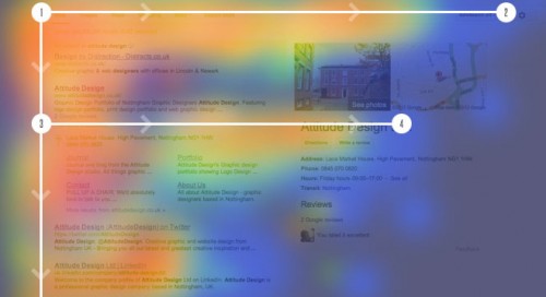
The F-Pattern relates to ad placement, but deserves a separate mention because of its widespread applicability and high impact. An eye-tracking study by the Nielsen Norman Group revealed that users followed a consistent pattern across a variety of sites and tasks.
First, the user read left to right across the top.
Second, the user made a vertical scan of content along the left side. When the user’s attention was captured by something during that downward scan, left to right reading resumed.
This pattern explains the higher visibility of top of the page content in the InfoLinks study, and this additional finding: ads placed in the left margin were seen by 73% of visitors.
Placing your key promotional content in those areas where virtually all Internet users look first is a simple, expedient way to boost visibility. Skinned home page advertising like that commonly featured on the popular movie site IMDB.com takes advantage of this placement structure, along with contextual integration.
When a site sells advertising, it’s usually pre-assigned to a slot and the size and shape of the advertisement is dictated by the publisher. This makes sense from a publisher perspective, but adds to the invisibility of the ads placed in those slots.
When you have the flexibility with an advertising outlet or are placing promotional content on your own site, mix it up to stand out.
Ad content that takes up more space (such as the aforementioned homepage skins) or sharply contrasts in color, font and other visual aspects with the page itself will be more likely to catch a visitor’s eye than an advertisement that looks like all of the other display ads that user is bombarded with.
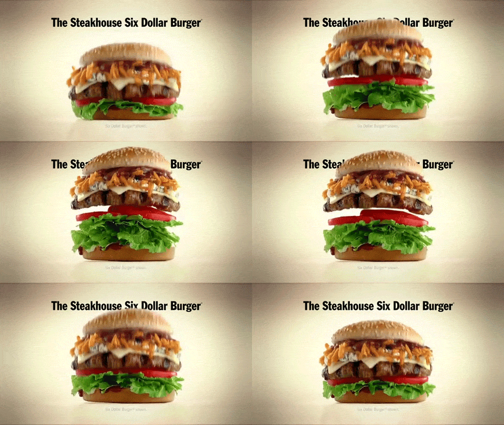
The same impact can be achieved by mixing up the format. For example, an animated gif will catch the visitor’s eye with movement. But, don’t overdo it. Remember those InfoLinks study participants, who valued the combination of “attention-grabbing” and “unobtrusive.” Catch the user’s eye without making it difficult for him to read the content he came for.
Though most of the strategies for overcoming banner blindness relate to the visibility of the ad, there’s another very important factor to consider: relevance.
Up to this point, we’ve talked primarily about getting your ad noticed, but that’s only the first step. To make those advertisements and promotional blocks useful, you need the user to do more than notice them. She must engage with them.
The same InfoLinks study referenced above revealed that when the margin units were “contextually targeted to the content of the page in question,” users spent 25% more time on those units.
The bottom line on beating banner blindness is to make your promotional content stand out visually from the page and catch the user’s attention while blending seamlessly in terms of content and relevance. That means carefully choosing not just where on the page you’ll place an ad or promotional block, but also which content those promotional efforts will integrate with best. Then, having selected the best contextual fit for your ad, set about creating the contrast that will catch your visitor’s eye.
Related Links:
[This blog post was originally written and published by Zhi Yuan on May 5, 2015. It is most recently updated by Allysa on Jun 02, 2020]
Updated: 4 April 2026
One thought on “What is Banner Blindness and How To Beat It”