Steph W. from SEOPressor


...help you check your website and tell you exactly how to rank higher?

80
score %
SEO Score
Found us from search engine?
We rank high, you can too.
SEOPressor helps you to optimize your on-page SEO for higher & improved search ranking.
By jiathong on June 18, 2018
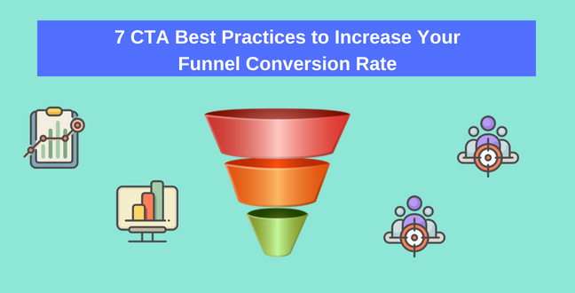
Call-to-action (CTA) is unarguably important to shift audience from one end of the funnel to the other. It’s unlikely that a prospect will buy your product before they have signed up to be a subscriber.
And what pushes them from being a subscriber to a client is the CTA.
However, the art of CTA is not simple to master.
Trying to engage potential customers in a purchase too early you risk intimidating them. Offer them with a purchase option too late, they might not be interested anymore.
The way to solve this tricky situation is alignment. You need to align user’s intent with buyer’s journey and sales funnel stages.
In short, you need to know the perfect timing to give them the perfect offer.
The whole reason for CTA’s existence is prompting the prospect to take an action. To achieve that you gotta start with the CTA button itself.
A button that you can’t see is a button that you can’t push. So make sure your CTA is visible.
1. First you have to pick a popping color.
The trick is to make sure to use contrasting color with the background for your CTA. Noticed how CTA buttons are usually green, blue or red?
If your button is the same color as the background, people might not notice it at all.
You don’t want your CTA to blend into the background. Instead, you want it to be “Hey I’m right here if you ever want anything”.
Here are some examples that showcase high and low contrasting colors.
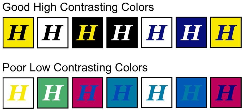
This chart shows you some example of high and low contrasting colors
2. Spread the CTA buttons placement across the page.
There should be a CTA both before and after the fold.
If you have a long sales pitch page, the button purchase CTA button shouldn’t be just at the end of the page. People might not scroll through the whole thing till the end.
That way those who already know why they’re here for can reach it quickly without scrolling down. While those who spent time reading through your page can access it at the end of the scroll.

The New York Times with the log in and subscribe at the usual upper right side.
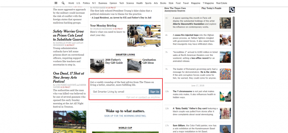
After a little scrolling you’ll be prompted with another sign up button at the middle of the page.
3. Give them a button where they expected it to be.
Do you habitually look at the upper right side for the login button? I bet you also expect there to be a subscribe button at the end of an article right?
It’s the same thing for everyone else. So make use of that and place your button at where it’s expected.
Follow a logical flow to decide where to place your CTA.
Prospects are supposed to take an action by clicking on the button. But what action? What’s coming after they clicked on the button? That’s what you need to spell out.
A CTA is usually accompanied by a copy. So make sure that your copy is compelling and inviting enough that they will want to click on the CTA.
Let’s have a look at some simple tips on how to create a more compelling copy and CTA.
4. Be clear about what you’re offering
Be it “Grab your free ebook now” or “Sign up to be a member” you need to tell them what clicking on the button will do.
Don’t put an ambiguous phrase like: submit, enter, click here etc. So what? What’s going to happen if I click here? Don’t let them ask that question.
Build their expectation starting from the copy and then provide them with an option to take an action.

Netflix has a compelling copy with their equally actionable CTA.
5. Use possessive pronouns to establish a connection
“Get your quote now” sounds better than “Get a quote now” right?
You’re implying that the quote is personal to them, it is theirs, so it’s only normal that they take what is already theirs.
Make the copy about them, talk to them directly.
Let’s say you’re selling a chatbot service, tell them how you will help them serve their customer better and secure more sales for them.
Show them something concrete, everyone can say a product is great. How you define great makes a difference.
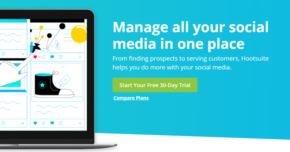
See how it’s YOUR free 30 day trial?
6. Create a sense of urgency
You want to fuel the action making. Especially when prospects are on the fence about purchasing.
Show them a countdown, a time-limited offer, tell them to get it now.
Give them a gentle push to make that decision.
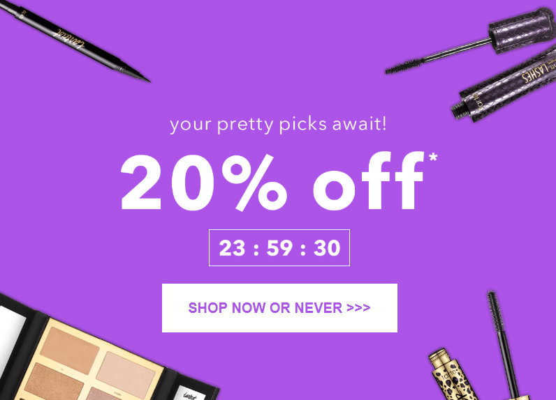
Tarte uses a countdown clock to create a sense of urgency.
7. Be precise and concise
“Click here to request for an instant quotation” seems a little too much to fill in a box. What about “Request your quote now” instead?
When you can use fewer words to express the same thing, do it.
Make sure that your copy is straightforward and clear.
User intent differs according to where they are on the funnel or buyer’s journey.
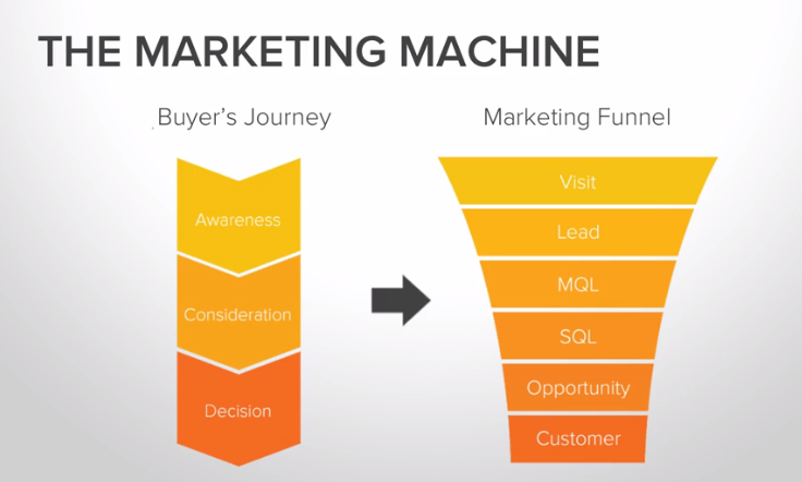
The equivalent of a buyer’s journey with the sales funnel example.
You can’t tell someone who just walks in your computer store out of curiosity to buy a $2399 MacBook Pro. They will, however, accept your promotion leaflet though. And the next time they come in they’d probably be more inclined in buying that 16gb USB on promotion.
It’s the same thing with CTA placements. You need to place your bet on where the best opportunities are.
That way you can guide them to reach the endpoint of making a purchase from firstly taking in information then being presented a solution.
Visitors from the top of the funnel have no sentimental engagement with you. They just wandered into your site and have zero desire to commit anything.
At this point, you need to retain their attention and interest. Your content or copy should be written in a helpful and friendly tone. The posts need to be relatively simple and easy to understand.

Please, please don’t put down your readers just because they don’t have the same reading taste as you.
Drive engagement by asking them to leave a comment, share the post, and recommend them other contents that they might be interested in.
The CTA should be offering them things that are closely related to the topic. Your target at this point should be inviting them to continue exploring your website and become a recurring visitor.
They have a little trust in you and now they are coming back for more.
Your goal now is to continue educating them while building up yourself as a trustworthy and authoritative figure of your niche.
Give them more in-depth contents targeting on specific and real problems. If you can, use targeted email marketing to further build a relationship with your visitors.
Convinced them you are the one they’re looking for. Let them know you have the solution to their problem.
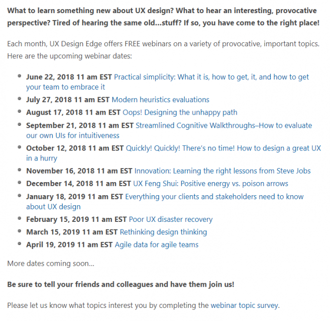
Webinar is the best way to directly engage with your audience and show them that you can provide them with solutions.
Time to close that deal. You have built a relationship with the prospect, they trust your expertise now they just need a little more convincing that you’re the best choice.
Showcase your product, let them know exactly what you can do.
Give them a price cut for that little extra push. Make that as a first-time offer, send them a coupon code for 20% off, or tell them they can have the first month for free.
That way they have less to lose, so why not give you a chance? Goal in, you got a customer.
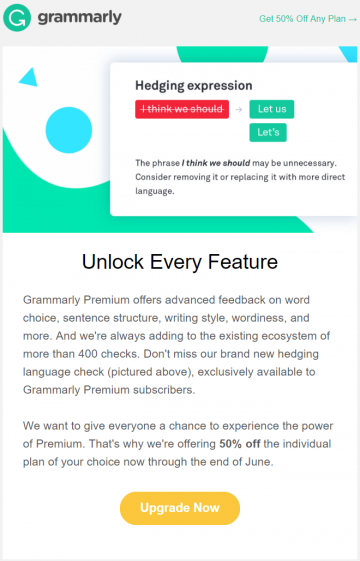
A 50% off sounds awesome for something that I know I love using already.
Providing CTA relevant to the audience’s intent is the way to win more conversions. Make use of the buyer’s journey to really up your CTA relevance game.
A visitor downloaded the offered ebook at the end of your blog posts and became a follower of your blog. He signed up for your newsletter and became a subscriber. He then checks out your products and decides to buy your product.
That’s the perfect scenario, all with a little help of some well optimized CTA.
Updated: 10 April 2026


Save thousands of dollars (it’s 100x cheaper)

Zero risk of Google penalty (it’s Google-approved)

Boost your rankings (proven by case studies)
Rank High With This Link Strategy
Precise, Simplified, Fast Internal Linking.
