Steph W. from SEOPressor


...help you check your website and tell you exactly how to rank higher?


...help you check your website and tell you exactly how to rank higher?


SUBSCRIBE TO SEOPressor BLOG
Join 50,000+ fellow SEO marketers!
Get SEOPressor latest insights straight to your inbox.
Enter your email address below:
95
score %
SEO Score
Found us from search engine?
We rank high, you can too.
SEOPressor helps you to optimize your on-page SEO for higher & improved search ranking.
By jiathong on May 23, 2019
Social media sites are getting increasingly visual, and also increasingly confusing on what ratio and size the images should be.
Good old, simple texts are no longer in sync with the scrolling habits of the modern users, that’s why featuring a good visual element is so important if you want to catch more eyeballs.
Unfortunately, more often than not, we find our painstakingly edited images turn outcropped at odd places or zoomed in so much that it’s all grainy. Which really defeats the purpose of impressing the smart device users with our visual element prowess.
In order to avoid that, all the images need to be optimized to be the perfect size to fit in where you want them to be. Be it your Facebook group cover photo, your Twitter profile picture or your LinkedIn post image.
Starting from Facebook, Instagram, and Twitter to Pinterest, LinkedIn and Youtube, we’re covering all the ratios and sizes for each part of each website’s visual element.
Buckle up, it’s time for a ride to your complete guide to social media image sizes.
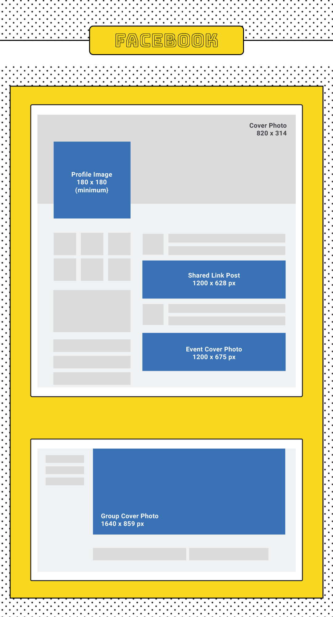
Cover photo :
(Desktop) 820×314
(Mobile) 640×360
Group Cover Photo:
1640×859
Event Cover Photo:
1200×675
Profile Picture:
340×340
Shared Links Featured Image:
(Desktop) 1200X628
(Mobile) 1200×900
Video:
600×315
Maximum file size 1.75GB or 45 minutes
With 2.2 billion active users, Facebook remains as one of the most relevant social media site for all age groups.Which makes it a perfect platform for marketing purpose. Using an image with the correct ratio and size that pops, can mean a huge difference. Maneuvering through the different size requirements of Facebook is also a daring task with its frequent updates and various features.
While creating a Facebook image, keep in mind that Facebook prioritizes images with less text. They used to have a 20% rule where the text-image ratio should not be more than 20-80. Although they removed it now, it still serves as a guideline to remind you that your images should be the least text heavy as possible.
One pro tip: How your image appears on the timeline might be different with how it appears on someone else’s.
Profile Picture:
110 x 110 (1:1)
Story Image:
1080×1350 (4:5)
Or
1080×1920 (9:16)
Photo Post:
Landscape
1080×608 (1.91:1)
Or
Square
1080×1080 (1:1)
Or
Portrait
1080×1350 (4:5)
Video Post:
1080×608 (1.91:1)
Or
1080×1350 (4:5)
IGTV:
1080×1350 (4:5)
Or
1080×1920 (9:16)
IGTV Cover Photo:
420×654 (1:1.55)
Story Video:
1080×1920 (9:16)

Being pretty much a mobile device only platform, Instagram’s size guides are much more straightforward. But, not knowing the exact sizes and ratio can still be pretty annoying for your social media efforts. Customize your visual contents to fit perfectly in your IG to appeal to your younger audiences and rack up those views.
Here are some tips on top of the size guide above. An Instagram story image supports anything with a ratio from 1.91:1 to 9:16. IGTV can only be in portrait, landscape images are a no-no. Want to share an awesome video on your story? Make sure it’s smaller than 4GB.
As a highly visual platform, your post can perform better if you have a distinctive, recognizable style. Or as the Instagrammers say, a certain aesthetic. Have a theme in mind, and make sure that it is consistently shown throughout every single post. Be it a good old image post, or a story. Stay unique and stay consistent to stand out.
Header:
1500×500 (3:1)
Profile picture:
400×400 (1:1)
Tweeted Photo:
(Minimum) 440×220
(Maximum) 1024×512
Shared link image:
800×418 (1.91:1)
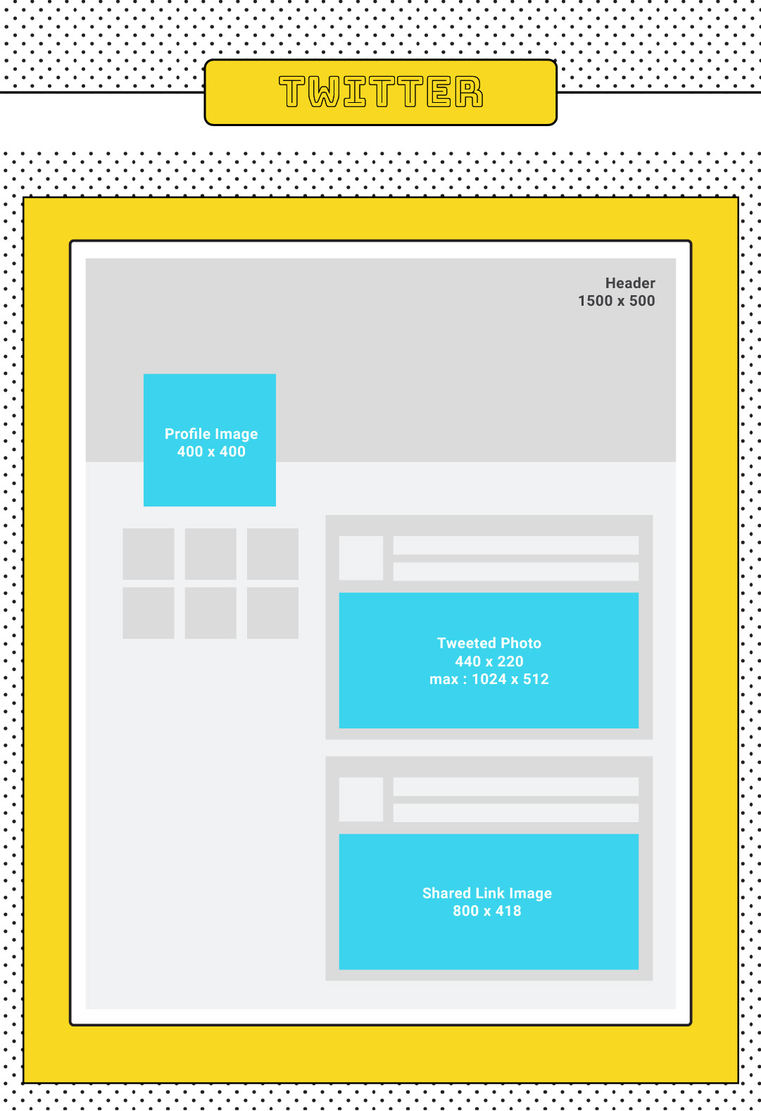
Twitter has 313 million monthly active users, definitely not a platform you want to miss out. Twitter automatically displays only part of the photos you have tweeted, but don’t worry, users can see the full image just by tapping on it. So you want to make sure to adjust the center and focus of your image so that it will be visible even when it’s collapsed. One thing to note is that you can attach up to 4 photos in a tweet.
If Twitter is your company’s main content sharing site, do remember to create a template for the images that come with your shared posts. And remember to make use of Twitter card so every link you shared from your website will come with an image.
One more thing, Twitter is also the best place to be if you want to get a little quirky with a meme gif. Sharing a gif on your Twitter will definitely earn you more brownie points, especially a customized one.
Profile picture:
165×165 (1:)
Pins:
Standard
600×900 (1:1.5)
Or
Tall
600×1260 (1:2.1)
Or
Square
600×600 (1:1)
Board Cover:
Large Thumbnail
222×150 (37:25)
Or
Small Thumbnail
55×55 (1:1)
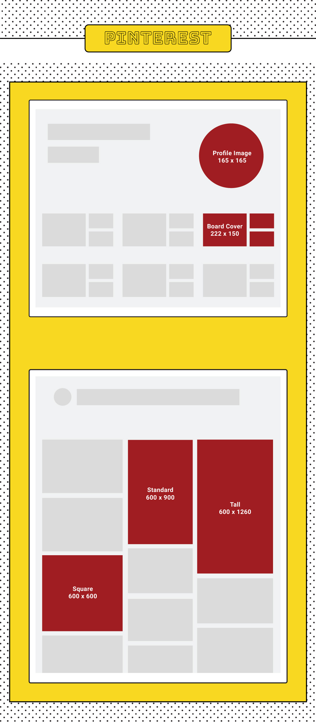
On Pinterest, images with warm hues, moderately saturated and medium lightness perform much better than their blue tones, desaturated and dim partners. So do take this as a guideline while creating your pins.
With a platform that is as focused as visuals as Pinterest, you also want to make sure that your images are high resolution and high quality. Low quality, grainy photos should not be associated with you or your brand.
Text overlays are another great way to entice your audience to pin your posts. But because the images are so packed and Pinterest users are mostly on mobile, you need to be very careful with your texts. You don’t want to overcrowd it so much that people can’t even read it. But you also want to be able to get the meaning across at the same time. So use short and precise copies coupled up with a readable font in a contrasting color with the background.
Pinterest is much more effective in driving sales for retailers compared to other social media sites. If you’re sure your targeted customers are on Pinterest, you better start investing on those pins. They might be your next bucket of bucks.
Profile Cover:
1584×396 (129:8)
Profile Logo:
200×200 (1:1)
Posts:
Mobile
1200×628 (300:157)
Desktop
1200×1200 (1:1)
Company Cover:
1536×768 (2:1)
Company Logo:
300×300 (1:1)
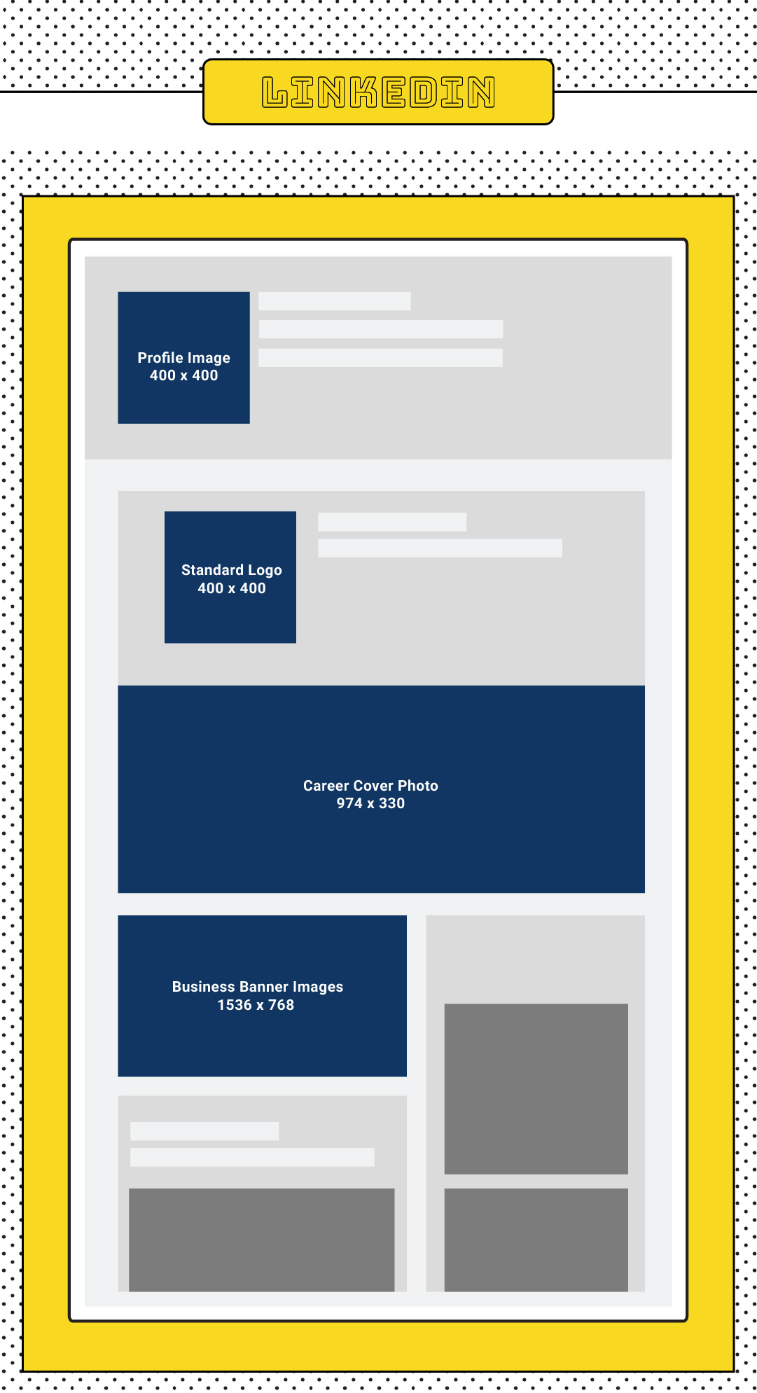
LinkedIn is one of the more professional social sites and B2B businesses can generally find more success here. That’s why maintaining a style that showcases your professionalism is the most important for LinkedIn images.
The website recommends using an image with minimum text for both your personal and company cover. They also only accepts PNG and JPEG image formats.
If you run a company page, visitors can also click on your Company photos featured in the Life tab of your page. So make sure to have some images or photos on hand to offer your visitor a sneak peek of your daily operations.
For LinkedIn, you need to make sure your images are sharp, clean, professional and straight to the point. Memes and fancy fonts might make you stick out like a sore thumb.
Channel Art:
2560×1440 (16:9)
Video Thumbnail:
1280×720 (16:9)
Channel Icon:
800×800 (1:1)

The last on the list, YouTube.
With ⅓ of the internet users also using YouTube, you can know for sure that it is a big deal. While the website mostly focuses on videos, there are still a couple of images that give your video sharing channel that added edge.
Having an eye-catching video thumbnail is definitely important. A lot of YouTubers use an edited screenshot from their video as a thumbnail. Which is brilliant, because you’re kinda giving a sneak peak of your video to the audiences.
Lastly, let me leave an image optimization advice as a parting note. Always remember to fill in the alt attributes with your target keywords.
Applying alt text to images can help explain them to Google search bots and rank in the image search results.
However, avoid keyword stuffing as it can result in a negative user experience and resulting in your site being seen as spam. The key is to be descriptive and detailed, as well as use a variance of related and relevant keywords.
Just do a quick search on BiQ’s Keyword Intelligence and you will find semantically relevant keywords you can use.
Here’s a useful tip, use BiQ’s Content Intelligence to check if you have overused your keywords in your content. Better still, it shows how semantically relevant your content is with your target keyword.
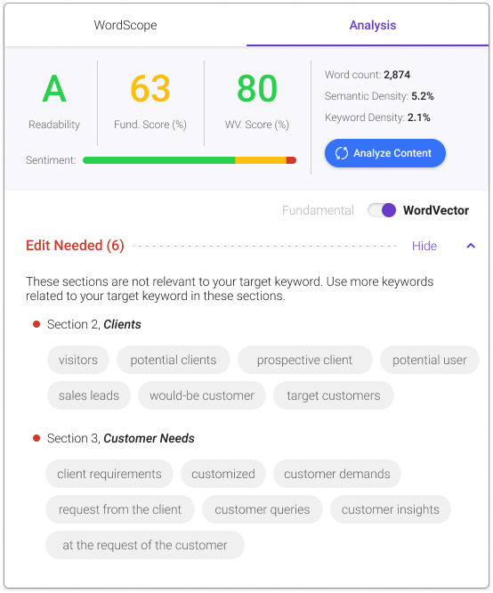
Other than that, Content Intelligence will also show you all errors that can be further improved.
For example, the WordVector will tell you the performance of your content against the Top 10 SERP content in relation to your target keyword.
The best part about this feature is that it can tell you exactly which paragraph has lesser relevance to the overall content.
Now, you will be looking at the “Edit Needed’ section to check which paragraph needs revision.
And that’s it! Remember to practice the ideal social media image size and include your alt keywords to get the best results! Remember to apply and do share down on the comments below if you find this practice helpful.
Updated: 10 April 2026

A polyglot plummeted into the deep blue world of SEO and inbound marketing armed with a burning passion on letters and a fascination on how thing rolls in the world wide web.
Struggling with internal linking?
Wish you could...

Automate internal linking

Use optimized anchor text

Fix 18 issues like orphan pages

Get link reporting and analytics
Precise, Simplified, Fast Internal Linking.


Save thousands of dollars (it’s 100x cheaper)

Zero risk of Google penalty (it’s Google-approved)

Boost your rankings (proven by case studies)
Rank High With This Link Strategy
Precise, Simplified, Fast Internal Linking.


Subscribe and receive exclusive insider tips and tricks on SEO.
Delivered to you right from the industry’s best SEO team.
Copyright © 2026 SEOPressor. All Rights Reserved.
Powered by Semantics BigData Analytics (SBDA).
