1
Steph W. from SEOPressor

👋 Hey there! Would you like to try out this New AI-Powered App that'll...
...help you check your website and tell you exactly how to rank higher?

70
score %
SEO Score

Found us from search engine?
We rank high, you can too.
SEOPressor helps you to optimize your on-page SEO for higher & improved search ranking.
By vivian on January 28, 2016
At this point, you’ve probably read through tons of advice concerning the setup of your website, from how to optimize your website using rich, relevant keywords to making sure that you are using a strong site structure to make navigation easy for both users and Google’s bots.
I know that I’ve emphasized these points time and time again to the point where you’re probably tired of reading about them. However, there’s one thing that can affect the performance of your website that you probably haven’t put much thought into – the font.
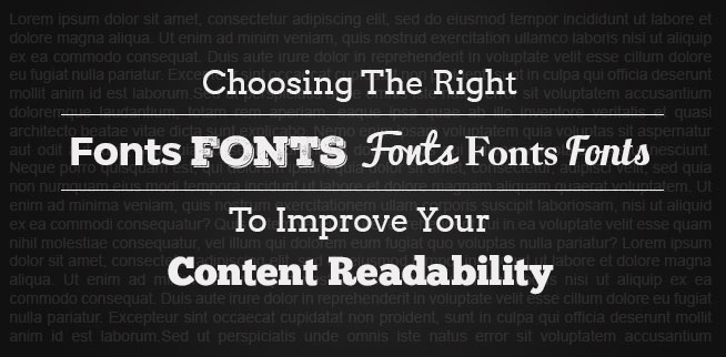
That’s right, the font you choose for your text can have a big impact on your website’s performance. So today, I’ll be sharing some tips with you guys on choosing the right fonts to improve your content readability.
Before we can get into the importance of choosing the right font, you need to understand exactly what a font is. This may seem pretty obvious; however, most people get it wrong.
A common misconception that people have about fonts is that they are the styles of text that you can choose. For example, Arial, Helvetica, or Comic Sans. However, these are not fonts – they are typefaces.
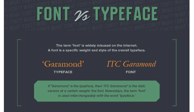
A typeface is defined as a group of letters, numbers, and characters that all share the same design. So what then is a font?
A font is made up of a typeface in addition to the width, size, and weight chosen for that typeface. For example, 12-point Arial Italic would be a font. One way to think about it would be to consider the typeface the creative design of the group of characters that are chosen and the font to be the delivery mechanism of those characters.
Everything that constitutes a font, from the typeface to the size, is vital to the content of your website. The following are a few reasons why you shouldn’t take the font selection of your content lightly:
If your font is too small, then readers are going to have trouble reading your content. You don’t want readers to have to put their faces up to the screen in an attempt to read your website – and neither do your readers.
One of two things is going to happen, they are either going to not bother with reading your content and leave your website, or they are going to struggle through your content and not remember the message because the only impression that will be left on them is how difficult it was to read your content.
Don’t forget that consistency is key too. You don’t want every page to have different sized fonts. Although your readers may not notice right away, they will be affected subconsciously – the flow from page to page will be off. This doesn’t mean that you should never adjust your font sizes.
In fact, using larger fonts for your titles and headers helps draw the reader’s eye so that you can inform them about what the content is about.
To ease your work, you’ll need a tool that can help you fasten the process.
Here is how you can use BiQ Cloud’s Content Intelligence to check your content readability.
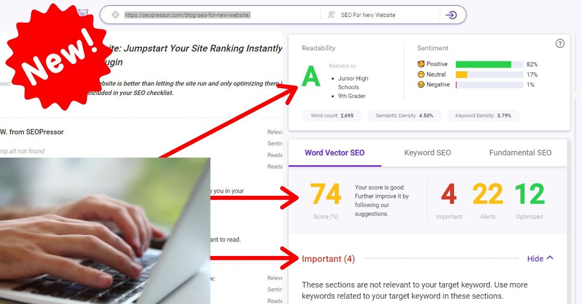
The intelligent tool will show you a summary of your content’s readability at a glance. I love how it analyzes the whole content and returns with easy-to-digest numbers and data. For example, in the overview section, you can easily see the content is readable by which grade.
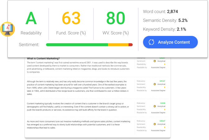
You will also see that the tool analyzes your content paragraph by paragraph and shows you the respective results of ‘readability’ and ‘readable by’.
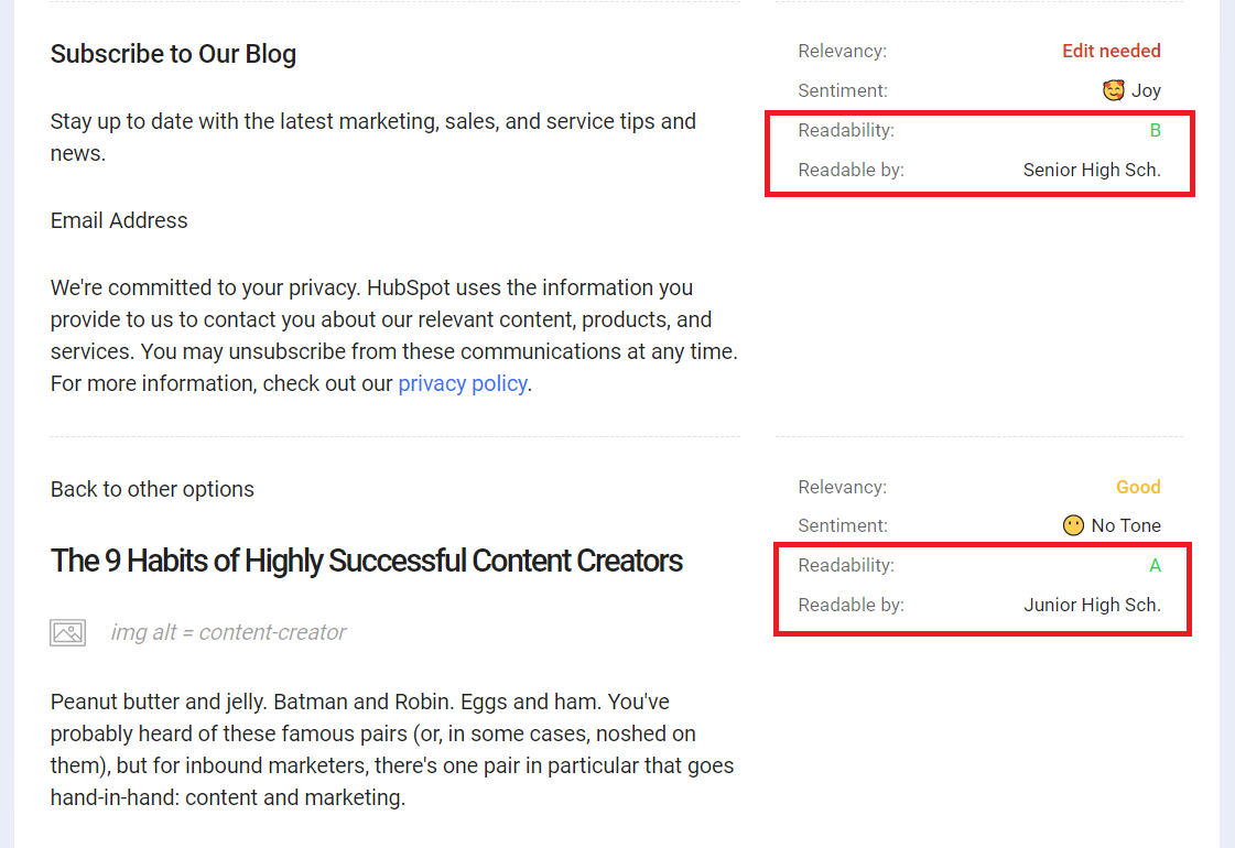
Readability – Tells you how easy it is to read the section. It takes into account the number of syllables in a word and amount of words in a sentence as its base measurement
Readable by – Tells you the education level required to understand the writing
With that, check your content with Content Intelligence for free now!
Other than font size, the style of your font also affects how readers react to your content. Remember when Lebron James left the Cleveland Cavaliers in dramatic fashion in order to chase an NBA championship with the Miami Heat back in 2010?
The owner of the Cleveland Cavaliers, Dan Gilbert, was furious at the decision and felt like he had been betrayed. He drafted a letter saying as much. The rant would have garnered more sympathy from readers (most believed James handled the situation poorly) had he not made one huge mistake – he published the letter in Comic Sans.
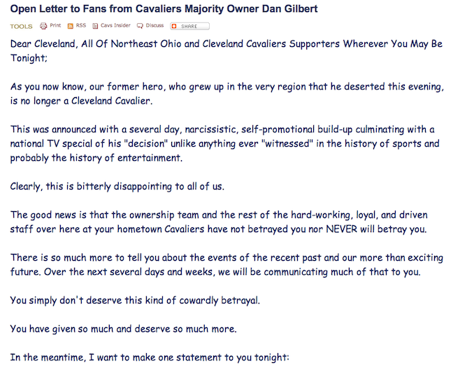
Instead of gaining sympathy, he was widely mocked by everyone on the Internet, from casual Internet users to large media outlets. He was mocked for using Comic Sans because how could anyone take him seriously when using typography that was so cartoony and childish? Had he used more appropriate typography, his message would have gotten across more clearly, and the same can be said for any content and the choice of typography.
Now you’re probably thinking, Comic Sans is a pretty extreme example. That’s like drafting a resume using a crayon. But typography can have subtle effects as well.
Just take for example the experiment run by Errol Morris back in 2012. The renowned documentary filmmaker ran a passage of the book The Beginning of Infinity in the New York Times under the heading “Are You an Optimist or a Pessimist?”
The passage was followed by two simple yes or no questions asking readers if they supported the claim made in the passage and how confident they were with the answer they provided. What no one at the time realized was that Morris had no interest in whether people were optimists or pessimists. He was testing whether typeface had an effect on the text.
Six different typefaces were used for the passage. Typefaces such as Comic Sans and Helvetica incited the most amount of disagreements to the passage. When the passage was presented in Baskerville type, most readers agreed with it.
So what’s the link here? Every typeface has a personality of its own. To use the right typeface, its personality needs to match with your content’s message. If you’re publishing a serious piece about the current state of the economy, Comic Sans just won’t cut it. But if it’s a fun and silly piece of content aimed at kids, then Comic Sans might actually work.
People judge books by their covers. We’re taught not to – but we are a very visual species and just can’t help it. If your website makes use of a bad looking font that’s either too big or too small, it’s going to make your website look bad. So is not using your font consistently.
You can’t use five different typefaces on your homepage in seven different sizes or it’s going to become visually cluttered, making it difficult for readers to do something as simple as just scan the page. When your font looks bad, it’s going to leave a bad first impression on visitors.
Now that you realize how important your choice of font is to the content of your website, you might be panicking just a little bit. After all, how do you know what font to choose? Dan Gilbert obviously thought that Comic Sans was a good choice, but what if you simply have poor taste in fonts?
Fortunately, studies have been done in order to determine which fonts are the best options. A study by the Software Usability Research Factory compared eight of the most popular online typefaces and found out the following:
These results should provide you with a good idea of how your readers react to fonts. Of course, this doesn’t mean that these are your best options. There are even some contradictions within the results. For example, Comic Sans is one of the most preferred typefaces, yet it was also considered one of the most illegible. This is why what readers prefer and what you should use differ.
While some readers might be attracted by unique fonts (like, for example, Comic Sans), more often than not a unique font will sacrifice legibility and readability.
Just because a reader thinks Comic Sans is more aesthetically pleasing than Arial, it does not mean that they are going to have an easier time reading and engaging with the content and its message.
As I mentioned before, the message of your content comes first and foremost. While you might think that a unique font can help draw attention, it can also overwhelm the content. Therefore, you have to limit the use of typefaces that use lots of swirls and curls.
One trick that you may want to use is to look for a typeface with large counters. Counters are the areas of the letters that are either entirely or partially closed, such as “O” or “e.” This will help make the text appear less crowded together and will ensure better legibility.
When it comes to using different fonts, don’t go crazy. Consistency is important to readability. However, you can pair two different typefaces together.
For example, you can use a different typeface for your title and headers than your body text. When you decide to pair two different typefaces, make sure that they aren’t too similar. Readers will begin to subconsciously compare the two to see if they are similar, which will distract them from your message. Instead, look for contrasting typefaces that share a common trait.
As far as size goes, consider your audiences. If you have older audiences, then odds are that their eyesight isn’t as good (this isn’t a generalization – everyone’s eyesight degrades over time), which means that using a larger font will be a better idea.
As you can see, the fonts you choose for your content has a huge impact on the performance of your website. By not using the proper font, not only could you turn away readers (and lose potential leads), but you also risk not getting the message of your content across.
Fonts really do have an impact on your content readability. Therefore, you should identify what types of fonts are the best to be used in content and understand the reason behind it. With this, you will prevent your readers to stop reading your content. Instead, you will get more readers as well. People not only like your content, but they will also like the way you manage your content with good readability.
What is the common font variant that you prefer to use in your content and why? Share with us in the comments section below.
Related Links:
Updated: 26 April 2024

Do you want to
Grow Your Traffic FAST?

Generates 5,000 words in minutes
Publish 60+ content in a month
Rank in the SERP’s Top 10
Gotcha.

Generate 5,000 words in under 5 minutes
Publish 100+ blog posts monthly
Rank in the Top 10 with SEO-optimized content
Drive 500K organic traffic
Rank in the Top 10 now with Longform AI
Save 67% today (As low as $14.69/mo)

Subscribe and receive exclusive insider tips and tricks on SEO.
Delivered to you right from the industry’s best SEO team.
Copyright © 2024 SEOPressor. All Rights Reserved.
Powered by Semantics BigData Analytics (SBDA).