Steph W. from SEOPressor


...help you check your website and tell you exactly how to rank higher?

96
score %
SEO Score
Found us from search engine?
We rank high, you can too.
SEOPressor helps you to optimize your on-page SEO for higher & improved search ranking.
By vivian on September 18, 2017
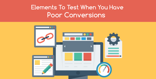
A landing page is an inbound marketing tool used for lead generation. Your landing page should drive visitors to you by persuading them to click through to another page where you warm them up to make a purchase. The kind of action your visitors will take while on your landing page will determine your conversion rate.
The basic landing page purpose is: sell a product, encourage visitors to subscribe to an email newsletter, promote a downloadable eBook or report, and sign a petition among others. So if your landing page is not generating enough leads or conversions, you’re in trouble right?
Well, maybe, and maybe not. Because there are elements you can test to eliminate any pain points. Here are the landing page elements to test:
First impressions are the most lasting. And what’s more, poor first time experience will likely cause you permanent loss of a customer. According to findings by Webby Monks, 2-3 seconds is all it takes to determine whether a visitor will explore your site or whether it’s adios to you.
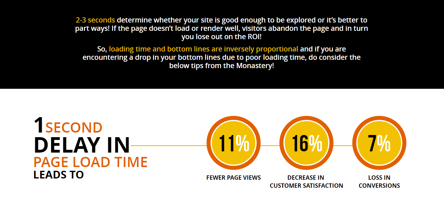
This is what a 1 second delay in load time will cost you.
You don’t want to imagine what a full 23 seconds will do. In 2010, Google announced that site speed is a new ranking signal in their ranking algorithm. In Google’s eyes, a slow website is equivalent to a bad user experience and a poor landing page with poor conversion rates.
You can do landing page optimization by trying to find out what causes slow loading time. The most common culprits are:
As you work to create high converting landing pages, remember that 47% of visitors expect a webpage to load in under 2 seconds.
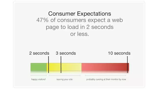
So if you don’t want your visitors to bolt the moment they land, avoid the three culprits above, especially images. More images mean more requests on each page load which slows your page down.
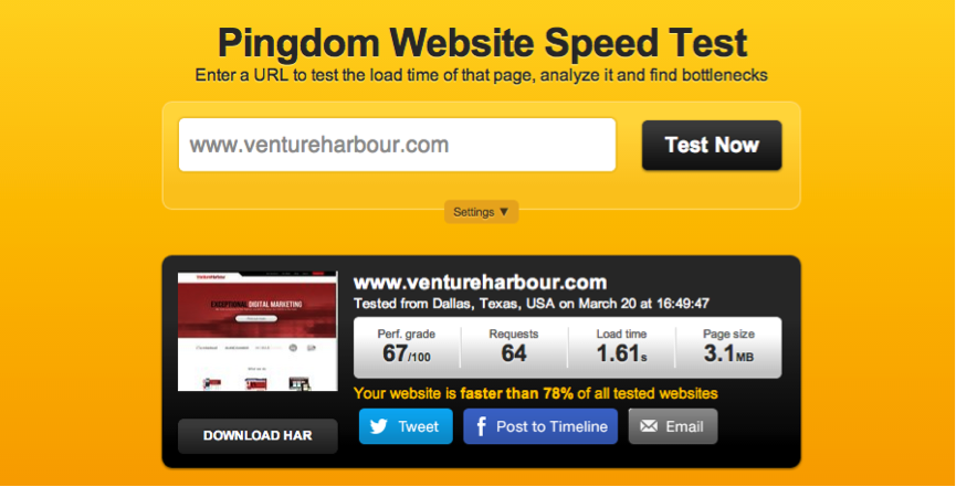
The Venture Harbour homepage was making 64 requests on each page load, which was over 3mb.
It was majorly caused by a lot of Java script files from not used plugins. After implementing recommendations like avoiding fancy sliders and excessive images, they managed to reduce loading page speed to 583ms, reduce the page size to one third, and almost halve the number of HTTP requests. You too can do the same for your landing page.
Ever been to a newspaper stand? You’re excused if you first look at the headlines, it’s what most people do.
Your landing page headline is the first things visitors see so don’t let it be the last. Your headline should be able to communicate a clear, specific, and useful message. If your headline doesn’t invoke curiosity and set the visitor’s expectation about your product, it’s not good enough for conversions.
Take for example a headline like “lesbian couple says they want kids.” Post something like that and see the kind of views you will generate; tremendous. So why are your headlines failing? Here’s why:
To have good landing page optimization, first you need to create content that is benefit-oriented. That is, content that will entice your visitors to want to learn more because it benefits them.
Big headlines grab attention too. You can test your headlines by changing the title case, headline orientation, quotation marks, and using contrasting color to improve readability.
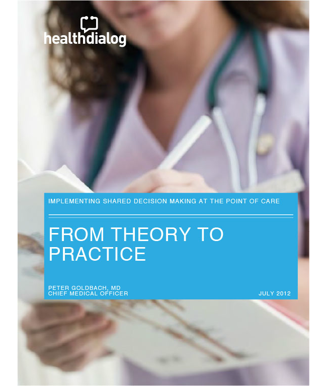
Health Dialog had a whitepaper titled “From Theory To Practice” on their landing page which was quite vague.
After taking suggestions, they came up with a better headline with a strong offer; “X tips for implementing shared decision making at the point of care”. They even went on to add what you would learn from downloading their whitepaper.
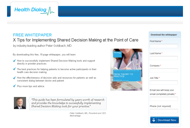
Health Dialog has never looked back since as their conversions continue to grow.
Invest time to write powerful headlines to increase the amount of time visitors spend on your page. Blog Title Generator by SEOPressor can help you generate great headlines.
Simply enter your keyword to get five great titles, which you can then enrich with this guide.
We can agree that enticement alone is not enough to convert a lead into a sale. In any sales funnel, you need to have a compelling story with call-to-action (CTA) that will evoke action from your landing page visitor. However, 55% of all page views get less than 15 seconds of attention from a reader.
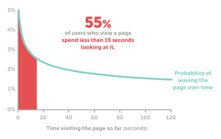
Optimize your landing page elements for the today reader by making sure your CTA is prominent enough. Here’s how:
i) Use an action verb in your CTA that is benefit oriented.
An action verb first forces you to write in the perspective of your audience which strikes a chord with their benefit orientation. Second, it helps you build momentum for the reader to drive them down the sale funnel. Action verbs are words like ‘get’, ‘dominate’, ‘see’, ‘try’, etc.
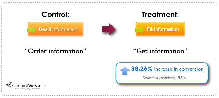
Michael Aagard changed his CTA button from “Order information and prices” to “Get information and prices” and realized almost 15% increase in conversion rates.
ii) Make your CTA stand out from the rest of the page by playing around with its color, size, and shape.
Your CTA should look clickable to your visitors. The surest way to confirm whether your CTA really stands out is to conduct tests. Color is used by most visitors as a cue of where to click next. Do some intelligent guessing and pick the right color with the assistance of tests.
Bigger button size does not guarantee conversions although your button should be big enough to be seen but not obstruct the visitor. Strategy is everything if you want to get noticed. Place your CTA button strategically on your landing page especially if you have a long form landing page.
Unless you are an impulsive buyer, what step do you take first when buying something say a car? You look for reviews from people who have previously bought the item. Your behavior is just right and is called social proof.
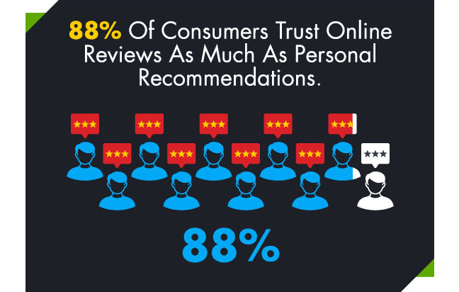
Social proof is so much of a guarantee that 88% of consumers trust it as much as they would personal recommendations.
Your business is judged by personal reviews as though you were in an interview. Gaining credibility is harder than losing it. High converting landing pages display trust signals on their landing pages and so should you if you want to gain buyer confidence.
Show your newsletter subscriber numbers, social media following, or testimonials on your newsletter subscription landing page. You can also use social proof as a headline like, “We signed up 4,000 people yesterday. Today is your turn”. This makes you look very credible.
Most businesses display testimonials at the bottom of their pages in sections called “what others say about us”. The most powerful testimonial you can get is an endorsement by an influencer in your industry or celebrity.
Have you ever tried to water a tree in the rain? It would be pointless.
In the same vein, you need to drive the right traffic to achieve good meaningful results. A great way to do this is to target effectively. That is, keep your target audience in mind at all times.
Additionally, you need to run tests on your traffic sources to establish what works and what doesn’t. Assuming your two major traffic sources are Facebook Ads and Google AdWords, tests will help you identify: optimal headlines, copy, images, as well CTA that is most attractive to your target audience.
Once you have identified how to improve your ads, focus on your landing page to optimize post click experience. You need to have individual landing pages for each of your market’s specific needs. If you succeed in getting it right, landing page conversions are the first step to a loyal customer.
To do landing page optimization, ensure your landing page copy, headline, and CTA are in line with the content. Do not also bypass the overall look and feel of your traffic sources whether social media or search engine traffic but instead look to replicate them.
Elizabeth from Unbounce had a ready-to-eat meals client who was bidding for keywords and using them at the wrong stage as well as targeting the wrong people. After brainstorming with her client, they came up with buyer personas for her client’s business. She then altered the keywords as well as the landing page copy to appeal to the buyer personas.

Although there was a drop in traffic, quality traffic picked up which led to more conversions.
Design is the medium to communicate your value clearly and effectively. It is no wonder that 35% of internet users aged 18-34 years do not feel safe online. Your visitors should be interested in what they see rather than get anxious and worried.
A good design should utilize directional cues to make CTA prominent.
Arrows, lines, eye glances, and other pointing attract the attention of your visitors to specific elements of your landing page you want them to see.
Additionally, a good landing page design should be unique and not utilize common generic stock photos and design templates. Like marketers use product differentiation, you should also use unique landing page designs because no visitor wants to see the same thing they’ve seen in ten or more other pages.
Going the extra mile might not save you any buck, but will surely save you a lot of loss in traffic, leads, and conversions.
MailChimp make their unique value proposition very clear right on their homepage when they say “easy email newsletters”.
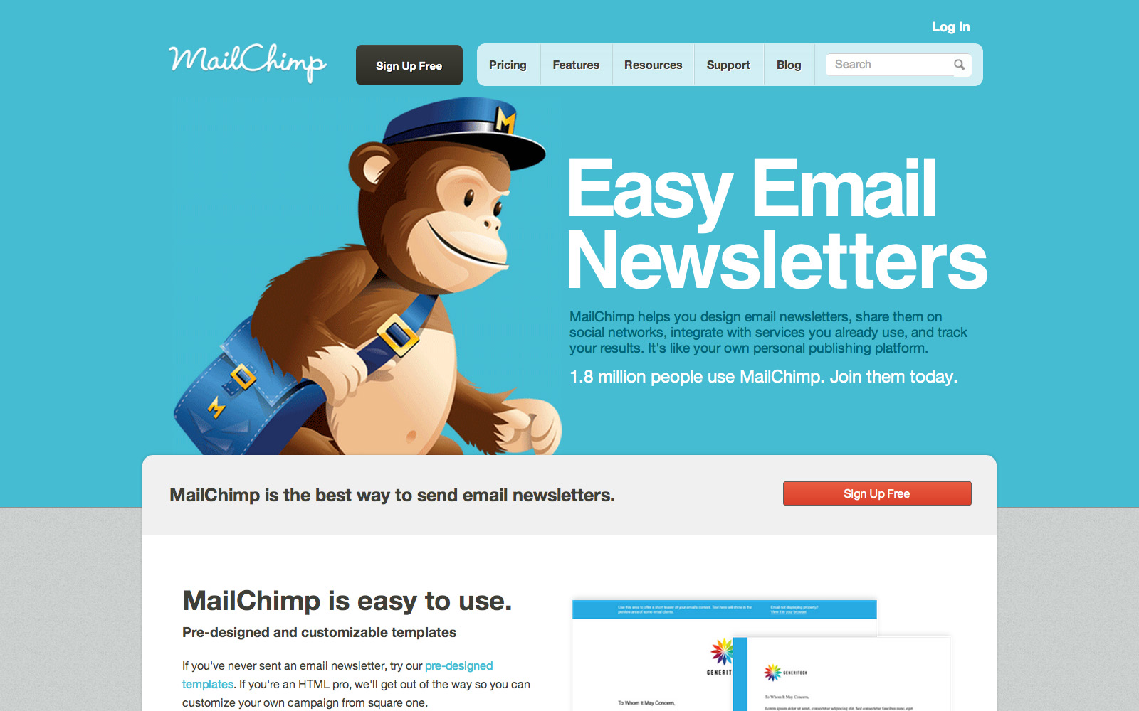
Everything is simple and clear from the word go and those who have used MailChimp can attest to this. Themeforest have also made a very successful landing page template known as LISTA. You should consider buying such proven templates but customize them for maximum effect.
You need to keep testing and optimizing to generate good landing page conversions because there is no one-fits-all formula. Different sites have different target audiences and needs.
In the long term, you can create a list of landing page elements you will need to be testing say monthly or at other favorable intervals. For now I hope you agree with the above six elements. Do you?
What have you have found to be your number one landing page killer after testing these elements? Share with us in the comment section down below!
[This blog post was originally written and published by Joanne on Aug 26, 2017. It is most recently updated by Howard on Jun 3, 2020.]
Updated: 28 April 2026


Save thousands of dollars (it’s 100x cheaper)

Zero risk of Google penalty (it’s Google-approved)

Boost your rankings (proven by case studies)
Rank High With This Link Strategy
Precise, Simplified, Fast Internal Linking.
