1
Steph W. from SEOPressor

👋 Hey there! Would you like to try out this New AI-Powered App that'll...
...help you check your website and tell you exactly how to rank higher?
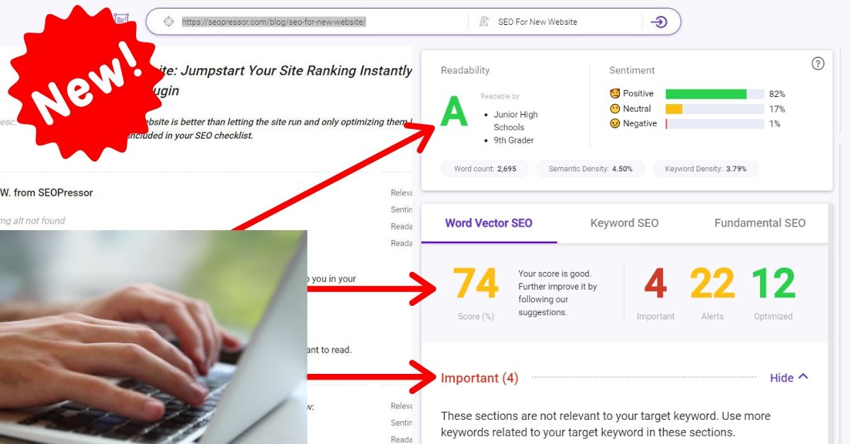

Actionable SEO tips, tutorials, and insights to help you rank higher.
83
score %
SEO Score
Found us from search engine?
We rank high, you can too.
SEOPressor helps you to optimize your on-page SEO for higher & improved search ranking.
By vivian on August 31, 2016
One of the most crucial tools in any online marketer’s toolbox is the landing page. While many amateur webmasters mistakenly treat them as an oversight, landing pages are incredibly important to successful online marketing.
They should be given at least as much consideration as any other element of your online presentation, as well as being one of the most-tested and experimented-with aspects of your lead generation.
In this article, we wanted to take a look at what goes into a truly great landing page, and highlight elements common to highly successful landing pages.
“Landing Page” is a fairly broad term, and can encompass a lot of different page types and goals.
A landing page is not your homepage, but it is very often the first page a visitor sees. It’s the destination for most of your placed advertisements, links in emails and social media, and (often) is highly-ranked for your brand in search engine result pages as well.
For this reason, it should be treated as a true brand ambassador, a virtual foyer introducing people to your products and services.
Some companies even consider their landing pages to be more important than their home page, specifically because they see more traffic enter their site that way.
The main defining feature of a landing page is that it is making an offer and giving the visitor an opportunity to accept that offer on-page.
Landing pages can inspire visitors to:
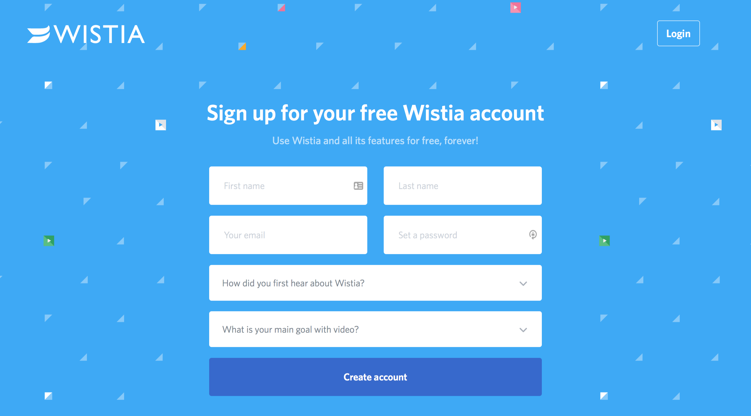
As an example, the Wistia video marketing platform has an excellent minimalist landing page for account creation:
It’s important to understand that a landing page always pitches a transaction, because that’s how visitors see it. Even if money isn’t involved, the visitor is still being asked to “buy in” with two valuable resources: personal information, like contact info, as well as their time.
A company which understands their landing pages are always a marketing pitch will be well on their way to creating great pages. Here are some effective landing page tips that you shouldn’t miss:
Studies have shown that a given webpage has literally seconds to capture a viewer’s interest, generally around 5-10 seconds. So, a strong headline is an absolute necessity. The very first thing they’re likely to see should immediately inspire them to keep reading.
A good headline should have some compelling, attention-grabbing adjectives, and use action-oriented language.
As a great example of how simple this can be, check out the landing page for InboxDollars, an online rewards club.
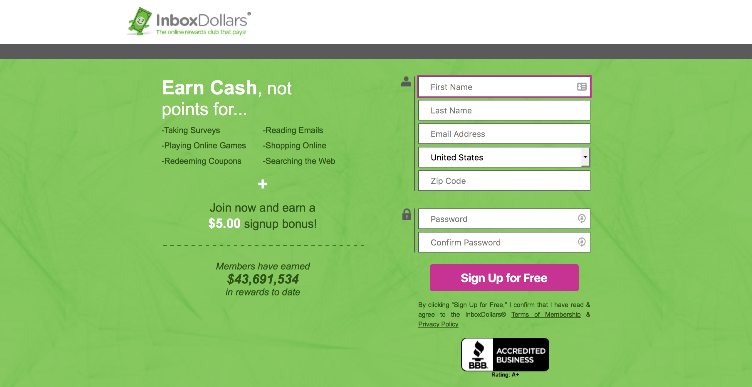
The first words the visitor sees are “Earn cash,” in larger/bolder words than anything else on the page. It’s a cheap trick, sure, but it works.
The other key thing to remember with headlines is to always be honest. If the headline promises one thing, but other elements on the page don’t agree with that promise, you’ll immediately drive away potential leads.
Again, this goes back to landing pages always being a value proposition. Whether you choose to use a text- or graphic-focused design, every element on the page should in some way push the idea that the landing page offer is beneficial to the visitor. It should be pitched as a solution to a problem.
A small amount of self-promotion is acceptable, but keep it to a minimum. Visitors want to hear about what’s in it for them, not extended braggadocio sessions. Most or all of your self-promotion should directly relate to how you will help them.
One example here we love is Basecamp‘s homepage, which is also their landing page.
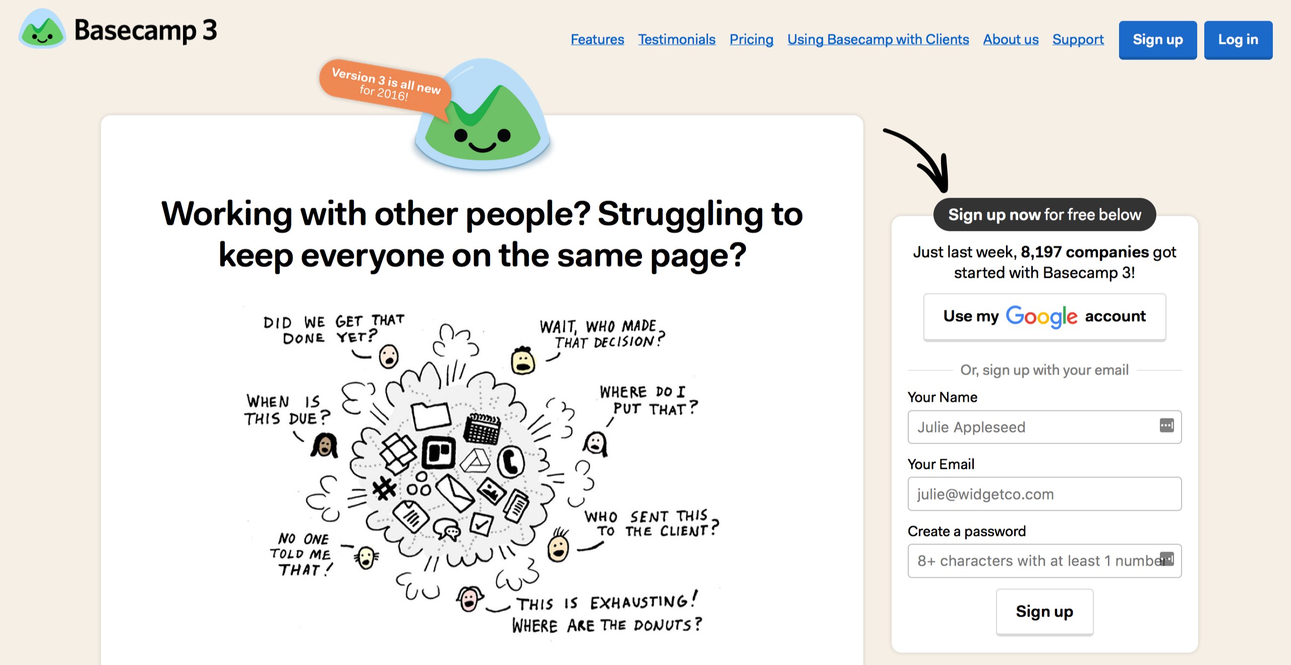
The cute graphic immediately illustrates the problems they’re trying to solve, then it continues on with more details. (It’s a bit long for our tastes, but notice that the sign-up area is continually available on the right sidebar.)
Over-generalization is the death of marketing copy. The more specific you can make your offer, the better, especially if you can provide hard data or statistics backing up your claims.
Decision-makers at the moment love numbers, and will often be swayed by their inclusion. Of course, honesty remains a primary concern here. Don’t include any claims you can’t back up, either with internal numbers or outside citations.
If possible, use some charts – but don’t make them the first thing a visitor sees. Build up to them. Then use a great chart as a whammy demonstrating your expertise and overall value.
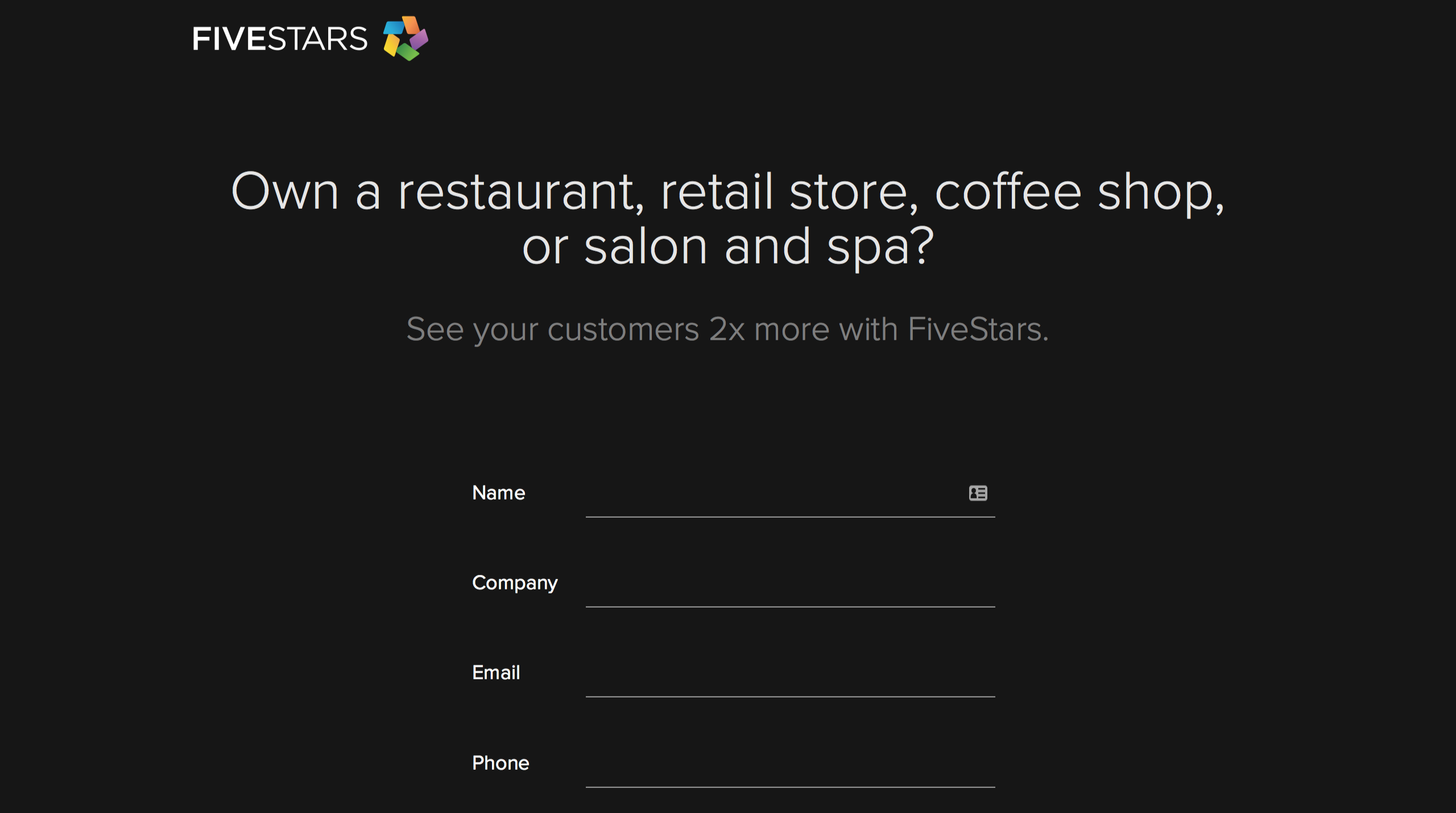
For example, the way FiveStars (a customer loyalty program) utilizes both charts and impressive-looking numbers to build their case midway down the page:
Using language oriented around urgency, like “This is a limited-time offer! Act now!” is one of the oldest tricks in the marketing book. It’s also, psychologically speaking, very effective… but in the online world, such measures still need to be deployed carefully.
A savvy visitor is going to know, for example, that you’re never going to run out of stock of a digital product. Trying to claim you have limited stock of an ebook would just seem laughable and insultingly manipulative.
Good scenarios for urgency language would include:
So use urgency language when there’s an actual basis for the urgency, but avoid it if there isn’t.
The form and/or button(s) that a visitor needs to interact with to complete a landing page offer should always be among the most eye-catching elements on the page. It’s generally a good idea to make it a different color so that it stands out against the other elements.
Another great technique is to use visual design elements to guide people’s eyes to the action space. If you go back to the Basecamp example above, notice that they have a literal arrow pointing at the signup field. This might seem overly obvious from a graphic design perspective, but it’s actually very effective for increasing signups!
Also, try to avoid boilerplate text on your interaction buttons like “Submit” or “Click here.” Be more specific, so it’s absolutely clear what’s happening. If they’re signing up for a free online video, label the button “Watch Our Video!”
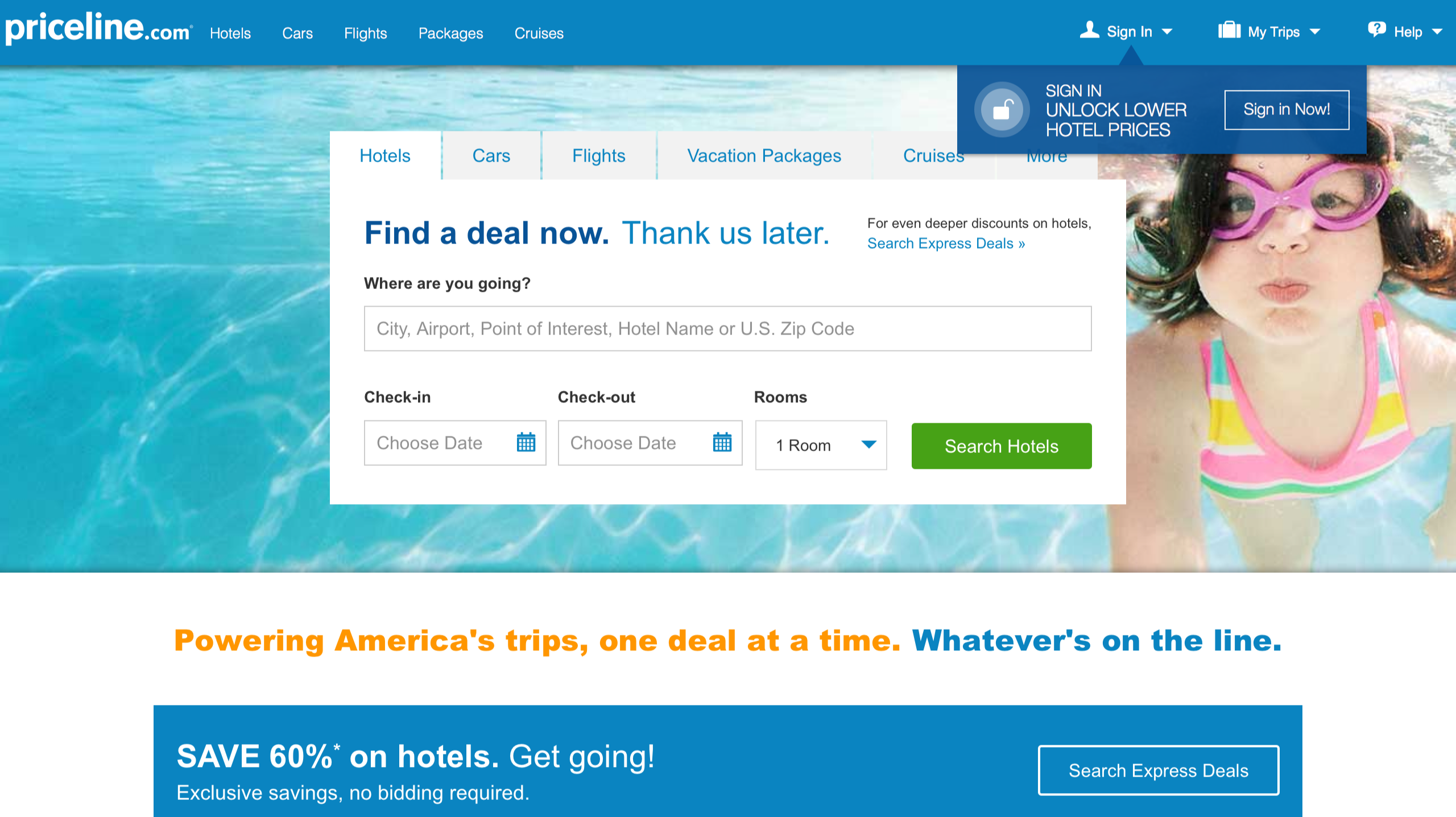
A nice example here is Priceline, who makes sure every button on their interactive windows is clearly labeled. This is also important since they have several search options, and the visitor can be certain they’re searching hotels, rather than rentals or airfare.
There isn’t room to go into a full spiel on good graphic design, especially since it varies so much from industry to industry. Suffice it to say, you should use every tool in your graphic arsenal to enhance the offer and help encourage conversions.
These include:
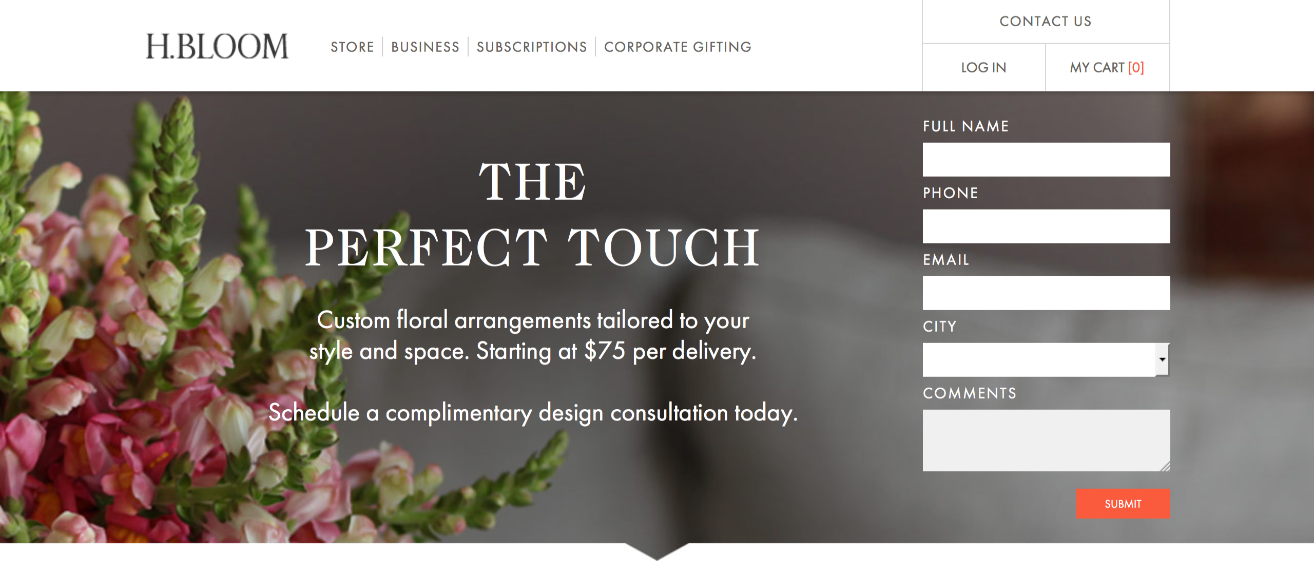
As a great example of design, we’d point at H. Bloom, an online florist. Their field demands a visual focus, and their landing page is a minor masterpiece of minimalism. Look at all that whitespace!
Your landing page should be laser-focused. Don’t try to use it to pitch every service your company offers. You’re making one particular offer, and absolutely everything on the page should be about that offer.
Keep in mind, particularly, that visitors to your landing page have usually already clicked on an existing advertisement with a call-to-action pointing at that landing page.
Make certain there’s a perfect match between the offer they clicked on, and the offer being pitched by the landing page. If possible, try to make the language in the CTA and the headline or opening paragraph match as closely as possible.
Ie, a banner ad might say “Click Here To Earn 5% In Rebates!” while the landing page headline says “Earn 5% In Rebates With Our Exclusive Club!” That textual match will greatly reassure visitors.
There’s no One True Way to build a landing page. You should be constantly experimenting with designs and running A/B tests, to judge which approaches work best for your audience.
However, with a well-designed landing page, you’ll greatly increase your lead generation and create more enthusiastic leads in the process!
What are some other effective landing page tips that you have tried? Do share it with us at the comment section below.
Updated: 25 July 2026

Subscribe and receive exclusive insider tips and tricks on SEO.
Delivered to you right from the industry’s best SEO team.
Copyright © 2026 SEOPressor. All Rights Reserved.
Powered by Semantics BigData Analytics (SBDA).
