Steph W. from SEOPressor


...help you check your website and tell you exactly how to rank higher?

86
score %
SEO Score
Found us from search engine?
We rank high, you can too.
SEOPressor helps you to optimize your on-page SEO for higher & improved search ranking.
By jiathong on August 2, 2018
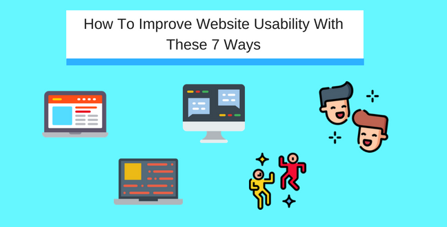
Have you went to a website before and just feel lost?
You don’t know where to find the navigation bar. And when you finally found it hidden as a drop down menu, the categories tab brings you to another confusing page where you can’t find a single product.
Now, we would never want that for our website visitors.
“The user experiences usability first and pays later.” – Jakob Nielsen, The King of Usability
Website usability is how easy an average person can navigate your website to achieve specific goals. Be it getting to your blog post or complete a purchase.
What you need to know is,
The final aim of usability is to create a navigational and informative website. The website can not only retain visitors but also make them into recurring visitors. Thus, help to build a user community on your website.
Ignoring usability means you’re neglecting your users. What will they do when they have difficulty navigating your website? They’ll leave, there are plenty other websites out there.
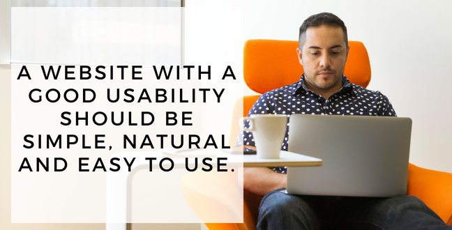
A website with a good usability should be simple, natural and easy to use.
A successful website combines both the company’s and the user’s usability goals.
Keep this in mind,
A company’s goal is tangible and can be presented by numbers, like conversion rate, revenue, page ranking etc.
While the user’s usability goal is a little less tangible to measure, which includes their satisfaction and efficiency.
It is crucial to test your website usability every time you have a new update or a redesign. That is because you need to strike a balance between the two goals.
Accurately predicting user behavior is crucial in increasing web page dwell time. You can use the real data to smooth out and guide your visitor’s exploration process on your website.
When you know what’s working and what’s not working, you will have a better idea on which part of the design to start fixing to retain visitors.
When you take what you learn from the test to improve your website design, you can ultimately increase your conversion because of the good usability that leads to good user experience.
Testing can be carried out in multiple stages of a website development. There are ways to test it out before the website is created or when the website has matured.
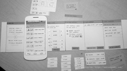
(Source)
This is the most cost effective way to test your website usability. Since you only need some papers, drawing skill, someone who understands how the system works, a facilitator and 5 real users who are willing to help you carry out the test.
Paper prototype can be used at the early stages of or before development to test out different concepts instead of scrutinizing detailed features.
Create the screen and all the different features of the website, like a burger menu in separate papers. Create a list of scenarios for the users to follow. The human computer a.k.a the guy who knows the most about the system will then adjust the papers accordingly to mimic a real prototype. All while the facilitator takes care of the whole process.
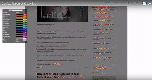
The confetti report from Crazy Egg offers an unique heatwave report based on individual clicks.
Heatmap is a visual analyzing tool that can be used on live and running websites. The idea of a heatmap is to use a cool to warm color spectrum to show you the most clicked or viewed spots on a webpage by tracking real user behavior.
Website redesign can benefit a lot if you can get real user data from a heatmap to see the browsing habit of your visitors and which elements interest them to click on the most. You might be surprised how different it is compared to where you think they’d click.
Heatmap tools like CrazyEgg offers more personalized data on every unique visitors’ clicks with their confetti feature. You can further customize your data by selecting the matrix like search term, search engine, time of day etc.
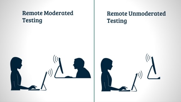
Source: CanvasFlip, 2016.
As the name suggested, the users are not in the same room as you when the test is carried out. This gives a test result that is closer to the real thing because some users might behave differently subconsciously when they’re face to face with the researcher compared to when they’re on their own.
This type of test can also give you a wider pool of users since they can be recruited online instead of having to be physically present for the test.
The remote test can be done either moderated or unmoderated. You can share-screen, or be on a conference call with the users while they’re testing, that is moderated. While an unmoderated user gets a list of tasks, an automated software to carry out the test while their screen and voice is recorded while saying out loud what they think.
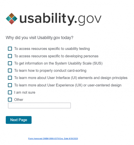
If your website is already established and have a good size of visitors daily, you can implement a survey to ask them directly how their experience on your website is.
This method is easier and cheaper to implement since your visitors will be free volunteers who answer your questions. However, how effective your data can be used depending on what questions you ask. If your questions are too general, you won’t get usable data; if your questions go too technical or complex, the visitors might not answer it at all.
For example, don’t ask Do you like the dropdown menu?, instead, you should ask Does the drop-down menu has everything you need?.
So the best way is to base the survey questions off a set of data you want and offer your estimations as the options for the users to choose from. Instead of giving them open-ended questions with no options that require more time and effort to answer.
This is straightforward, you hire someone, usually a UX designer to go through your website and tell you what they think. What is good, what is bad, what should be changed, what can be better etc.
The thing with accessing your website through the eye of an expert is they already know what the users will be looking for. While the users may not be able to tell you what they really want unless it’s presented as an option for them.
Expert Review can happen at any stages of the website development and when a website is already established. The cost will also be cheaper than planning for a full-fledged test hiring real users. The User Is Drunk is one of the more unique expert out there that will carry out a review on your website and also give you a good time while watching it.
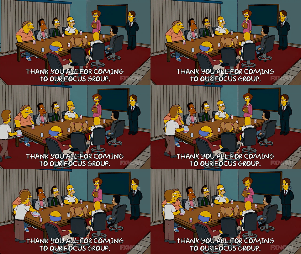
To create a focus group for your usability test, you will need to gather 6 to 8 users from your targeted market that fits your buyer persona, and also a moderator. This is a technique better used on the early planning stages because it helps immensely in deciding the direction your design will follow.
First thing’s first, you need to state a clear focus of the discussion. Sit the participants down before the discussion starts to make sure they understand what they need to be talking about. Set the length of the session to no less than 2 to 3 hours, especially when you have a bigger group nearing 10 people so every participant has a chance to voice out.
To fuel the session, you can ask a few open-ended questions. Note the word open end, you don’t want in any way influence their answer because the data you gather will be skewed.

(Source)
Like the remote usability test, one single user will be testing out your website. But instead of using means like screenshare or screen and audio recording, you will be in the same room as the user to observe the testing process directly.
To accommodate the tester/ user, you will have to set up the space and equipments to carry out the test. You will also need to create a set of tasks beforehand for the user to accomplish, together with a set of question regarding the user’s opinion on your website.
Take into account the time the tester takes to accomplish certain tasks because that speaks volume on the usability. Also, prepare a subjective scale to easily gauge the level of ease to accomplish each assigned tasks. The test can be carried out repetitively throughout the course of website development and also on an established website.
1. Less is more
5 is the magical number that you’re looking for. According to the usability expert Jakob Nielsen, you can get enough usable insights to work on from having just 5 testers.
2. Run multiple tests
He also suggests that you should carry out more small tests instead of one big, complex, elaborated test. Remember, you’re testing for the improvement of the website design, not recording weaknesses.
3. Don’t be too choosy
Every website has their targeted audience, but not every user visiting your website will fit your targeted persona. Keep that in mind when recruiting testers or volunteers, have a basic requirement and stop there. Getting diverse opinions is more important than getting the opinions you want.
4. Before the fold is the most important part
You want to put the most effort on the part that greets your visitors when the website is first loaded, that is before the fold. How pleasant and clear the navigation is at the first glance means a lot in retaining visitors.
A website doesn’t have to be fancy, but it needs to be easy to use. Having a good website where visitors can actually get to where they want and what they want, is the very first step of having some happy people that might become your happy customers. So start testing and improve your website usability to be a bigger conversion magnet!
Updated: 4 April 2026


Save thousands of dollars (it’s 100x cheaper)

Zero risk of Google penalty (it’s Google-approved)

Boost your rankings (proven by case studies)
Rank High With This Link Strategy
Precise, Simplified, Fast Internal Linking.
