Steph W. from SEOPressor


...help you check your website and tell you exactly how to rank higher?

81
score %
SEO Score

Found us from search engine?
We rank high, you can too.
SEOPressor helps you to optimize your on-page SEO for higher & improved search ranking.
By winniewong on August 2, 2015
Search engine optimization (SEO) is undoubtedly important for your company’s success. You simply can’t attract the traffic you need to convert leads into an expanding customer base without implementing various SEO strategies. Therefore, today, I am really thinking that…
Ok, hold your horses!!! Just hear me out on this one: Both User Experience and SEO have the same objective. SEO wants to have high “average time on page”, low “bounce rate”, more “return visitors” and more ” Social Shares”. Do Uxers desire these results too? Yes, we all want them badly! Then why do we need to argue with each other?

There is a danger of us SEO practitioners to become overly focused on SEO. Sure, it’s important – but so is the user experience. It’s not uncommon for websites to be so focused on SEO that the user experience suffers – and guess what?
There are still some SEO marketers who do not believe in User Experience. But when we are talking about user experience, we are talking about how easy it is for visitors to navigate beyond your website, how fast your pages load, how easy it is for visitors to find what they are looking for, how easy on the eye your website design is, amongst other factors.
If you do these, you are improving user experience. Neil Patel did an article about 5 tactics to increase your pageviews. However, it is rare for SEO communities to talk about user experience. The Term “user experience” is often used by web developers. Maybe it is because Google is endorsing the idea of user experience that it is becoming a hot topic now.
SEO communities should not be an isolated department. The biggest mistake made by marketers is thinking that they should be focusing on just link building every day. Don’t get me wrong, I am not saying that link building or link earning are dead. They are still working fine in SEO for the time being.
But ask yourself these questions:
I do think that SEO has to look at the bigger picture rather than just focusing only on building links or earning links. We have to come together with other departments to understand the big picture, from driving traffic to making visitors return to our website.
Remember, Google also tracks user history in personalized search. This is the way to grow your blog. Here are blogs that benefit us about user experience and usability from the design perspective, such as:
Uxpin’s blog: The place where all the designers hang out. They share their throughts and experiences with everyone here.
UX movement : User design seen through the lens of a marketing perceptive. Many great articles on what you shouldn’t and what you should do on a blog or sales page.
Google Design:A great way to find the ins and outs of Google’s user experience and usability.
“User Experience’s greatest impact to SEO is through the increase it creates in organic sharing and distribution. ” Rand Fishkin Moz
It’s a given that most blog owners want an absolutely beautiful website peppered with lots of flash animations, fancy images and high definition graphics.
The pragmatic fact is that being beautiful or flashy does not necessarily make your blog any more attractive to visitors and users than other blogs. In fact, it will mostly just drag down your site performance, meaning a negative experience for your users and visitors! Here, user experience is defined as the experience of a user as that person interacts with the elements in your website.
[Tweet “If you think good design is expensive, you should look at the cost of bad design -Dr Ralph Speth, CEO Jaguar”]
The number one reason why everyone is not improving User experience? It is because it’s expensive to hire a UX designer. Before that, we need to address why improving user experience and usability are expensive.

$72 per hour, is that really going to help me?
It is because user experience require time and experiment. It is basically a never ending process. Dr. Susan Weinschenk explained it very well in this video. You have to experience it first hand to know the return of investment.
If you are outsourcing the work, this spreadsheet will be helpful to you. If you are going to do it yourself, read the following carefully.
We SEO marketers really should do more than just look at the numbers. We should start observing how the user interacts with our website and start making changes and adjustments based on that.
User experience is the journey and process of people browsing your website. Megan Grocki explains in a video how to create a customer journey map for a website, and I also think we should take a look at it to better understand how to create a good user journey map.
The simplified process of user experience is presented here in four parts/phases to help you better understand the whole process. Here is a flow chart I have created to give a better idea of what I’m talking about:
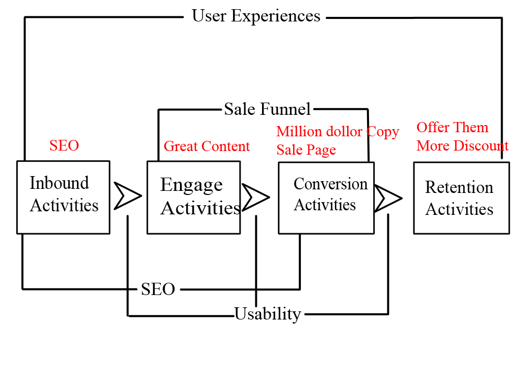
As can be seen above, there are 4 phases (Inbound activities, engage activities, conversion activities, and Retention activities) if we break down the process. So, what to do with these activities?

Trello Referral Program
In the retention activities phase for example, you can create a “Referral Program” to encourage the current user to promote your content to their social circles. By doing so, you are indirectly boosting or increasing your brand search in Google.
At the conversion activities phase, you may perform some analysis on the search intent of the users to get a better idea of the number one core problem/need, and then write a sales letter based on the analysis of that search intent, thus leading to higher conversion rates. Here is how Copyblogger does it..
Nevertheless, the reality is that it isn’t as clear cut. It is indeed quite difficult to create the perfect user experience for the user.
With time and experience however, you will get closer and closer to creating and delivering a standout user experience through engaging and analysing your target audience, and you will then create personas. which highlight the external factors that directly or indirectly affect your user audience.
Moreover, multiple user intents have different user journey experiences. Not every user intent and experience is the same! This requires you to fit the right Persona for each search intent.
It is vital for us as SEO marketers to focus and think from the user’s point of view, such as offering the things that they want and need, instead of thinking what they want and need, which is from our point of view.
Once you have identified their wants/needs, then provide them with a solution that you can offer so that they have a great user experience. An important tip is that different word orders have different meanings and intent. So, let’s say that you own a website that is all about dog toys.
Don’t be greedy and go, “Hey, the keywords toy dog has 6,600 searches a month, let’s use that to my advantage.” As you can see, a dog toy (toys for dogs) is very much different from a toy dog!

Targeting wrong user intent can damage your user experience
If you go ahead and try to rank for the keyword “toy dog” anyway, thinking that you will draw more traffic, well you’re in store for a rude surprise. The intent of the people searching for a toy dog (user intent) is very much different than those with the intent of looking for a toy for a dog (dog toy).
As a result your content will definitely experience high bounce rate and low time on page. This is because your site is not giving these people what they want! As a consequence this will directly lead to a rank drop for your page!
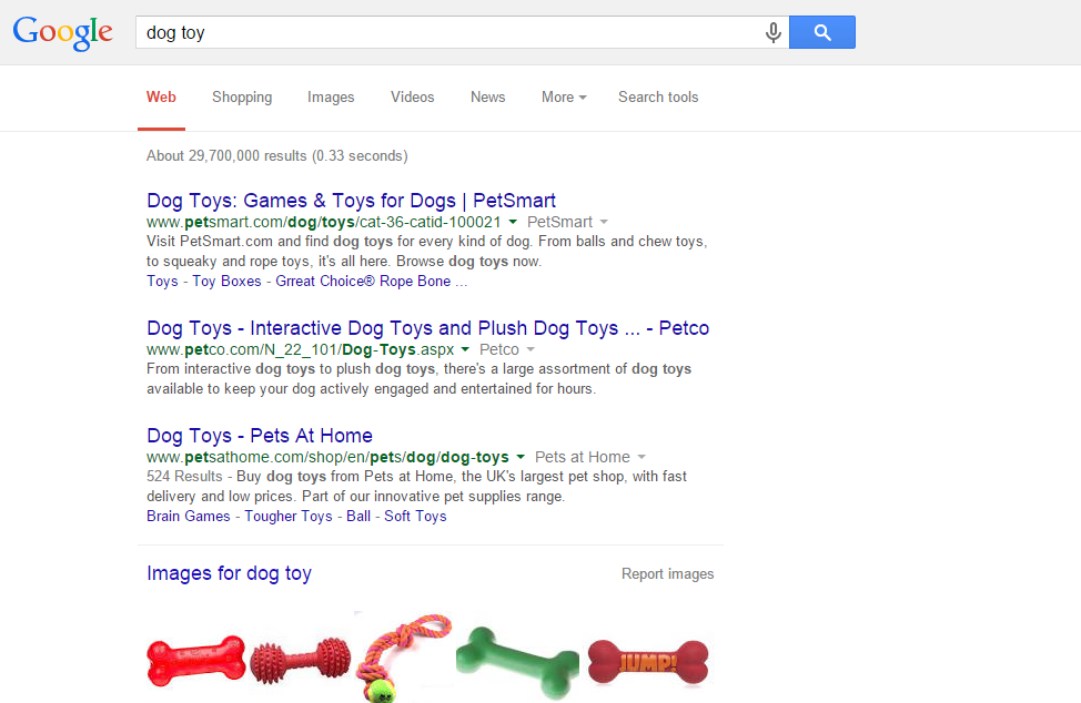
Clearly the SERP speaks for itself
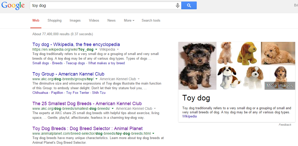
This SERP has a completely different intent than from a dog toy
From a SEO perspective, there is an important role for identifying the searcher’s intent, as searcher intent is important for creating the right content. For example, if a searcher types in “Samsung s6 vs iPhone”, the searcher is expecting content detailing the comparisons, or pros and cons, between the Samsung s6 and IPhone.
If the results are not what they expect, they will bounce off from your website. Therefore, our job is to find the right searchers for our sites through the targeting of the right keywords.
The majority of SEO gurus recommend a keyword density of 2% to 4% for content. But sometimes when we are writing content, we can find ourselves getting stuck between keeping good reading flow for the content and keyword density.
Here is the thing, you have to take priority on content workflow, so stuff your content with keywords if you have to..
In return, this helps to improve your dwell time and reduce your bounce rate, which are two of the factors that Google takes into account when determining your PageRank. Not to mention that a positive user experience often results in visitors returning to your website, meaning that you’ll be getting more traffic.
By creating a positive user experience, users are more likely to search your brand name via Google’s search engine, which will increase your domain authority. Keep in mind that the user experience affects your SEO strategy, so the last thing you want to do is to make mistakes that negatively affect your user experience.
1) Google Analytics
I personally use Google Analytics to track user experience, but there is a downfall. It only tracks in internal sites.
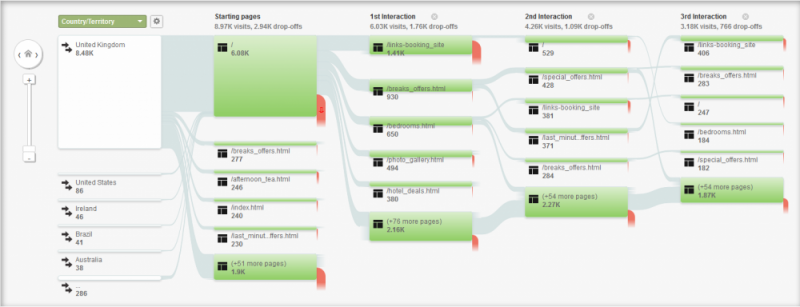
Here is how you can access your User flow in Google Analytics
To access Google Analytics, you click on “Audience” > “user flow” >, sort your setting to “Acquisition” “source/medium”
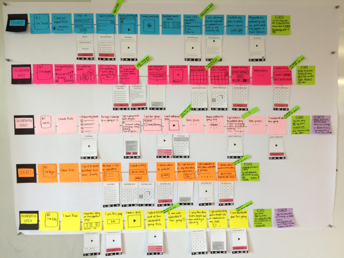
2) Offline sticky notes
Sticky notes are actually one of the best ways, but you cannot bring them everywhere. Remove any features that are hurting your user experience and highlight any pages required for attention, such as page 404.
David Sherwin did share a great article about the process of conducting research beyond user intent, creating a different scenario and splitting the design by using these 4 steps:objective > hypotheses > methods > conduct > Synthesize

Split testing different design

Here are a few mistakes you’ll want to avoid making if you want to keep your website’s user experience a positive one:
The use of low-quality stock photos is going to make your content feel like spam, whereas the use of high-quality images can not only create an emotional connection with your visitors, they will also make your website look and feel more professional.
This means that your visitors may begin getting a bit antsy when exploring your website, even if you are offering great content.
By including an interactive element on your page, such as an interactive carousel or a roll-over animation, your visitors will be given something to interact with to help them stay engaged, thereby helping to keep them on your page longer.
Parallax scrolling creates an illusion of depth by separating your page into visual layers that scroll at different speeds when the user scrolls down or up. This helps to keep your page fresh and makes your website stand out from your competition.
Sure, it’s a visual element, but it also causes your site to slow to a crawl and tends to make it look unprofessional to boot. The coding of your site has a big effect on your page speed as well. Make sure that you place your style sheets before your scripts.
This will let the browser load the CSS first so that users can at least see your pages visibly load instead of staring at a blank white page. If they see it loading, they’ll be more likely to wait it out, whereas if all they see is a blank page for more than a few seconds, they’ll be more likely to leave your site.
When you do use pop-ups, make sure that they close when users click outside of the pop-up box in case they can’t find the cross button. If they are having trouble getting rid of the pop-up, they will leave your site out of frustration.
One thing to keep in mind is that sometimes one element of user experience can be sacrificed in order to boost another facet of the user experience. You won’t be punished by Google for doing this. The following are two great examples of websites that have excellent user experiences:
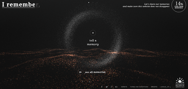
I Remember – I Remember is a very unique social website that helps bring attention to Alzheimer’s Disease. It asks users to upload a picture and to write a few sentences about it. The website will gradually disappear if it’s not regularly given “memories” to emphasize how alzheimer’s works.
The website is visually gorgeous, with a landscape of lights representing the memories, which you can zoom in on and click on. The interface is very easy to use – you’re given the option to add images from your desktop, Instagram or Facebook, or you can look through other posts.
The only drawback is loading times are a little longer than what is usually acceptable – but this trade off is okay considering the ease of use and visual beauty of the site.
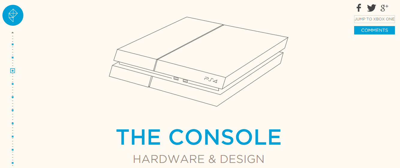
Polygon – Polygon is a video game website that has two great examples of user-friendly pages – their PS4 review page and their Xbox One review page. They are designed in a very elegant manner – text is broken up into small paragraphs and there are plenty of clean, professional images. As the page loads, an outline of the system is animated in real time to keep the user’s interest visually.
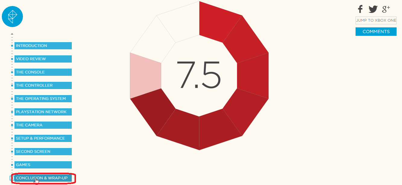
You can navigate your way on the review page with the navigation button to the left.
A video below it provides a visual review if the user doesn’t want to read the text. A navigation bar on the side pops up when you scroll over it, providing you with reviews for different elements of the system. These two pages are great examples of how to design a page with the user in mind.
Although SEO is very important, don’t neglect the user experience of your website. The user experience is one of the most important factors of a successful site and will effect your SEO efforts as well.
[Tweet “Broadly Speaking, a better user experience is well correlated with better rankings – Rand Fishkin”]
Related Links:
Updated: 15 April 2026


Save thousands of dollars (it’s 100x cheaper)

Zero risk of Google penalty (it’s Google-approved)

Boost your rankings (proven by case studies)
Rank High With This Link Strategy
Precise, Simplified, Fast Internal Linking.
