Steph W. from SEOPressor


...help you check your website and tell you exactly how to rank higher?

91
score %
SEO Score

Found us from search engine?
We rank high, you can too.
SEOPressor helps you to optimize your on-page SEO for higher & improved search ranking.
By winniewong on October 13, 2017
Landing Pages are an essential part of any successful online marketing strategy. So much so, in fact, that we’ve already discussed them at length. We’ve talked about the elements that make landing pages successful, but we missed out one key question.
What about video landing page?
That’s right – video content is becoming more and more common online, and it’s already dominating the traffic figures.
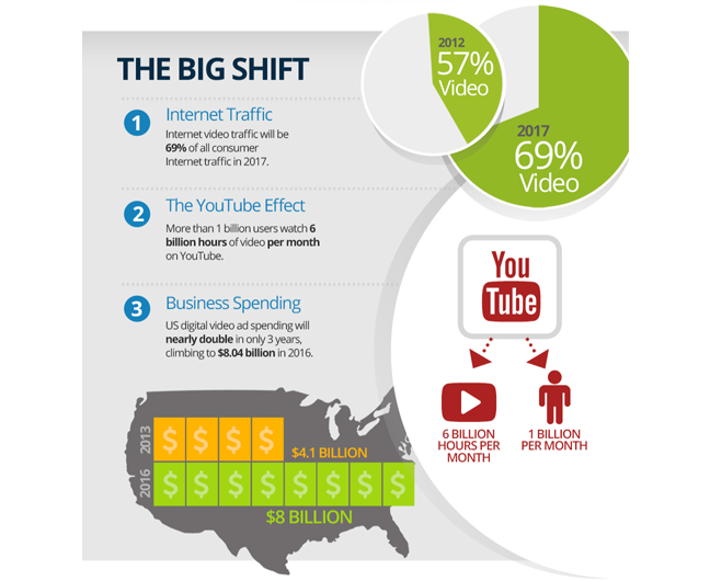
69% of all consumer internet traffic is now video based, and online streaming has increased since last year.
So, video is important. Landing pages are important. Put them together and what do you get?
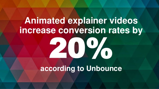
Video is currently the best online analogue we have for real life – moving audio-visual content mirrors how our brains are wired, and so maximizes engagement over other forms of media.
Today, we’re going to look at the video landing page best practices – how they work, and why they outperform traditional landing pages. We’re also going to cover some of the best video landing page examples we’ve found, and then pull out the lessons we can learn from this industry-leaders, so you can begin to create your own amazing video content.
A video landing page is a page on your website that is designed to catch incoming traffic and engage it using multimedia resources. Typically, this takes the form of a landing page with an embedded video, which serves to illustrate the value of the product or service on offer, tell a compelling story about the product and its history, or simply create excitement in the viewer.
The video itself can be hosted on YouTube or Vimeo, alongside static images and text using standard HTML code.
For a few reasons. First and foremost, it’s an excellent way to legitimize your product and service, making it seem more premium from the outset. Video content requires a pre-production, production and post-production phase with writing, lighting, sound and more. This level of commitment demonstrates the confidence you have in your offering while presenting in in its best light.

More practically speaking, video enables you to cover and explain a lot of information in a short period of time.
Artistically, they enable you to use the power of storytelling. You can walk a prospect through using a product or service, using an authentic scenario. It means people can get it much faster. You can get across any technical details and USPs, while illustrating the benefits in a more attractive, engaging way.
Finally, you can use the opportunity to entertain your prospects. People respond positively to emotional cues. If your product or service can make a difference, make that difference have an emotional consequence. You can also simply come across as dynamic, engaging and light-hearted in order to endear yourselves to your audience – remember, people sell to people.
Actually, from some really great video landing page examples you can find online. Don’t worry, I won’t make you go looking – I’ve brought them all together here so you can see just how much it’s possible to achieve with video.
The following is a list of the best video landing page examples around right now. We’ll look at what they do and why they work, before we unlock the science behind them so you can achieve the same thing.
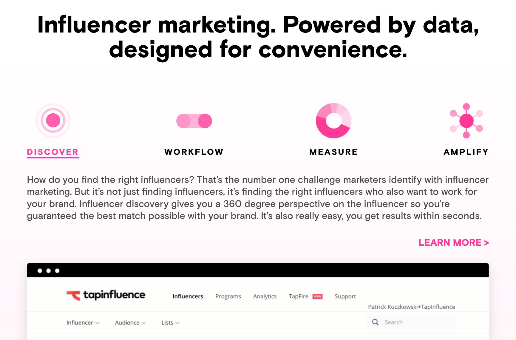
The Offer: TapInfluencer offers a platform for influencer marketing, allowing businesses to recruit cutting edge content creators to collaborate on pieces that promote their offer, and then track its success.
The Video: Simple, clean animation with a relaxed, friendly voice over. Visual storytelling using basic iconography that uses the brand colours and shapes, themselves influenced by social media tropes.
What It Gets Right:
The Offer: A practical language learning software that doesn’t get caught up in lists and rules, and enables people to learn through speaking.
The Video: Bold primary colors, fast moving transformation animations, combining key icons with dynamic typography.
What It Gets Right:
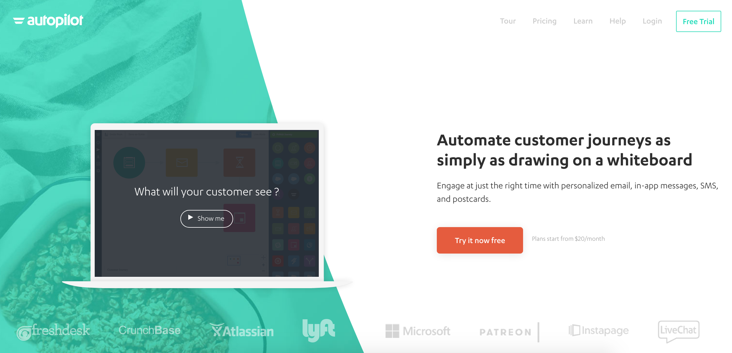
The Offer: A Marketing, Retention and Customer Support platform that uses simple flowcharts to make sure there are no missed opportunities in converting leads.
The Video: This video takes the form of a screen capture tutorial with an informal voice over, demonstrating how the product works in practice.
What It Gets Right:
But…: It’s nearly three minutes long. Too long for most modern audiences.
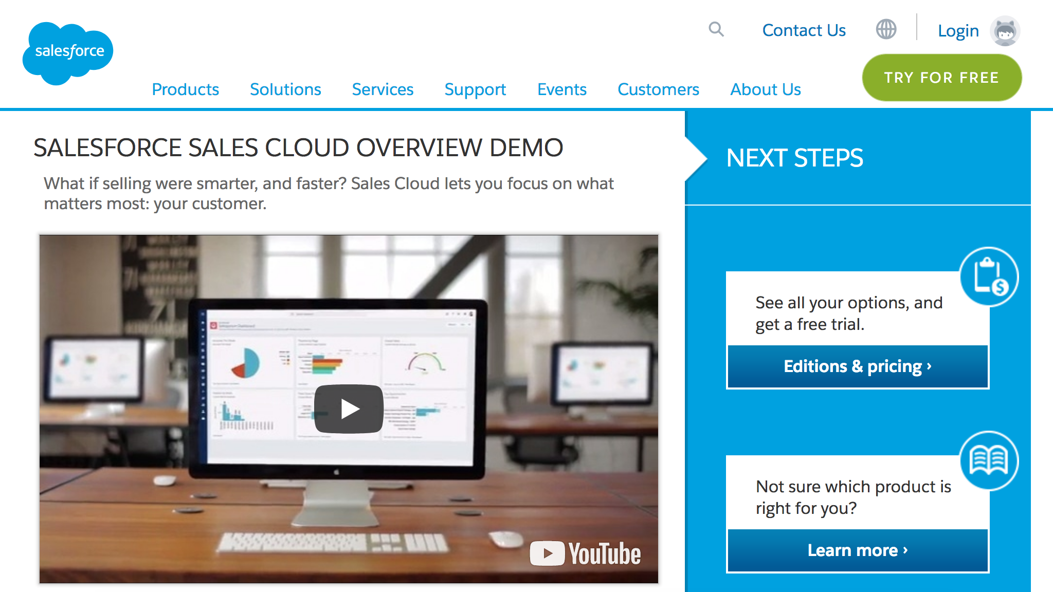
The Offer: A comprehensive end-to-end sales solution, digitized within one platform, available across all your devices.
The Video: A ‘West Wing’ style breezy walk-through video showing us the product at work on the move, creating a dynamic journey that never stops moving.
What It Gets Right:
But…: The voice over is delivered right in the back of the speaker’s throat, creating a tremulous, strangled quality that at many points sounds like nerves. It undercuts the dynamism of the imagery.
The Offer: A toilet converter that allows people to squat to poop, which offers numerous health benefits.
The Video: A comedic fantasy land which is equal parts whimsical, gross and absurd.
What It Gets Right:
I’m glad you asked, because it’s time to drop some knowledge.
People who visits a landing page are typically looking for fast answers. Take too long and they’ll simply look elsewhere, which means you’ll lose leads rather than increase them.
Be clear about the action that you want your visitors to take and make sure you tell them to take it within the time frame.
Try to convey the benefits of your product within 45 – 90 seconds. Any more of this will take an extraordinary feat to hold interest.
Time is at a premium. Your video should be scripted so that it answers visitor questions very quickly. If you have something more important to talk about – tie it into these questions and answer them first. People won’t hang around to find the answer when they can look elsewhere.
Instead of figuring out what questions people will ask about your offerings, you can skip the guesswork by using BiQ’s Keyword Intelligence.
The free tool will reveal all the questions that people have together with the answers. For example, these are the questions related to Reiki Healing:
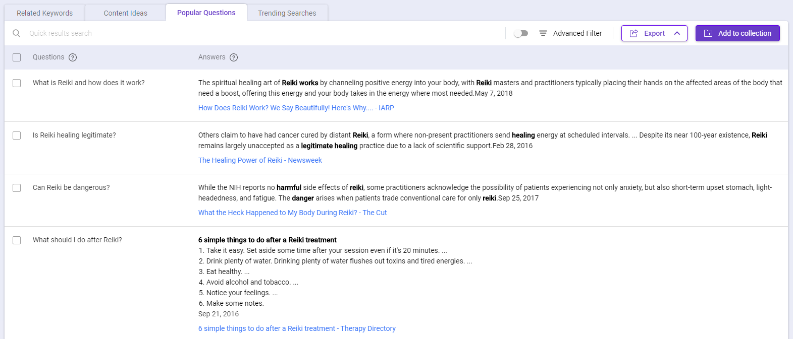
One of the questions that people are interested in is what is Reiki and how does it work. Let’s explore the search volume for this question by switching to the Related Keywords tab.

There is a total of more than 200,000 search volume for all the keywords that are related to what is Reiki and how does it work. Most importantly, you can see from the keyword intent that people are generally looking for information when they search for what is Reiki and how does it work.
Here are other keywords that are related to what is Reiki and how does it work:
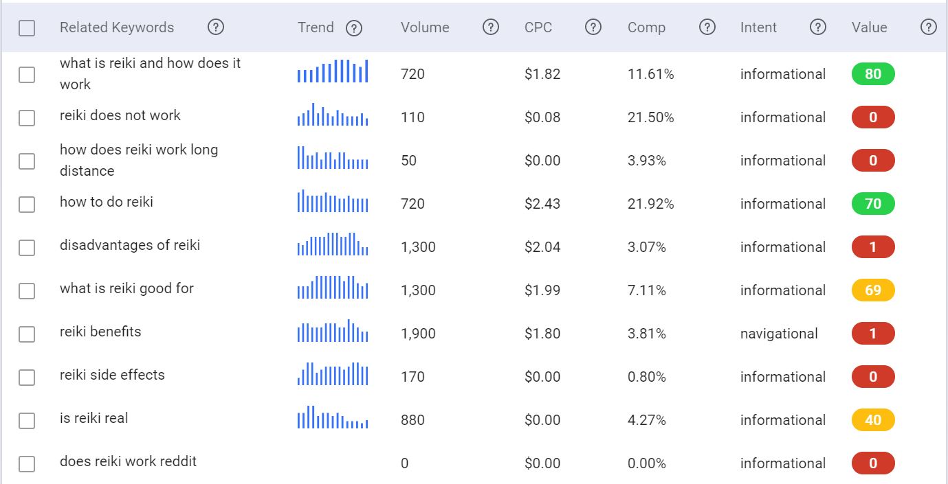
You will be able to make more informed decisions on what topics to choose based on the keyword volume, search intent, and relevance. Then, make sure to deliver the answer your potential customer wants, quickly.
You need to think like your customer to create great video. What are they looking for, what do they want to see, what problem do they have that they need solving? Remember the camera is the customer, not the seller.
Tell your story from their perspective.
Oh, and don’t you dare autoplay your video. Have you ever had someone come up to you out of nowhere and start shouting at you about what you should be doing with your life? If you have, you’ll know it sucks.
So don’t do it your customers! This is the best way to get a visitor to bounce off your page and never return. Let them make the choice to engage. Think of the play button as a handshake.
Videos can tell stories, relate testimonials, walk people through hypothetical situations and usage cases. The most fundamental rule of filmmaking is “show, don’t tell”.
Make sure you have a clear vision for what your video is trying to achieve and why.
Then, relate that through visuals and storytelling, not bare statements. Facts should be the salt that subtly brings out the flavors in your story, not the three bulbs of garlic that overwhelm any other taste.
Grab people’s attention, demonstrate an affinity with their problem, show how you propose to fix it, and tell them where they can go to get your fix.
You need to make a big impression, fast. Your first three seconds are make-or-break. That means clean and compelling imagery that is dynamic and energized – that hooks the viewers.
If you’re filming, using HD cameras and make sure you have someone lighting the spaces properly. For example, let’s take Apple video landing page example. The latest Apple Watch Series 3 commercial features a high production value with upbeat track.
Production value counts when it comes to scripting too – make sure there’s an entertaining turn of phrase, a compelling journey to the piece, or a concept that will help you stand out.
Most products and services can serve many different types of people, but in order to sell effectively to people, you need to be addressing their problems and speaking their language.
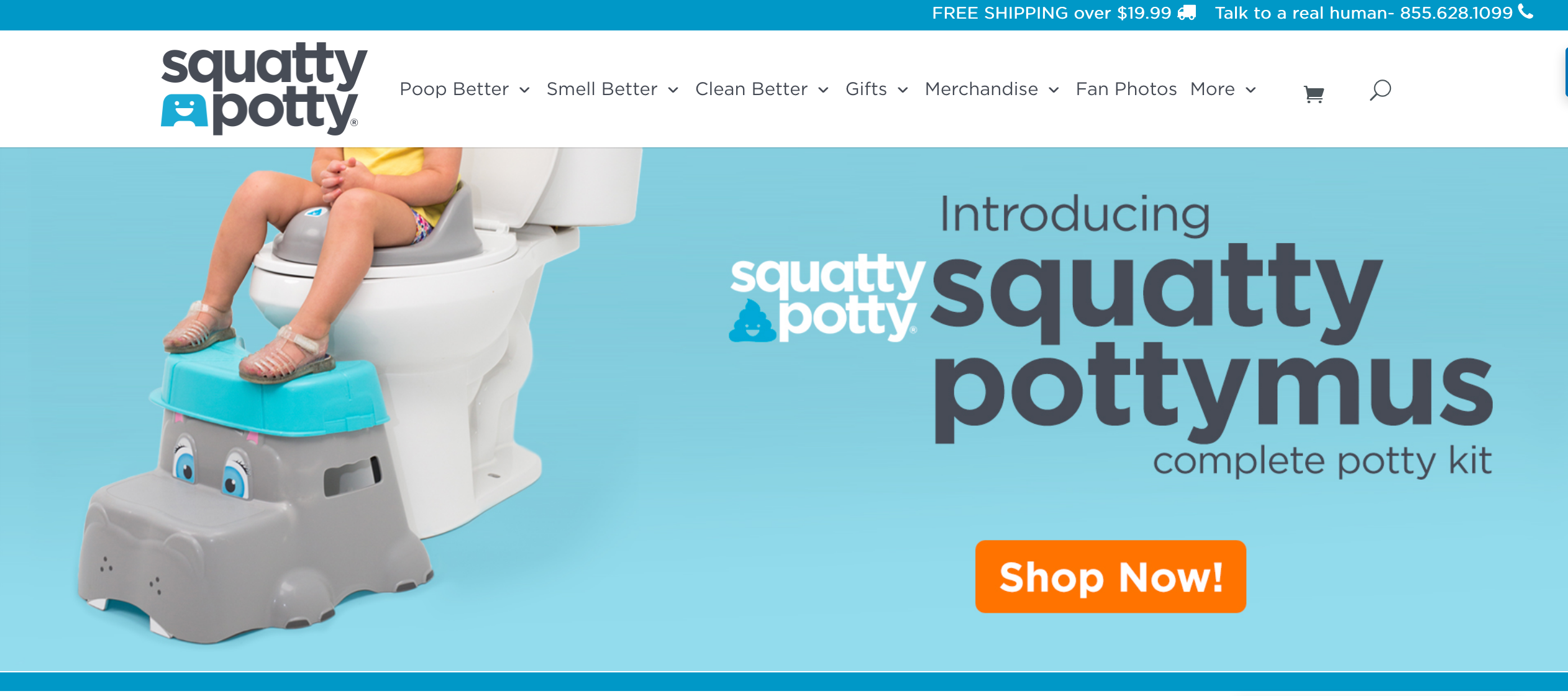
Realistically, the Squatty Potty ad would not work to sell a marketing and sales software platform to businesses.
It’s a consumer product sold online – online consumers eat up viral content. Knowing your audience can help define your tone.
If your audience is broken down into different segments, consider creating video that tailors to those segments. Just as you would create multiple landing pages to address different challenges for your audience, you can create multiple videos.
A word of caution: Speaking to the right audience is only half the battle. Your business needs a consistent aesthetic, approach and tone of voice. Being consistent across multiple videos will increase the trust factor and feel authentic. Having wildly different tones and approaches can feel opportunistic, manipulative or simply desperate.
Let’s face it. It’s rare that people nail their very first ad campaign and see unprecedented success and fortune, allowing them to sell their business for millions and retire in the sun.
Fare more likely is that you’ll be playing a long term game, learning as you go. The only way you can learn is to collect data on how your videos perform. You’ll also want to give them the best chance by optimizing them effectively to reach the audiences they were made for.
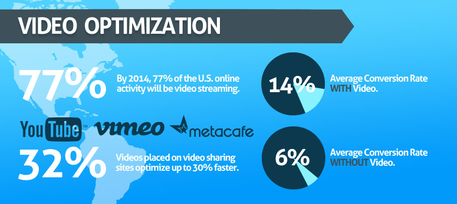
If your video landing page is geared toward lead-generation and sales, then you need to optimize your video with relevant keywords.
Use your page analytics and video insights to learn more about your audience, why they have found your content, and be honest about whether you’re meeting and exceeding their needs once they arrive. The more information you have on this, the better you’ll be able to match your content to what they want.
Learn what works and what doesn’t, and make changes based on feedback from viewers. Remember, content is about developing a relationship with people who will become customers. The most important thing in nurturing that relationship, like any other, is listening.
Now you have the advice, ideas, and inspiration for making the best video landing pages, all that remains is to get shooting.
Remember, give your visitors a simple and straight forward way to play the video, give the video the space and emphasis it needs to grab the eye, then support it with excellently written copy to maximize your success.
If something isn’t working, re-edit, re-shoot, retry. It’s that simple.
What makes a good landing page to you? If you’re already using video landing pages, share with us your experiences and success stories, and other advice you might have for those looking to make their cinematic debut!
[This blog post was originally written and published by Joanne on Sep 25, 2017. It is most recently updated by Howard on Jun 3, 2020.]
Updated: 30 March 2026


Save thousands of dollars (it’s 100x cheaper)

Zero risk of Google penalty (it’s Google-approved)

Boost your rankings (proven by case studies)
Rank High With This Link Strategy
Precise, Simplified, Fast Internal Linking.
