1
Steph W. from SEOPressor

👋 Hey there! Would you like to try out this New AI-Powered App that'll...
...help you check your website and tell you exactly how to rank higher?

Actionable SEO tips, tutorials, and insights to help you rank higher.
75
score %
SEO Score
Found us from search engine?
We rank high, you can too.
SEOPressor helps you to optimize your on-page SEO for higher & improved search ranking.
By allysa on January 14, 2016

A call to action (CTA) is usually a button or a link that marketers place on their websites to attracts more visitors to become leads by filling their details on a form of a landing page.
CTA is created to communicate with your visitors and encourage them to take immediate action on your website. The best CTA is when it can influence people to actually click on it. In order to do so, you have to create a CTA that is relevant and interesting to persuade your visitors to opt in.
I’m sure you have seen CTA appears everywhere when you’re surfing the Net. Most widely used CTAs are usually Sign Up, Download Now, Start Your Free Trial Now, Learn More, and Add To Cart. Different types of CTA are used to attract more attention from quality leads.
A good example of a CTA would be the one from GoToMeeting:

An effective CTA should provide short and simple message, and actionable for visitors to click on it.
Marketers look for different ways to optimize their websites for better conversions. Some have found their way, some are still searching for it. But most importantly, you must have a plan. Planning is important as it affects your results. When you have planned well, you will be able to carry on with your work. In other words, you know the direction that you’re heading to.
Once you have an SEO friendly website, your aim would be to generate more revenue and increase your sales. But how do you achieve that? You need to create an effective CTA and here is how you can create the best CTA for a higher conversion.
The basic and also the most important thing you have to include it in your CTA is a clear and concise message. You want your visitors to click your CTA, but how do you do so?
Every visitor would like to know what they can gain by clicking your CTA. Therefore, you should provide them the answer – be straight to the point. Make your CTA clear, simple, and actionable. If you’re writing too many jargons and long sentence in your CTA, you are confusing the visitors and they will lose their attention.
You have to explain clearly on what you want them to do so that they will know. Let’s say you’re providing information on how to do SEO copywriting, you can say something like “Download The Free E-Book On How To Do SEO Copywriting”. Make your CTA specific, but interesting at the same time so that your visitors will download it.
To get more conversions, use strong action-oriented verbs and add a sense of urgency to encourage them. An actionable CTA should be direct and able to answer all the visitors’ questions of “what”, “why”, and “when” in seconds.
Here are some good examples of CTAs:

Provide a clear message that you would like to deliver to your audiences so that they will know what to expect when they signed up.

It is also useful to include the benefits that the audiences can gain in the CTA.
The message of your CTA should be engaging to your visitors so that they will click on it. You can always start with verbs such as “Download” or “Register” so that visitors have a clear idea on what they can do. When visitors see the word “Download” in your CTA, they will know what to expect from you when they clicked on it.
A simple word can also affect your conversions. If you don’t believe it, you can read the test done by Firefox here. They managed to improve their conversions to 3.44% when their CTA text changed from “Try Firefox 3” to “Download Now – Free”.
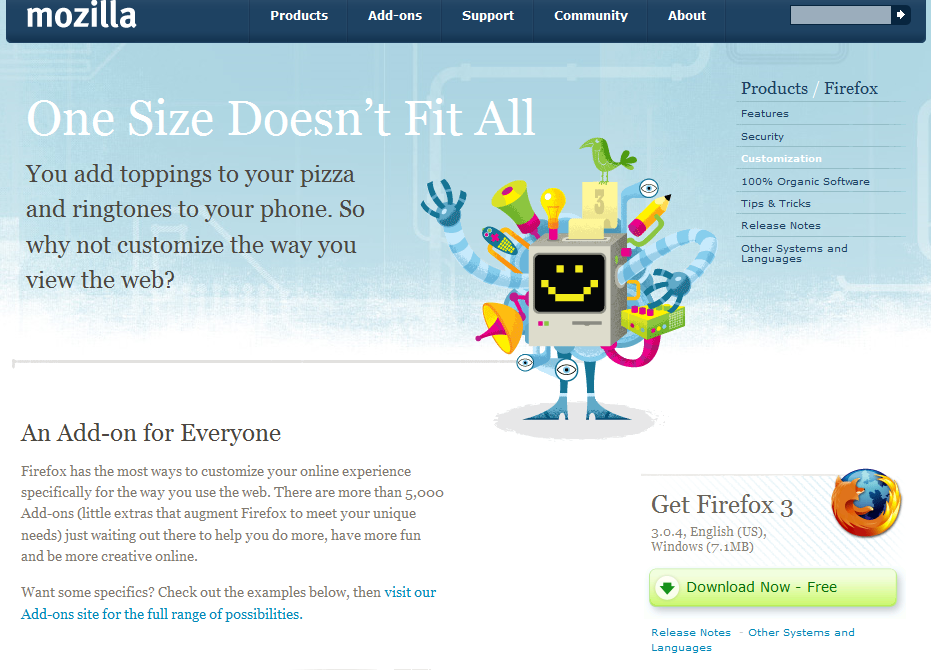
After Firefox made a change on their text in CTA, there were about 300K visitors and nearly 30K clicks to download Firefox within two weeks.
This has proven that message that is straight to the point is much more appealing to the visitors, especially when you have the word ‘Free’.

Using “Start Free Trial” is a good way to attract the visitors to try your product because they can test it first.
A common CTA message that you can see almost everywhere is “Click Here”. Honestly, this CTA doesn’t bring any value and I personally wouldn’t recommend you guys to use it. Some marketers might use “Click Here” to bring you to another website that is not related to their content. Therefore, using “Click Here” in a CTA is highly not recommended as it doesn’t explain the benefits of clicking your CTA as well.
To persuade the visitors to click your CTA, you have to create a sense of urgency. One way you can do it is by mentioning a limited time offer. Then, they will know that they don’t have much time left to purchase an item and it will encourage them to think about it and click it.

Would you click it when you know that the promotion is ending?
In order to get the visitors to notice your CTA, make sure to create an outstanding design of your CTA. Using the color that is contrasting to your background is one of a good way.
Think about it, if you CTA blends in with the rest of your page, how is it possible for the readers to notice your CTA? When they didn’t notice your CTA, you wouldn’t get much traffic then.
Color really does make a strong impact. Look at how Spotify did it:

Spotify’s CTA is so colorful and refreshing that you wouldn’t resist yourself to click on it.
Other than the colors, you have to also keep your CTA at the right size. It doesn’t have to be too big that it overwhelms the entire design and content, or too small to be ignored by the visitors.
When it comes to the size of your CTA, you have to keep in mind of the white space surrounding it as well. You wouldn’t want to place other images or text near to your CTA and make everything looks cluttered. Your CTA has to stand out and it deserves the individual attention. Therefore, it is good to give it an appropriate amount of white space.
Let’s look at Spotify again. Even though it is very colorful, but it doesn’t cram everything together that visitors will get confused on where to click. In fact, you can identify the CTA just by looking at the caps such as “Download Spotify” and “Go To Web Player”.
If visitors have to scroll down the page in order to look for your CTA, then you’re doing it wrong. You have to make sure that the visitors can see your CTA once they stumble upon your page to increase your Click-Through Rate (CTR).
The most effective place to insert your CTA button is to put it where it is visible for the visitors to see even before they scroll your page. By placing the CTA at the top of your site, it will increase chances to get a response from the visitors.
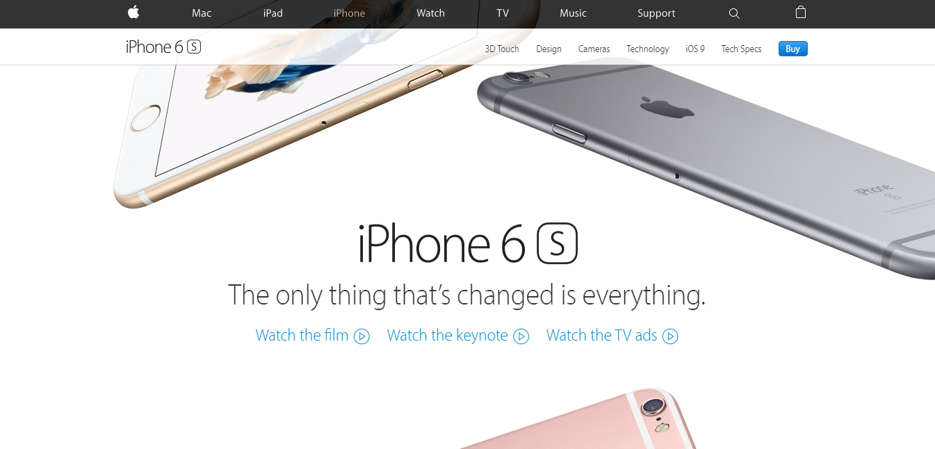
Apple always does a great job in this as you can easily spot the iPhone 6s features and the other information that you would like to know in just one page.
To get better results, you can also try placing relevant CTAs on each of your blog post. Like what we’re doing here in SEOPressor, we have placed related CTA in every blog post to help improve our conversions. Depends on the content, some of our blog posts give free e-books or a complete checklist to the visitors.
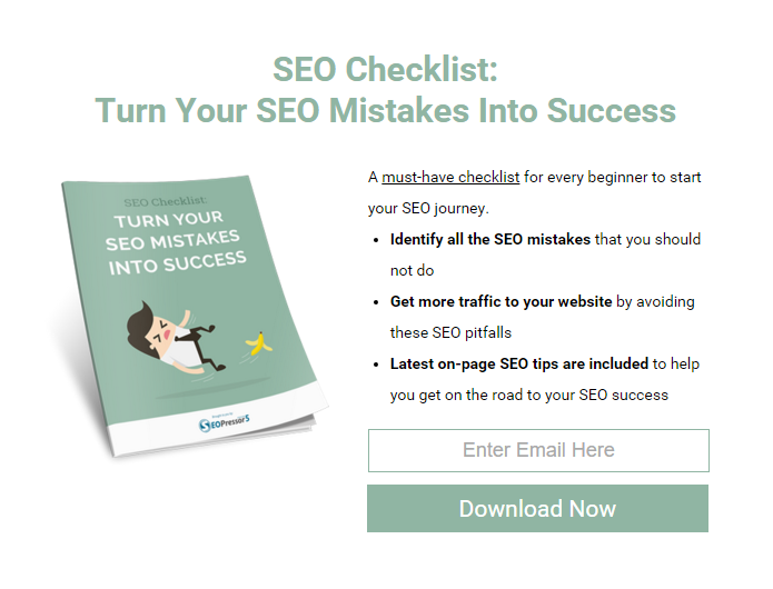
In SEOPressor, we make sure to have a clear message that tells the readers about the benefits that they will get from downloading our e-books or checklists.
You can do the same thing as well. Show some appreciation by giving your readers something in return for their support.
This is the part where I enjoy the most – A/B testing, which is also known as split testing. Because CTAs come in different forms and every visitor has their unique thoughts, we wouldn’t know which CTA works the best for every visitor. Therefore, a split test will help to figure that out.
Even if we can’t figure out what every single visitor prefers the most, but, at least, we get to discover what do the majority prefer.
In SEOPressor, we do quite a lot of split testing. We test most of our CTAs whenever we have a new idea on mind and unsure which CTA performs the best.

Split testing helps to determine which CTA performs better to improve conversions. Do you prefer the red book or the blue book?
So when you’re unsure, just test it out. Split testing is one of the important steps to do when creating the perfect CTA for your website. You have to know what makes the audiences tick. Test all the different messages, words, color, sizes, and the placement of your CTA. Some people like it better if you have a red background for CTA, some people prefer yellow background.
When you do split test, you will get to see which CTA can get more page views from the visitors, and which CTA gets the most conversions. By doing split testing, you are able to understand your visitors more and also know how your business is performing.
CTAs do have an impact to help you achieve a higher conversion rate. It may take a longer time to see the results, but it will be worth it if you are able to create the perfect CTA for your website that increase conversion.
By now, you should know that CTAs can be used across your website, emails, and even social media. All you have to do is to make sure that your CTA has a clear message and most importantly, it answers every reader’s question on what can they gain when they click your CTA.
Don’t worry if you’re doing it wrong because you can always test it. Do the split test every time you have a new idea for your CTA. Once you can provide your visitors with what they want, then you will have no issue. Now that you know how to create the perfect CTA for your website, the next step would be the copy of your CTA.
Stay tuned for my next blog post where I will be sharing with you guys on how to improve conversion rate through copywriting.
What are the effective CTAs that you have done before? Let me know in the comments section.
Related articles you might like:
Updated: 21 July 2026

Subscribe and receive exclusive insider tips and tricks on SEO.
Delivered to you right from the industry’s best SEO team.
Copyright © 2026 SEOPressor. All Rights Reserved.
Powered by Semantics BigData Analytics (SBDA).
