1
Steph W. from SEOPressor

👋 Hey there! Would you like to try out this New AI-Powered App that'll...
...help you check your website and tell you exactly how to rank higher?

89
score %
SEO Score

Found us from search engine?
We rank high, you can too.
SEOPressor helps you to optimize your on-page SEO for higher & improved search ranking.
By winniewong on June 2, 2019

Here’s a mind-blowing statistic: there are now officially more mobile devices than people in the world. Guess what, this news was from back in 2014.
The world was home to 7.2 billion gadgets then, which were multiplying five times faster than we were. Since then, Mobilegeddon has become a fact and Google had modified its algorithm to favor mobile-friendly websites.
This lead to a massive disruption in page rankings and sites that previously performed well in search completely fell off Google SERPs simply because their sites weren’t mobile-friendly.
After how mobile use has grown in the past decade, now being able to provide your potential customers with a positive mobile experience has become something of a basic requirement.
So let’s get to it.
As the name implies, mobile-friendly websites are sites designed, developed and optimized for users on mobile devices – and this is both more complex and more important than it seems.
BiQ Cloud’s website is a good example of a website that is designed with mobile users in mind.
It’s scrollable, the texts look sharp, images are seen well, there’s a good amount of white space, and most importantly, everything that you want to click on is clickable, and works well!
If I’m a potential buyer looking for a new SEO tool, just checking out sites like these on mobile is the kind of good first impression that can push me further down the sales funnel.

Go take a look at how mobile-friendly BiQ’s website is! I’m sure you’ll have a better idea on how a mobile-friendly design should be after navigating through the site.
[bof_display_offer id=7549]
On the most fundamental level, users want content that’s easy to view. If your text and pictures are too small, they’ll grow frustrated and leave – so appropriately-sized content is critical.
Unfortunately, it’s not that easy to create – mobile phones and tablets come in many different sizes and resolutions, so there’s no one format that will display perfectly on every device.
To solve this, today’s website templates are moving into a scaling format where they can quickly adjust to the device they’re displaying on.
Before moving on, here’s a good read on the importance of mobile friendly websites when talking about SEO in 2019. That said, in 2019 we are looking at mobile-first indexing, becoming one the key factor for your ranking and conversion rate.
Checking whether you have a mobile friendly view or not is easy – Google has a mobile friendly website tester called Webmaster Tool to do exactly that, and it’s accessible right here.
All you need to do is insert the URL of your web page and click on the ANALYZE button.
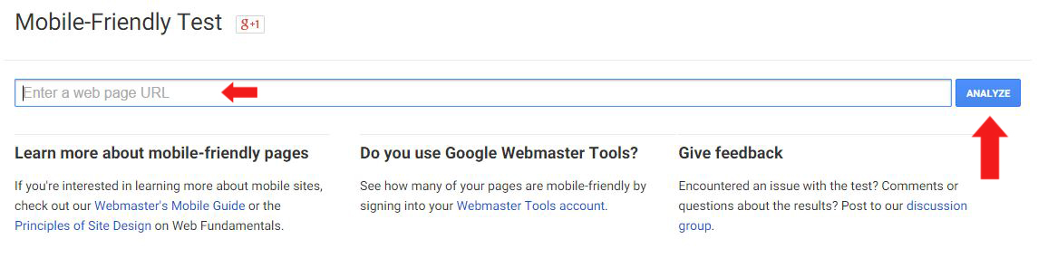
Google’s test will then analyze your website and display the result.

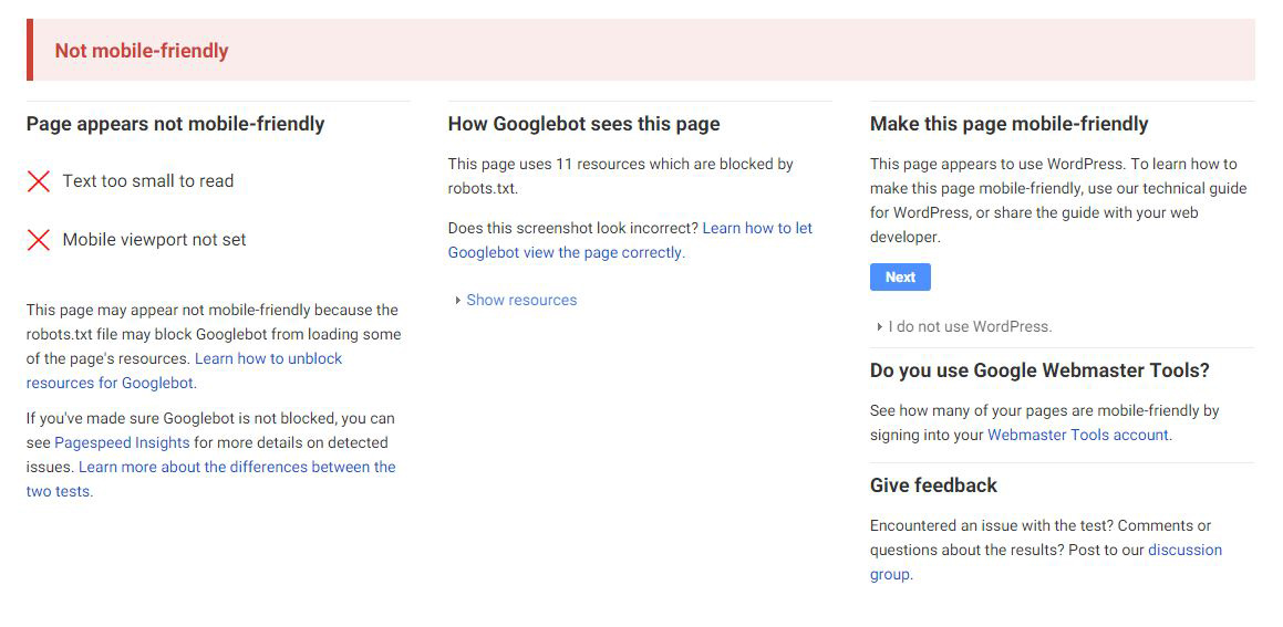
Analyzing your web page might take awhile…
You’ll see something like this if your web page isn’t mobile-friendly, Google will even list down why your web page isn’t mobile-friendly and suggest solutions on how to make a website mobile ready:
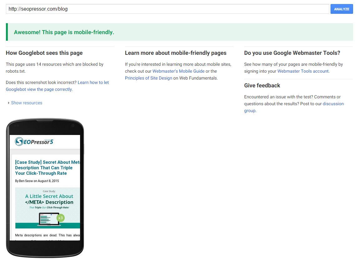
Once successful, you will get to view the mobile version of your website as Googlebot sees it:
In 2018, the percentage of users that are accessing the internet through some sort of mobile device is increasing consistently while the percentage of desktop users are heading in the opposite direction.
Just look at the graph below and you’ll have a clear picture of the trend, and it doesn’t take much to figure that one day, mobile users will outnumber desktop users by a lot.
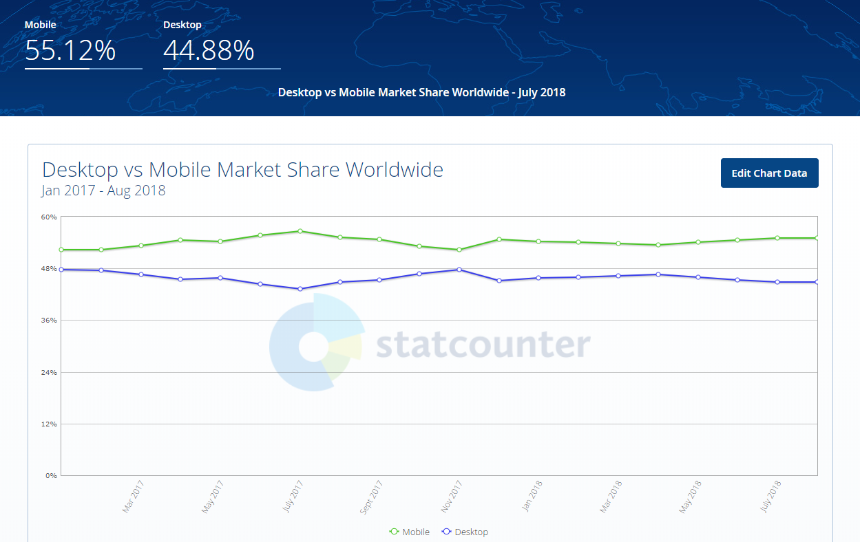
Data from January 2017 to August 2018 shows how important a mobile-friendly website is.
If that graph isn’t enough to convince you to make your website mobile-friendly, this should – Google has recently updated their search engine algorithm to prioritize websites that are mobile-friendly on mobile searches. This means that even high-quality websites won’t be ranked highly for mobile searches if they’re not mobile-friendly.
In other words, you could be losing out on half or more of your potential visitors. Given today’s searching climate, making your website mobile-friendly is extremely important for your SEO – even if you have to build an entirely new site – is a (relatively) small investment to ensure you can maintain a steady stream of visitors.
If you’re still trying to figure out how to make a website mobile friendly, here are 10 simple things you can do to tighten up your code and make sure everything functions the way you want it to.
[Tweet “Don’t get caught by the #mobilegeddon, learn 10 Simple Ways to Make Your Website #MobileFriendly”]
I know, this sounds like you’re going to talk to a reporter or something – but the ‘media’, in this case, is the content that you’re delivering to a user.
In this case, media queries are a popular technique for delivering a tailored style sheet to different devices
Media queries allow you to ask a device what size it is, then direct the browser to display things following the set of CSS that you have set.
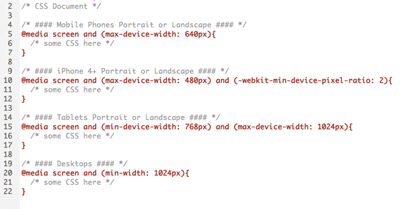
Media queries are a key part of most mobile-friendly sites, but you’ll need to be sure that the system is properly configured for all devices currently in use – not just the two or three most popular.
Make sure you actually look at the list or have some kind of ongoing subscription that gets the information for you.
There are many frameworks out there that you could use for free such as Foundation 3 or Skeleton. One of the more popular framework is Twitter’s Bootstrap.

Bootstrap is a front-end framework for your site designed to quickly and automatically scale your web page to any device. Using a pre-built system is much easier than trying to code every possible combination by yourself – and it’s much less of a headache as well.
However, you will need to check any framework you’re using for full compatibility with your existing site and goals.
The more custom coding and functions your site has, the more difficult it may be to ensure everything works properly on a mobile device – don’t be afraid to call in an expert if you really need the help.
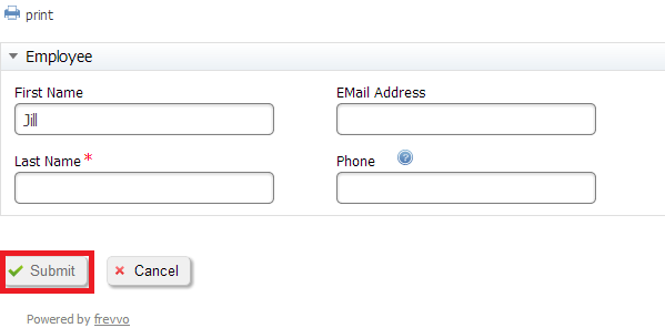
Mobile devices are popular, but many of them still aren’t entirely reliable – and this can be a headache for users who click a ‘Submit’ button only to have their connection drop out and see the button disable itself so they can’t try again.
Trying to prevent repeat submissions is an admirable goal, but the realities of mobile connections means it’s not good to prevent them in this way.
Responsive themes or mobile-friendly website templates – such as those from Somothemes – make it easier to ensure a high-quality display for your users.
This is something that many companies overlook when they’re trying to become mobile-friendly, and they shouldn’t – because what your users experience is far more important than how easy something is to code.
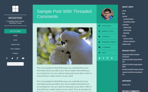
Moderne theme from Somothemes
Ideally, you’ll be able to get the best of both worlds – and responsive themes are outstanding for casual sites that don’t need a whole lot of customization in order to succeed.
In the past, most people thought about pictures in terms of pixels – but the widely different resolutions on mobile devices mean that having a single size for images is an inherently bad idea. It just doesn’t work – so don’t do it.
Instead, configure things like images to have a certain specific width on the page – typically 100% unless you have a reason to do otherwise. This helps to provide a consistent viewing experience on many different devices and ensure that each image offers as much impact as possible.

One major way mobile users differ from desktop users is their preference for simple site designs. This is a practical matter as much as anything else – things that are large and complicated will all but inevitably become slow on a mobile device, and one of their main demands is instant delivery of the content they want.
Simple designs also make it easy to keep their attention on the content you want them to see – mobile users often have notoriously short attention spans, and there’s definitely a point where keeping things simple can be more valuable than investing in an elaborate, complex theme.
Java is not a flawless system, but it is widely used – and together with CSS and image files, it’s one of the backbones of a responsive, mobile-friendly site.
One of your main goals here is trying to make your website universally compatible. It should display on practically any device that people would care to view it on, and for the most part, that means using software and coding that are universally accepted. The more specialized something is, the less likely your site will be compatible.
When you’re dealing with mobile devices, the goal is to create images that have the smallest possible file size while still looking crisp and clear on whatever screen it’s being viewed on. This is because the bandwidth of mobile devices are much smaller compared to desktop’s and causes longer loading time.
So if you need your users to download a 1MB jpeg file just so they can see a thumbnail-sized image, they’re going to be frustrated and leave your site.
Remember, mobile friendliness isn’t just about having a nice site design – it’s about improving the user’s experience, and the load times they go through are a major part of that experience. Shrinking the file sizes uses less of their data (if they’re on a limited plan), helps load the page faster, and generally contributes to a positive image of your site.
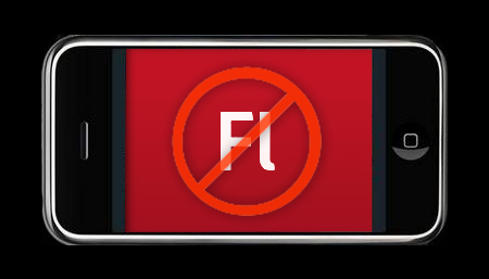
Broadly speaking, mobile devices do not support Flash. The reasons for this are less important than the reality – if your website is still relying on Flash, then it’s not going to display properly on any mobile device.
Flash is an obsolete technology and nobody loves Flash, even on desktop. Even if you think you need to use Flash, you could find other technology that could replace Flash, so to be smart and safe, do not use Flash.
Switch to a compatible technology like HTML instead – and remember that if you want to do something complicated on a mobile device, it’s best to relegate it to the realms of apps.
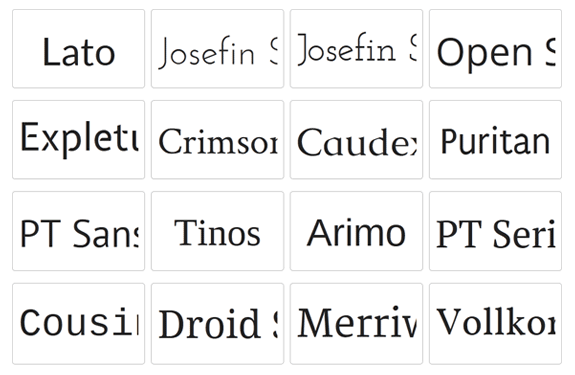
Custom, creative fonts can help a website look nice, but mobile users don’t want to be constantly prompted to download new fonts to their phone – in fact, it’s more likely that they’d instantly reject any such request and navigate to a different website instead.
Fortunately, most of today’s devices come with a wide variety of fonts pre-installed, and chances are you’ll be able to use these when designing your site. There’s one more thing to note, though – some fonts are easier (or harder) to read at different sizes, so be sure you check the readability of your font before you’re done with your updates.
Finally, we have one more design tip to share with you: remember your directions. The average desktop is a horizontal screen – sure, we may scroll up and down, but it’s wide.
Mobile phones, on the other hand, are tall and narrow – so the width of your content is an important consideration.
Whether you’re creating drop-down menus, adding pictures, or playing a video, always remember the direction of the device and how people will view the content.
And if all else fails, there’s no shame in relying on some professionals to fix your website to make it mobile-friendly.
This might require some investment, but with the increasing amount of mobile users and Google’s updated algorithm, you could say that it’s a calculated and worthy investment to make your existing website mobile-friendly.
[Tweet “10 Simple Ways to Make Your Website #Mobilefriendly. #Mobilegeddon.”]
This post was originally written by Zhi Yuan and published on Aug 12, 2015. It was most recently updated on June 2, 2019.
Updated: 18 July 2026

Struggling with internal linking?
Wish you could...

Automate internal linking
Use optimized anchor text
Fix 18 issues like orphan pages
Get link reporting and analytics


Save thousands of dollars (it’s 100x cheaper)
Zero risk of Google penalty (it’s Google-approved)
Boost your rankings (proven by case studies)
Rank High With This Link Strategy
Precise, Simplified, Fast Internal Linking.

Subscribe and receive exclusive insider tips and tricks on SEO.
Delivered to you right from the industry’s best SEO team.
Copyright © 2026 SEOPressor. All Rights Reserved.
Powered by Semantics BigData Analytics (SBDA).

