Steph W. from SEOPressor


...help you check your website and tell you exactly how to rank higher?

100
score %
SEO Score
Found us from search engine?
We rank high, you can too.
SEOPressor helps you to optimize your on-page SEO for higher & improved search ranking.
By winniewong on May 15, 2019
The landing page is the first webpage that a visitor lands on as a result of your traffic acquisition efforts.
The question is, can you convince every single web visitor to take the desired action on your page? Are you giving it the right kind of attention? What does your landing page look like in your user’s perspective?
Or are you facing a situation like this:
Your website launches, and you log on to your web analytics tool to check how your visitors are reacting. Much to your dismay, the first visitor arrives – and leaves in half a second. The next one lands on your site and is gone in 10 seconds as well. Despite the number of visitors, yet only a tiny percentage will take the action that you want them to take.
Sounds familiar?
On average, a typical landing page converts anywhere between 1 percent and 3 percent. Like everyone else, you probably won’t get it right the first time too (guilty as charged). Only after launching, testing (more testing), learning and optimizing can you improve your landing page conversion rate.
Strictly speaking, it is not merely your landing page that you should be optimizing, but rather the whole path from the landing page often happening somewhere deeper in your website. The famous 80/20 rule applies here. Ideally, with a 20% effort spent on landing page optimization, you’ll produce 80% of the results naturally.
It may seem like an easy process but according to researchers, getting a landing page SEO to truly work is one of the five biggest challenges marketers face today. To overcome such hurdles, I will be setting a stage of 8 steps in understanding the requirements of a perfect landing page.

Find the right leads by targeting the right people
Identifying your target audience and creating a customer-centric landing page is a must in the quality of a good landing page. Instead of making wild guesses, talk to them! You’ll be surprised by how much you can learn about them and how useful it turns out to be.
If your target audience turns out to be “everybody”, then you’re making it hard on yourself. Just like your offers, not every visitor should be directed to a generic “one-size-fits-all” landing page. After all, if you aren’t getting the right people to come to your pages in the first place, all your efforts might as well go down the drain.
Surely, what “appeals” to a 45-year-old mother of 3 who searches online will be vastly different from a 20-year-old user.
One of the biggest problems I see when doing landing page optimization is that the page has no understanding of who the visitor is, what they want and why are they there. Remember, conversions only take place when targeted traffic meets a relevant offer.
Your job as a marketer is to figure out how to make your landing page content relevant to your audience. The more you accept that connecting with you is on their terms, NOT YOURS, the better your landing page SEO will turn out to be.
If you can measure it, you can change it.
Your best friend for this is Google Analytics. It’s one of the most valuable tools for you as a webmaster. Even better, it’s free! GA as we call it tells you where your web visitors are coming from, how long they spend on your site, which pages they visit and so on.
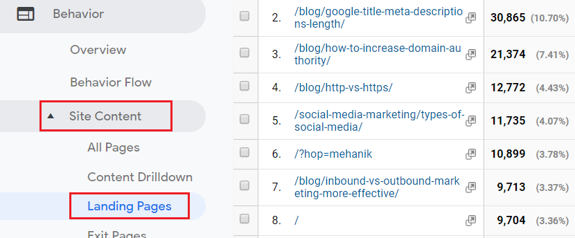
The landing page report in your Google Analytics account gives you important insights into the performance of your website.
If you don’t have actionable analytics, you’ll never get the full story on your landing page activity. Continuously, you’ll end up wasting money and time. For those of you who have yet to implement it on your website, here’s a brief guide on how to do it:
For an in-depth version of this, you may read it from Google: Get Started With Analytics.
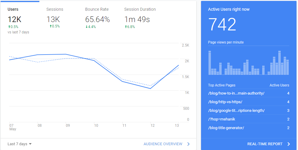
A lot of you may find it intimidating because of the vast amount of data that GA presents to you (Yes, I was like that too). Well, in actuality, 90% of the data don’t really matter. The remaining 10% that matters are:
Take time and learn to interpret your analytics data. Your marketing efforts will thank you, I promise.
We strive to show our best impressions to everyone we first come across. There’s even a saying that goes like, “You only get one chance to make a first impression”. Landing pages are like that, just harder (Anyone who has been on an interview or first date can relate to how stressful it can be).
You see, it only takes 5 seconds for visitors to form an opinion about your landing page, be it good or bad. Once they’ve subconsciously formed an opinion, it will last for the rest of the time on your page.
Check your site’s speed with Google’s PageSpeed Insight. It also provides you optimization opportunities. In addition, you can read and learn from our blog post on how we boost our page speed: 10 Tips On How We Boost Our Page Speed
Even the slightest “off” elements in your landing page will make it an uphill battle for you.
For instance,
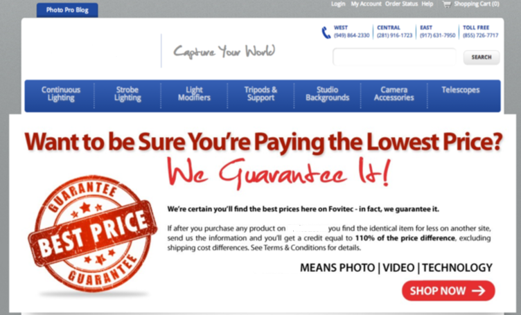
Too many words serves as a distraction!

Having a fresh and up-to-date website is one of the key elements for a landing page.
Learn from these best landing pages instead!
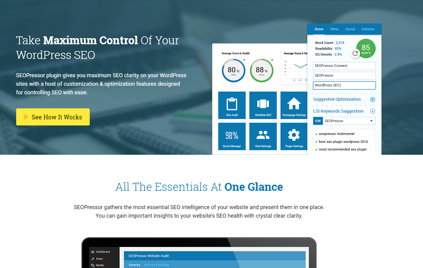
Having ONE yet clear CTA that stands out draws attention to it
Videos are a great way to demonstrate your product, just like RankReveal
In short, your landing page speed, design, and copy have to communicate a clear and simple message to make a good impression. That’s enough to get your audience’s attention and to get you on the road to being one of the marketers that can achieve 87% better results than the rest just by using the landing page.
Say that you’ve caught your visitor’s attention and a good first impression has been made. Your visitors subconsciously decide if the page is worth reading.
But the thing is, no one will dive into the details on a page if they are not satisfied with what you have to offer from the outset. For higher conversions, you need to make sure that your landing page copy is convincing, genuine and straight to the point.
To give readers a powerful value proposition:
LastPass, for example, gives a great example of what is being said.

An online password manager that solves the visitor’s problem
Also,

Buffer tells visitors the end benefits of using their product. “Drive traffic” etc.
Besides, eye-tracking researches say that the first thing visitors that come to your landing page looks for one thing in default – the dominant headline (which is also your value proposition). A headline is where everything begins. It’s what compels a visitor to stay and learn more about what you’re offering or not.
Then the next element you need to create for an effective landing page is the subheadline. If the headline makes the visitors look, then the subheadline should make them stay. Together, these copies make up the essence of a landing page’s power (as seen in the examples above).
All in all, your value proposition needs to be clearly stated on your landing page, home page, about page and any entry page on your website.
Including a video is extremely beneficial for your website. Explainer videos are an engaging way of communicating with your audience in a personal way. Believe it or not, 88% of businesses today already owns one. You’re missing out big time if you choose to ignore this important element when doing landing page optimization.
With the sheer information overload that consumers are bombarded with each and every day, it’s no wonder that their attention spans are getting shorter. So, a successful explainer video is the perfect way to connect and hook your audience, boost conversion rates and turn potential customers into actual customers.
Benefits of having explainer videos are:
However, before you hastily create one, ask this question, “What can video do that text and images can’t?” If you can’t answer this, then don’t jump into creating one yet.
For those of you who sell things that are difficult to understand, requires demonstration, or needs an extra push so your target market gets what you’re doing, video is an avenue worth exploring.
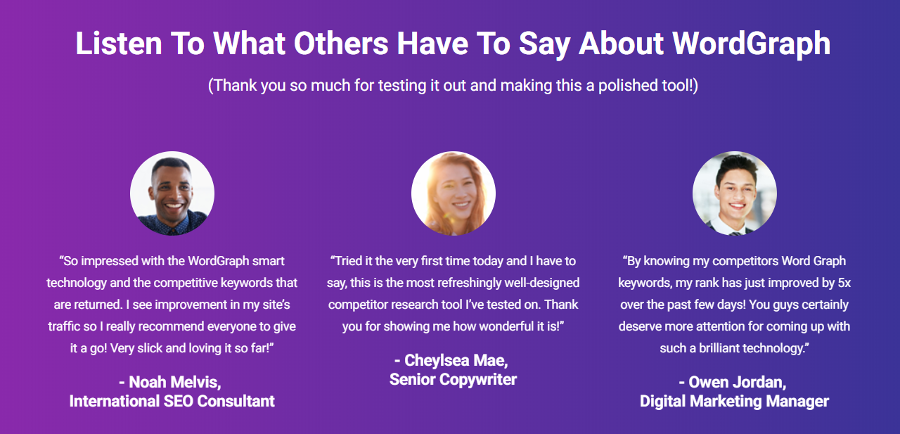
Don’t forget to include Name, Role, Picture!
When you’re browsing a landing page and see a testimonial from an industry expert you respect, that’s social proof. When you’re going through a pricing page and you see that an industry giant is already using that tool, that’s social proof.
Essentially, it’s borrowing the 3rd party influence to sway potential customers. You see, the more your visitors see “themselves” in the reviews and authority sites, the more receptive they will be to your page. It’s a psychological phenomenon known as implicit egoism, that basically means people gravitate to people, places and things that reflect a favorable self-association.
It also shows a strong trust element when presented with customer testimonials. Testimonial is an online version of word of mouth. Having only a few testimonials per landing page is recommended. You can find more testimonials about your product through tweets on Twitter.
LSIGraph has some notable examples of social proof:
Wait, what if you don’t have any testimonials?
First, be okay with not having any. You may consider giving away your product or service for free (ideally to market leaders) and ask for feedback. Besides, you can ask bloggers or your users to review your product or service after they have tried them out. Over time, you can build a long list of testimonials that will help build trust even for a smaller company.
Most of the time, if you’re getting a high volume of traffic but low conversion rate, the cause could be your Call-To-Action.
Ask if your call-to-action (and its surroundings) clearly says what it does, triggers a response and is designed in a way that contrasts with the rest of the site. It doesn’t matter if the objective of your landing page is increasing sales, generating email leads, or developing customer relationships, we all want higher conversions!
The best CTA’s invoke many quick reactions. It is done by using short, action-oriented words. Here are a few examples of conversion stimulating CTA’s including but not limited to:


CTA buttons can make or post click-through action because if you’ve optimized everything else but your CTA button – then you’re missing out on valuable leads (and sales). Make sure you design your buttons with a suitable position, size and copy if you want to maximize your landing page conversions.
Testing is a mandatory step in improving your landing page SEO and conversion. Split testing allows you to understand your readers and visitors better. The most basic testing method available is A/B split testing. This act is a random assignment of new visitors to the version of the page (A or B) that they see. Usually, “A” is defined as your original control page and the other version is the alternative.
If B (the challenger) proves to be better than A, then it will replace A after the test and becomes the new champion to beat in any subsequent tests. However, the test does not directly affect SEO and is not regarded as the most effective way to understand user intent.
Hence you need these tools when gathering data on your landing page for higher accuracy of split testing:
i) Google Optimize
Google Optimize is accessible to all website owners for free by removing the need for a web developer, hence making it really easy to use. It’s perfect for small and medium-sized businesses who need powerful testing, but don’t have a regular budget or team resources for an enterprise-level solution.

As seen on the reports tab of Google Optimize in one of our experiments
They also have an overview to help you quickly see how an experiment affects the metrics you care about most, whether that means conversion rate, probabilities or whatever else you’re tracking in Analytics. Notable features include:
Once you’ve done creating your variations, just click start experiment and your first test is LIVE!
ii) Website Analytics

Examples of some metrics found in GA
As mentioned above, website analytics software collects, measures, and analyzes the traffic to your landing page. It gives you accurate information such as page views, average page on time, bounce rate, number of new visitors, where your visitors come from, what devices did they use and so much more. All these give you an idea on whether you are answering to what your site visitors need.
The best tool for this is Google Analytics, hands down! It’s considered a standard tool for any site owner – so being able to access the data directly in your account is extremely convenient.
iii) Heat Maps
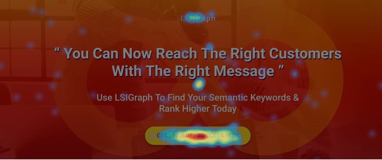
The colored area represents the strongest indicators of visitors motivation and desire.
Heat map software is one great creation. It tells you what users see on the page, what they read, what they pause to look at, what they skip over, how far down your landing page they’ll read through, where they click and so on. In case you’re wondering, mouse movements have been proven to be a good approximation of eye movement.
I’d recommend Hotjar for this. It’s really simple and effective in helping you decide what you can test on in your landing page.
iv) On-Site Surveys
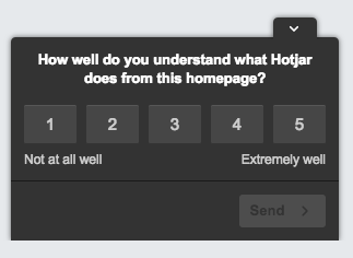
You can also have subtle pop-up boxes that appear to the visitors while they’re on your landing page. You can ask questions like “How clear are you on what this page is offering?” or “Is there anything holding you back from signing up?” before they exit your page. Try asking Yes/No questions or give them choices instead of asking them to type. Once you’ve gathered enough information regarding your landing page, you can proceed to change that aspect of your page.
Ultimately, running appropriate tests lets you narrow down faster which copy, design or messaging will generate the best ROI. Occasionally try out new ideas and see if it yields better results.
Most of us “think” we are doing the right thing just by preparing the best copy and design catered to your target audience the first time. Little did we know that your visitor’s landing page experience happens in less than a second and if you focus on the wrong aspects, they’ll brutally quit your site without thinking twice.
In that case, doing landing page optimization is the best way to get about. I hope you’ll get the most out of this landing page optimization guide and go forth in creating many effective landing pages! Feel free to come back to refer the next time you create a new landing page.
Landing Page Optimization:
Are there any aspects that I’ve missed out on when it comes to landing page optimization? If you have tested with a strategy that is working, don’t hesitate to share in the comments section below!
Updated: 12 April 2026


Save thousands of dollars (it’s 100x cheaper)

Zero risk of Google penalty (it’s Google-approved)

Boost your rankings (proven by case studies)
Rank High With This Link Strategy
Precise, Simplified, Fast Internal Linking.
