1
Steph W. from SEOPressor

👋 Hey there! Would you like to try out this New AI-Powered App that'll...
...help you check your website and tell you exactly how to rank higher?

Actionable SEO tips, tutorials, and insights to help you rank higher.
92
score %
SEO Score

Found us from search engine?
We rank high, you can too.
SEOPressor helps you to optimize your on-page SEO for higher & improved search ranking.
By jiathong on April 11, 2018

Look around you, are there people currently looking at their phone screen? There sure are some around me.
The society as a whole is utilizing internet on the go more and more frequently. As a matter of fact, more than half of Google queries come from a mobile device.
Google itself has released a mobile-friendly algorithm back in 2015. Which is designed to favor mobile-friendly sites in ranking which triggered a whole mobilegeddon terror.

What’s more, just last February at PubCon a webmaster conference, Google announced that they’ll be switching more sites to mobile-first index. Even though Google said it won’t affect any SERP ranking at the moment. But as all things Google, be wary and be ready.
You can read more about the mobile-first indexing on Google itself, or this FAQ compiled on SearchEngineLand. Be aware though those two articles are kinda dated but still relevant due to the experimental nature of the indexing.
Although the mobile-first index is still being rolled out in a snail pace for the sake of experimenting. There is no doubt that being mobile friendly is a must for every website out there and it will only be increasingly relevant.
Maybe not now, but definitely sometime soon.
What’s more, I’m pretty sure everyone would lose less hair if every website they tap into using their smartphone fits nicely and functions perfectly.
So now that you, me and Google are all on the same page that says we want mobile-friendly websites. Here are some tools on the internet that can help you do just that.
Just Google “mobile friendly” to access the tool.
Now if you Google “mobile friendly”, the first column on your result page will be an input bar for you to run a test. That is Google’s very own mobile-friendly test tool a.k.a THE Google mobile site test.

The first column is Google’s very own mobile-friendly test
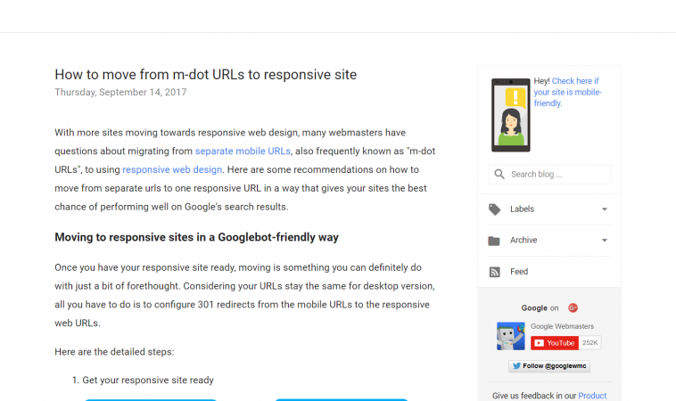
In fact, if you’ve been following the Google Webmaster Blog. You’ll notice that there is an illustration on the site that urges you to run a mobile-friendly test. Yes, they are both the same thing.
Do you notice on the right site that Google is asking you to check whether your website is mobile-friendly?
Thumbs up at the effort that Google is putting in. They REALLY want you to go mobile friendly.
The site is straightforward and simple to use. All you need to do is type in the URL of your website, and run the test. In less than a minute, you’ll either get a green “page is mobile-friendly” or a red “page is not mobile-friendly”.
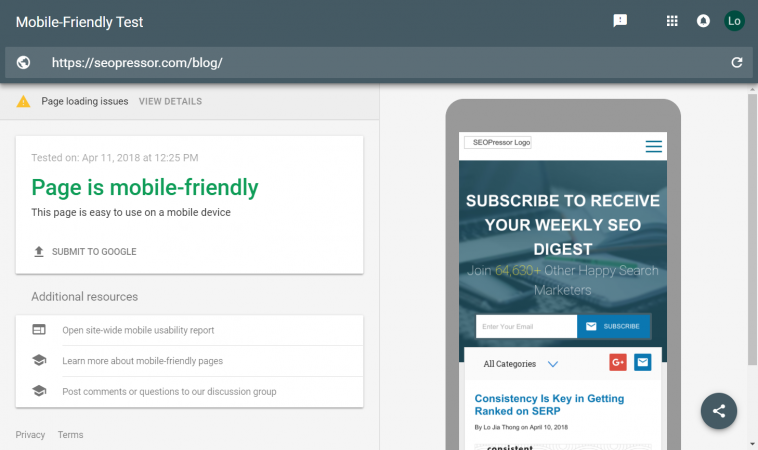
Hey the SEOPressor website IS mobile-friendly, hooray!
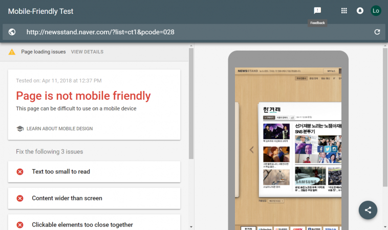
This news portal, unfortunately, is not.
Straight to the point and simple.
Whether your page is deemed green or red, you can view details on page loading issues. Because let’s face it, no web page is perfect, even if we want it to be. That gives you a simple overview of what you can fix to make it better.
Click here to access the tool.
If you’re a Chrome user, you can utilize their DevTools’ Device Mode to help you build your own mobile-friendly site.
How it looks like when device mode is on.
Utilizing the device mode, you can simulate the environment of a list of portable device and gauge how your site performs.
I won’t go over all the functions of the Device Mode. In a nutshell, by utilizing Device Mode you can gauge the responsiveness of your webpage via a list of portable device emulators. However, there also exist some downsides. For an example, they can’t emulate GPU and CPU behavior.
The point is, the tool will be sufficient for most mobile-friendly testing tasks. So go ahead and make use of this free tool to tweak your website. Up the game on mobile-friendly and responsiveness.
When users load a page on mobile, they are on the go, they want to reach a page and they want to reach it fast.
So here’s where speed comes into the big picture. 53% of mobile site visits were abandoned if a page takes more than 3 seconds to load.
Being a mobile-friendly website is important, being a blazing fast mobile-friendly website is even more important. Google helped you built a mobile-friendly website. They also want to help you to tweak it to perform at its best.
Click here to access the tool.
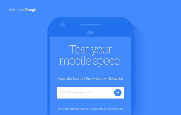
Taking only a minute time tells you the time required to load your webpage using a 3G connection. You can also download a free copy of the report on how to improve your performance.
Click here to access the tool.
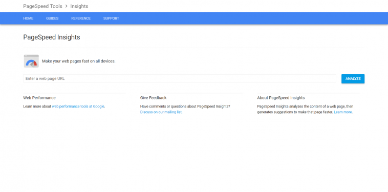
This web performance tool also gives you some insights on how optimized your website is.
It gives you stats on your website speed, optimization level and etc. It is excellent because in one click it also provides you with a solution on how to fix any problems. Follow the appropriate guides and you can have your website updated in no time.
Click here to access the tool.
You can pair the web performance tool up with the Chrome User Experience Report to get a clearer view of how your website performs as a whole.
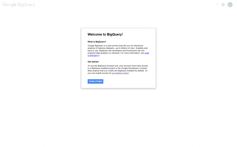
The data is a part of Google Cloud Platform, free to explore via Google BigQuery
As a whole, tools 4 and 5 together give you heads up on how to perform better. A website with better performance gains more edge in the mobile-friendly race.
Now that you have optimized your website performance, you can access it on your mobile device to see it for yourself how it performs, mobile-friendly wise. What’s better than testing out how mobile-friendly a website is, by viewing it in mobile!
Click here to access the tool.
While developing your website, you can make use of the remote debugging tool to inspect your page in real time.
This gives you the advantage of examining your website under the mobile condition that you want. While still maintaining the same control over the development.
In the case where your website is hosted, it is most probable that the software homepage has already created a how-to guide for you to haul your website into being mobile-friendly. If you want to know more about how to make a website mobile-friendly.
Click here to access the guide to customize your website software.
At the end of the day, the users want more mobile-friendly websites that work. Therefore, Google tries to deliver by emphasizing on mobile-friendly optimizations.
With the mobile-first index being rolled out, the age of internet on the palm is no longer a future event.
Making use and taking advantage of all the guides and tools that have been lying in the Google dungeon will definitely benefit you. Bracing the dark, cold corridor of the dungeons may be intimidating. That’s why we did it for you and compiled these 6 tools to help shape your mobile-friendly website!
Now, brave warrior, storm your way through the optimization and you may be rewarded with a high SERP rank by Google.
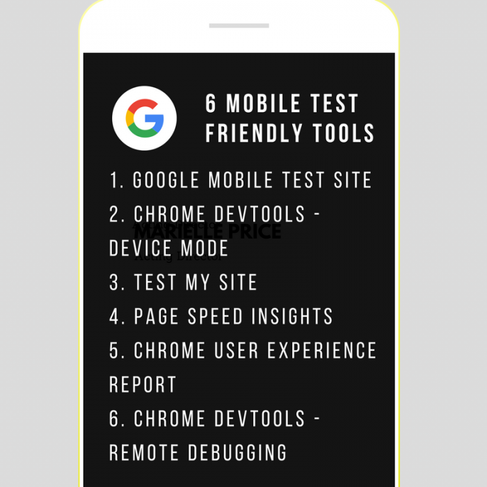
The list of mobile friendly test tools
Updated: 20 July 2026

Subscribe and receive exclusive insider tips and tricks on SEO.
Delivered to you right from the industry’s best SEO team.
Copyright © 2026 SEOPressor. All Rights Reserved.
Powered by Semantics BigData Analytics (SBDA).
