1
Steph W. from SEOPressor

👋 Hey there! Would you like to try out this New AI-Powered App that'll...
...help you check your website and tell you exactly how to rank higher?


Actionable SEO tips, tutorials, and insights to help you rank higher.
90
score %
SEO Score

Found us from search engine?
We rank high, you can too.
SEOPressor helps you to optimize your on-page SEO for higher & improved search ranking.
By winniewong on February 21, 2018
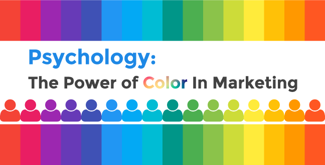
We have recognized the power of color to move and affect us since our earliest civilisations, and as our access to colors developed, and our mastery of them through artwork has grown, so has the sophistication of our associations with them. Some primal color associations remain and are deeply powerful, while others are relatively new and exciting.
Today, I’m going to explore the many psychological impact of color on marketing, sharing resources and insights to help you get the most out of them in your marketing. Colour is one of the most powerful subconscious motivators, and we have discovered many interesting subconscious influences on marketing.
For instance – energetic music makes people eat faster, and smaller floor tiles make people walk slower. In each case, the pace markers in our environment change how we set out rhythms to meet them. Eating popcorn can make you immune to cinema adverts, because you have a simple means of distraction – an immediate reward that requires no new action, unlike the advertisements.
We drink more from short, wide tumblers than tall slim glasses, because we see fullness as a measure of height, not width. Cool temperatures, dim lighting, and soft music are all evidenced to encourage over-indulgence in food, which is why that description sounds like every restaurant you’ve been in. Finally, every movie poster looks the same because blue and orange give us “cool” and “exciting” triggers.
Understanding your customers is really one of the most important things businesses today should focus on. Knowing what they want and providing them a solution to it will get your brand a notch higher than your competitors.
Which is why having an intelligence tool; Content Intelligence from BiQ Cloud, will make things easier on your side.
Aside from knowing the differences colors may bring to your brand, knowing how they what they say about your brand are a rich source of business information- if collected and analyzed.
Online sentiment analysis helps to gauge brand reputation and its perception by consumers and with Content Intelligence you’ll be able to do so, in automation.
By now you can see that the subconscious is acting on us in powerful ways almost all the time. You must also see that color can be an important tool in leveraging the subconscious to provide us with positive motivation to act. That is the impact of color on marketing in essence.
By understanding the power of color in marketing, we can begin to harness it indirectly actionable ways. Psychologists have long established that colors are tied to our emotion – Goethe first described the “Rose of Temperaments”, charting the allegoric, symbolic and mystic usage of color, in 1798.
Heads up – a lot of these insights have been inspired by material sources, including the great Pantone book Color – Messages & Meanings, which I highly recommend.
Now, we’re going to look at 10 of the most common colors brands use, and how they can be effectively leveraged when creating a brand identity, campaign, or image to evoke the sense you want.
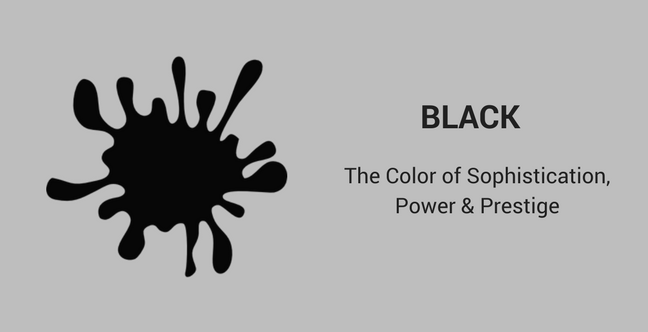
Black is a blank canvas. It is also rarer than you think – only OLED screens can show true blacks. Meanwhile, the blackest black has only just been discovered, and looks like some kind of optical illusion.
Black is the cover of space, of vastness. It can also be associated with absence and death. It’s also the classic color for ink, making it a favorite of brands that like to look well established.
As a result, black is frequently used by luxury brands to create a blank canvas upon which to hero the item – black creates a superior focus on the product itself, as the only thing lit.
Black, in too large an amount, can begin to feel gloomy and oppressive, so it must be used artfully to create a strong contrast with the hero, like in paintings by the Dutch Masters.
Chanel has long used black as part of its brand, while relative newcomer Hotel Chocolat uses the color to conjure that same luxury feeling. Rolls Royce have a whole campaign around modernising the timeless elegance of black.
Black can also symbolize an institutional quality, and a simple monochrome logo can give people a sense of establishment and trust. Simplicity can engender confidence.
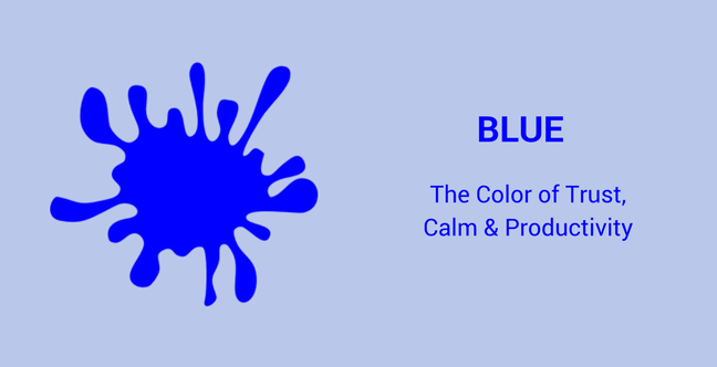
Blue is the most common colour in branding, from airlines to tech companies, banks and supermarkets. Used in luxury brands and budget brands, social media and more, blue is the great unifier.
Why? Well, blue is calming, and I believe this has evolutionary roots. After all, blue is the color of a clear sky, the color of a calm sea, or a clean river. All signs were in a rich habitat. Blue, unlike red or green, is unaffected by color deficiencies in processing, meaning everyone who can see can see blue. However, when we’re said to be “feeling blue”, we mean depressed. Do brands what to depress you?
Well, not exactly. They want to calm you. Blue is calming and clean, and importantly, consistent. The sky never disappears. That’s why we like blue, and why we feel ready to trust blue brands. Trust is, in turn, one of the most important factors in consumer decision making, so when choosing what emotions to trigger, blue is a strong choice.
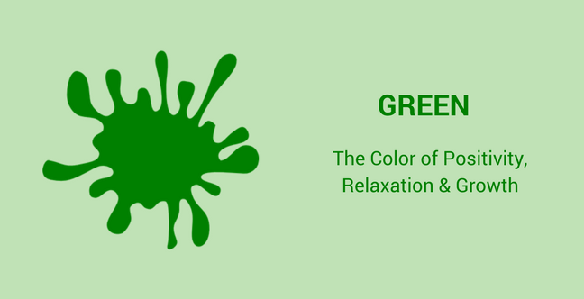
Green is a delightful colour. Green is the color of growth, the color of spring, the color of verdant rolling fields, and the idea of a paradise island. Green is the associated with times of plenty.
When things are green, people are relaxed. Green is the “go” light, the “great job” pen. Green is encouragement and positivity.
More recently, green has become a by-word for the environment – it encourages new concepts such as responsibility, sustainability, cleanliness and friendliness. A green brand is a conscious brand.
As such, green is great for a wide variety of brands. Health and nutrition brands, and brands that wish to promote reliability, like LandRover. Digital brands like Spotify use it to suggest abundance, while disgraced oil company BP used it to instantly reinvent their image.
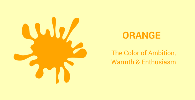
Perhaps because of companies like EasyJet, Nickelodeon, Amazon and more, 26% of people now view orange as a cheap color.
I believe this is the wrong way to look it. A warm color, the richer the orange palette becomes, the more energized the brand appears. Orange is a color of zest and juice, of sharp and sweet, of energy and dynamism. It is the color of impulsiveness and adventure.
As such, it can be a great tool in getting those impulse buyers, like EasyJet or Amazon, and it can also be helpful when trying to emphasize your Call To Action, as it instills that sense of eagerness. Similarly, if one of your selling points is low price, you know from these great examples that this color will work for you.
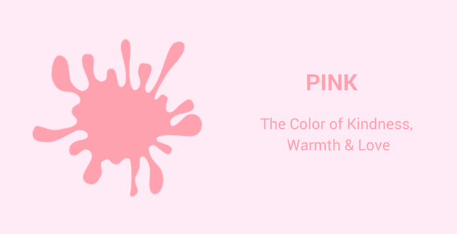
Pink is used by brands you’d expect to use pink based on norms established in the 1950s, such as Barbie and Hello Kitty. But the color is much more versatile than that, with LG, T Mobile, and even Taco Bell choosing pink.
That’s because pink can increase our blood pressure and our pulse rate – it’s the color of flushed cheeks, or lips. It is the color of flowers and flamingos – flamboyance in nature. For millions, it has become the color of hope in the fight against breast cancer.
Pink can be fun. Hot pink can be bold and exciting. Pastel pink can be neutral and calming. What’s more, pink can be a surprising, empowering choice that displays a sense of fun and confidence.
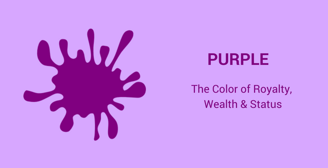
So, what does the color purple mean? Purple is the color of gods and rulers, worn by Zeus in Greek myth, by magistrates and Caesars in Rome, the emperors of the Byzantine empire, the emperors of Japan, and the British royal family.
Purple is rich, and so are the people who wear it. Perhaps as a historical association with rulers, the color is also associated with wisdom and spiritual practice – two traits the ruling classes traded upon to secure their authority.
Purple is a powerful colour, and as such, it should be used sparingly. Purple brands include Yahoo!, Hallmark and Cadbury – rich indulgences. Similarly, the colour is popular in cosmetics, as the colour of indulgence and elitism.
Brands that use purple need to know that they are sending a powerful statement, and it is best suited to those with an element of prestige and quality about them.
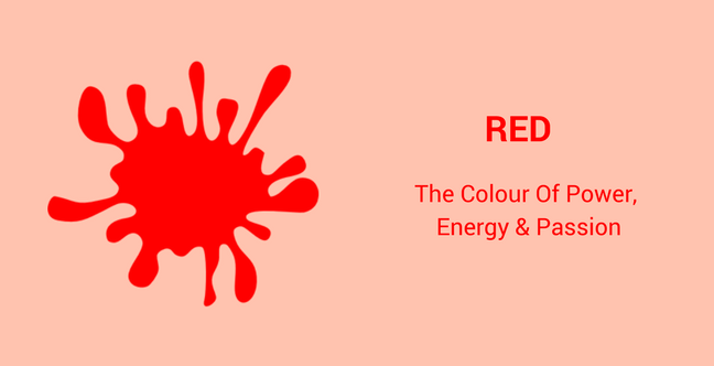
Red makes our pulse race. It is the color of blood and wine, of roses and danger. It is the color of the arousal – the ‘red light’ district. It is a color of health and vigor. Put simply, it’s a color of extremes. Whatever is red is exciting. Perhaps this is why the power of color red is still most famous for its association with Ferrari, whose cars make us so excited.
Red stimulates the appetite. YouTube and Netflix use red to fuel your appetite for more content. Heinz and Coca-Cola do the same in food and drink. Marlboro do the same with cigarettes, H&M for disposable fashion… the list goes on and on.
Red is also the color of threat and as such, the color of urgency. It is the color of errors and can encourage people to want to eliminate them. ACT NOW!
Red is the most aggressive, and therefore, the most manipulative colour.
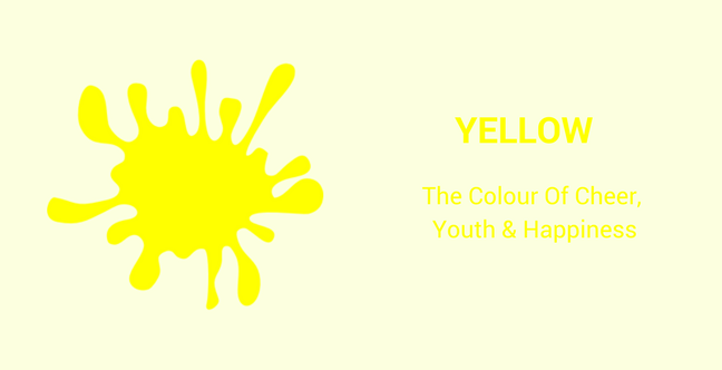
Yellow is bright as sunshine, and who doesn’t feel great in the sunshine? Yellow logos are used by companies who want to project optimism into people’s lives. IKEA can make you believe you can, and even WANT to, build furniture yourself. McDonald’s can make you believe their food tastes good. Best Buy can make you believe you’re buying the best, not cheapest. Optimism!
Yellow can grab attention, but its closeness to white means it usually needs to be accompanied by an accent color to stand out. The choice of accent can have a big effect too – yellow and black is the color of caution in nature – wasps and bees use it to threaten with their presence.
Yellow is also one of the first colours we begin to perceive after being born, so it’s often used on products aimed at infants and children.
Yellow is not without its institutional heavyweights too. Camera company Nikon and logistics company DHL use it to great effect by relating optimism to confidence – they will deliver for customers.
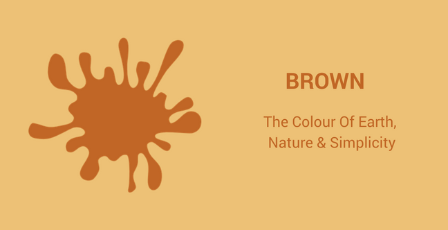
Brown is the colour of rich soil. Of coffee and chocolate and leather. Of wood. Brown is a color we are evolutionarily more familiar with, though modern life would see us spent our lives looking at grey and magnolia.
Brown is most commonly associated with food brands. Hershey’s use it to as a promise of what’s inside. Mad Men even used it to create an incredible moment in their final season, as the character admits something to strangers he has hidden from everyone closest to him for six seasons. Brown is used by UPS and Kettle Chips and hundreds of independent brewers.
That’s because brown offers us a balance of warmth, familiarity, and comfort. There are depth and richness, and nurturing in brown. There is strength and simplicity. While an understated color compared to many on this list, its power should not be underestimated.
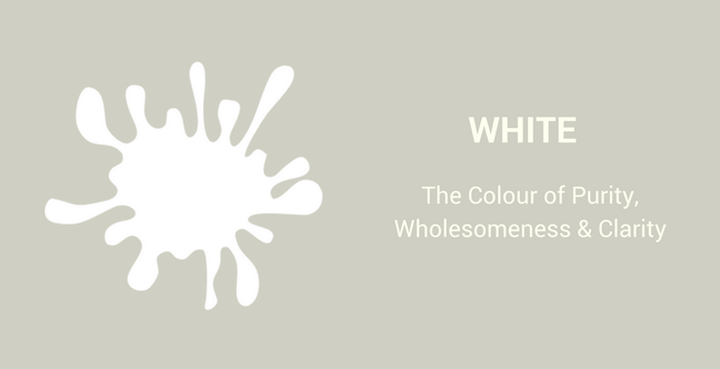
A wedding dress. A doctor’s coat. God. White has always been the definition of purity. It’s also been repurposed to be the height of modernity, most notably by brands like Apple and Google and Wikipedia. White is also seen as being clean and sanitary, making it a popular choice for dental, health care and child services brands.
Whitespace also creates the sense of a blank canvas, of a perfect or ideal space for the brand to exist in. This has been used to great effect by KitKat and others. Whitespace necessitates a larger canvas, which plays into the idea of conspicuous consumption – deliberate ‘waste’ to create an emphasis on wealth and richness. The product stands out more emphatically for being islanded off from the competition.
2018 will surely continue 2017’s work of examining gender with a fine-toothed comb. The gender of your audience does indeed affect preferences and perceptions when it comes to colors and marketing.
Fortunately, a huge number of studies have been conducted, and the results thoroughly reported. I’ll summarize them here, so you can focus on taking the information most relevant to your needs.
The most important thing to remember is that the pink vs blue idea of girls vs boys is a big fat myth. The BBC published a breakdown of the social conditioning that produces this fake preference, examining the history of color choice between genders, and discovering that blue is the most popular color with both men and women – thereby proving the universality of the color and its popularity among brands.
Martech created an outstanding infographic breaking down colour preferences – including for things like saturation, pairings and psychological associations – between genders.
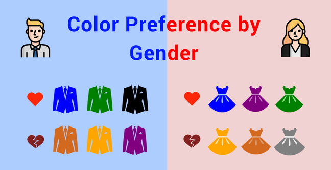
If your target audience is defined by gender, then the power of color is an important thing to bear in mind before committing to a visual identity.
Make good use of your colors!
By now you should see that colors and marketing are inextricably linked. By using color in marketing, you understand psychology of colors, the importance and power of colour, and recognize their role in creating associations for us subconsciously. These associations can help to motivate emotional responses that can result in sales, brand loyalty, conversion, and lifetime value.
So, where do you go from here? Testing, testing, testing.
Despite blue being a common favorite, there is no one “best” color. People profess to hating brown if you believe Kissmetrics, yet Louis Vuitton bags are the most popular luxury handbag and UPS are a world-renowned delivery service.
You need to test your color schemes, and consider not only what primary brand color you’re going to use, but what pallet of complementary colors will you use to support it.
What’s more, the use of color must be deliberate and evocative. Overuse of color can be distracting, annoying, and even uncomfortable for viewers. Pick a primary, accent and base tone to begin with, and align all your assets around this scheme. When you compose that scheme, always keep the effect in mind. You want to be using color at the right time, not necessarily all the time.
Finally, remember that this is for the audience. You need to consider what you want them to think about your brand and align your colour scheme with the colors whose associations best represent the qualities you are aiming for. It’s not about what color you like!
So, there we have it – an examination of the current data and best practice around the power of color in marketing. I hope this has been illuminating for you, and that you can go on to make bolder color choices as a result.
Have you seen the power of color in changing the performance of your brand? Share your story with us in the comments below.
Updated: 21 July 2026

Subscribe and receive exclusive insider tips and tricks on SEO.
Delivered to you right from the industry’s best SEO team.
Copyright © 2026 SEOPressor. All Rights Reserved.
Powered by Semantics BigData Analytics (SBDA).
