Steph W. from SEOPressor


...help you check your website and tell you exactly how to rank higher?

80
score %
SEO Score
Found us from search engine?
We rank high, you can too.
SEOPressor helps you to optimize your on-page SEO for higher & improved search ranking.
By allysa on February 3, 2016

Conversion rate is measured by the amount of visitors taking an immediate action on your website, whether it is signing up for a newsletter, buying a product, or downloading a free e-book. Let’s say there are 100 visitors on your site, and all of them have opt-in for your newsletter. So your conversion rate will be 1%. The more visitors clicking on your call to action, the higher conversion rate you’ll get.
But how do you make sure that every visitor will click on your CTA to improve your conversion rate?
Other than creating the perfect CTA for your website, your copy of CTA should be convincing to persuade the visitors to opt in. Every word you use in your CTA has to give the visitors an urge to click on it. In this post, I’ll be sharing with you guys on how you can get more conversions through copywriting:.
Before writing your CTA, you have to firstly identify what are the things that you can offer to your visitors and most importantly, why do they need it.
When you can identify the problem that your visitors are facing, then you can present them your product as a solution to that problem. With this, your CTA will be more attractive to them because you are giving them a reason to follow your instructions.
For example:

Airbnb has a great CTA where it answers most of the visitors’ questions who are confused on how they can earn money by using Airbnb.
Even better, make your visitors feel special like what H&M did:
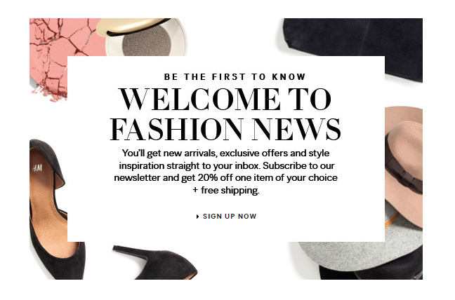
By providing some exclusive discounts and having the word ‘Be The First To Know’, visitors will feel special and opt in.
You should always provide benefits to the audiences on what they can benefit from your CTA, or else they wouldn’t care to click on it. For example, “Send Us An E-mail Today” is not as strong as “Send Us An E-mail Today And We’ll Help You Generate More Traffics”. The latter tells the visitors what they will get, so they will know what to expect.
Font size makes a huge difference for your business. If you choose the font size that is small and hard to read, you are chasing your potential customers away.
Let’s take a look at this example:

Make sure that your font size is just right for your CTA, or else your visitors wouldn’t be able to notice it when your font size is too small.
It is also important to make your CTA bold because it will stand out on the page. Fonts that are too thin will get buried under your images and other texts, which you wouldn’t want this to happen. Therefore, you have to make sure that every visitor who comes to your website will notice your CTA.
You can aim for a 20% increase in font size between your CTA compared to the fonts you used for the body paragraphs.
Make your intention clear and obvious so that when the visitors see it, they will immediately get the message and they will know what to do.
It may be challenging to write a short and detailed CTA, but it is possible. Some people wouldn’t spend time reading CTA that is too long because they don’t have the time. Therefore, a short, but detailed CTA works better for them.
The writing style is also different when it comes to writing for your CTA. Instead of using the storytelling method, it is more effective to use the direct approach. For example, if you want them to call, just provide them a phone number. Don’t ask them to fill up forms just to get your phone number as it is too troublesome and customers wouldn’t like that.
Here are some good examples of short and detailed message:
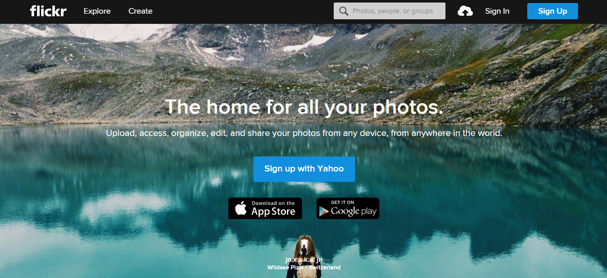
Visitors will understand easily on what flickr can provide them just by reading the short description.
Make your message as clear as possible so that visitors can take action on your CTA.
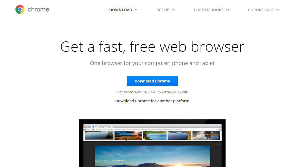
As for people who are using a slow web browser, Google Chrome will be able to convince them by having the word ‘fast’ in their message.
Remember, you have to be able to provide your visitors with information that they can understand with just a short message instead of a long one. By doing so, your conversion rate will definitely increase because you are going straight to the point instead of beating around the bush.
In the marketing world, everything is in a fast pace and not everyone has the time for the long-winded message.
Every word you choose to use in your CTA has to be strong as the words are what affect the visitors’ decision. Other than being straight to the point, you should also treat your visitors as friends so that when they stumbled upon your website, they wouldn’t feel foreign and wanting to leave immediately.
For example, instead of using “Send An E-Mail”, you can use a more friendly tone like “Talk To Us”, exactly like how Contently did:
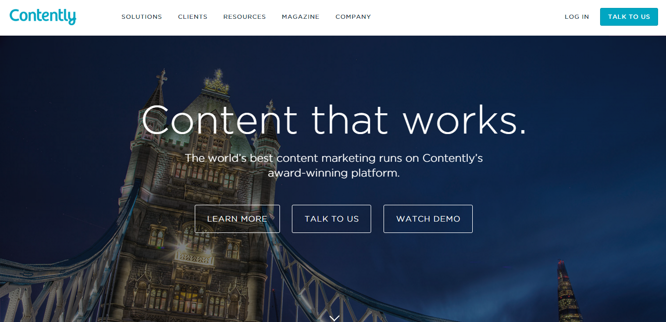
Using a friendly tone is important so that visitors will feel more welcomed.
To create a sense of urgency in your CTA, give your visitors a limited time offer. When you give a time limitation to your visitors, they will feel like they have to opt in today or they will miss the chance.

Let the visitors know that they don’t have much time left to purchase a product/service so that it will give them the urge to opt-in right away.
Sometimes, people will be skeptical when it comes to special offers. To overcome this, you can provide other incentives to sweeten the deal. For example, “Sign Up For Our Mailing List To Receive Special Coupon Code”. Visitors will have more tendency to sign up when you give benefits to them.
Keep in mind to write your message in a persuasive way so that you can get the visitors’ attention. The best way to persuade them is to show them the statistics or number of customers who have signed up for your plan. People are fear of missing out, so when you provide them with such information, they will get to keep up with the market.
Here are some of the examples:
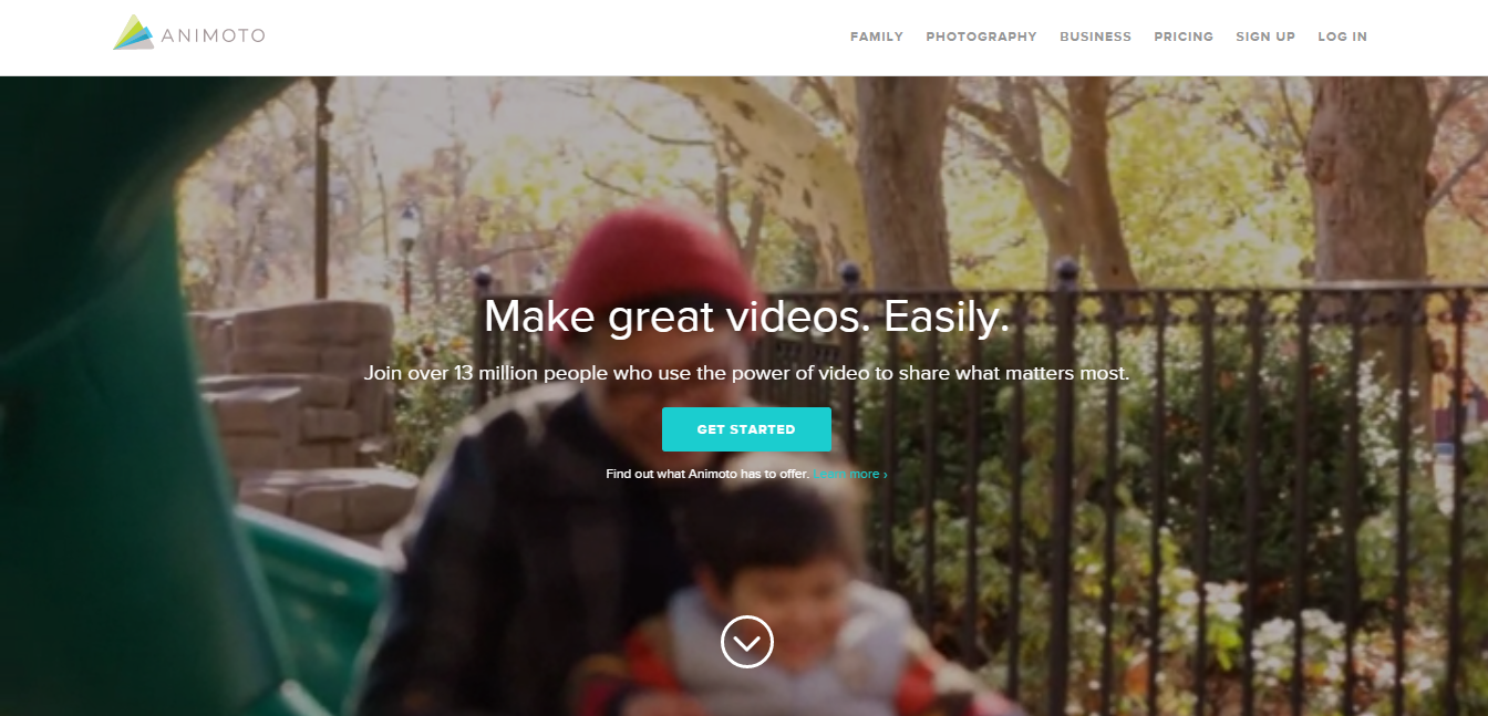
When there are over 13 million people who are using Animoto, will you not join the crowd?
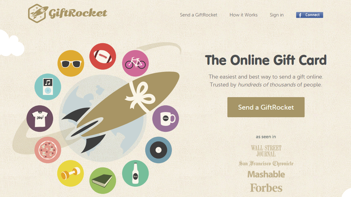
Clear your visitors’ doubts by showing them that there are hundreds of thousands of people are sending the gift card.
You have to tell the visitors about the process of what to expect when they click on your CTA. Like GiftRocket, their CTA is ‘Send a GiftRocket’. So after the visitors clicked on it, they will expect that the card will be received by the participant. And if the results are what you have promised, you will be able to gain their trust and possibly, their future business as well.
Many marketers are using the word ‘free’ in their CTA because they think that it will increase their conversion rate. You probably think that by using the word ‘free’ in your CTA will be very effective as well. However, Hubspot did a study on whether the word ‘free’ affects the email deliverability and click-through rates.
Surprisingly, the results came out different from what I thought it would be. Based on their research, the CTA that excluded the word ‘free’ performed 5% better than the CTA with the word ‘free’.
However, that doesn’t mean that you should stop using the word ‘free’ in your CTA. You can still use it, but it might not be effective for some of your audiences.
Instead of using the word ‘Free’, you can do it like Prezi:
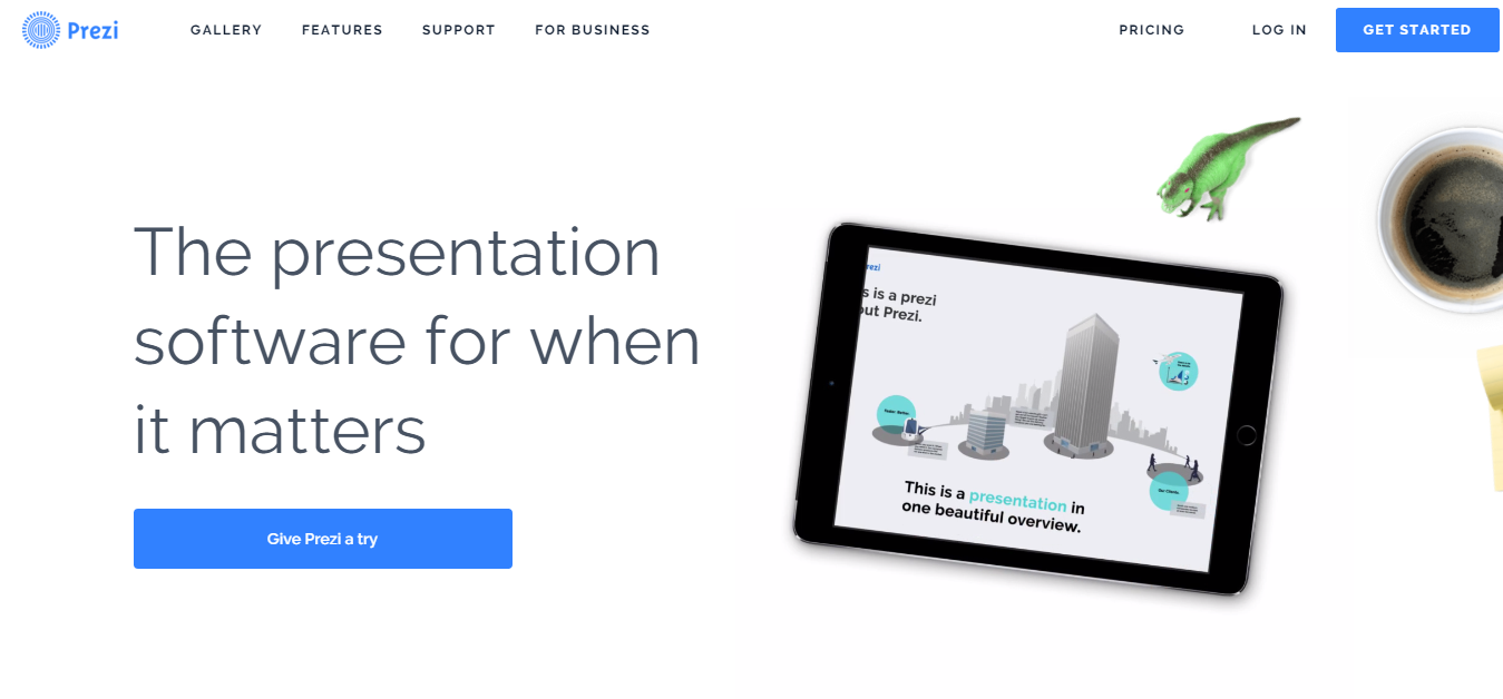
When the word ‘Free’ no longer attractive to your visitors, you can use ‘Give It A Try’.
So what’s next after your visitors have made the conversion?
You should always thank your visitors for making the conversion. When you show gratitude towards your visitors, they will feel that you are sincere. There will also be chances where they will recommend your product/service to their family and friends, in results, helps to improve your conversion rate.
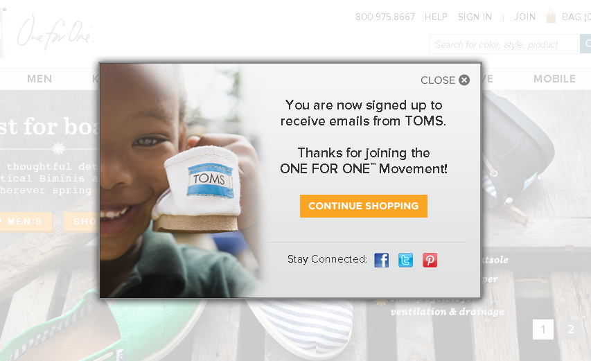
Let your visitors know that their action is appreciated by saying thank you.
In SEOPressor, other than a thank you page, we also engage with our visitors by encouraging them to tweet to us if they have any feedback.
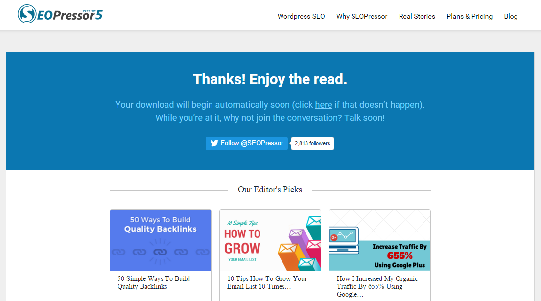
You can also suggest some interesting blog posts for your visitors to read while they’re downloading the e-book.
Stay connected with your visitors even after they have opt-in. This will increase your engagements with them and at the same time, you are building connections with people who are in the same industry as you.
Now that you have an idea of how copywriting can affect your CTA, make sure that you will create a better and more successful CTA. You can always do split tests to analyze which CTA will help to increase your conversion rate better. Keep testing until you find something that will work the best for you.
Don’t forget to use a friendly tone while you’re writing your CTA because that’s what makes the visitors feel connected. When you treat them as friends, you will increase your chance of getting more returning customers as well.
With all these copywriting techniques above, I hope you will be able to maximize your conversion rate. What are some CTAs that you have created before? Share it with us in the comment section below.
Related articles you might like:
Updated: 16 March 2026


Save thousands of dollars (it’s 100x cheaper)

Zero risk of Google penalty (it’s Google-approved)

Boost your rankings (proven by case studies)
Rank High With This Link Strategy
Precise, Simplified, Fast Internal Linking.
