1
Steph W. from SEOPressor

👋 Hey there! Would you like to try out this New AI-Powered App that'll...
...help you check your website and tell you exactly how to rank higher?

Actionable SEO tips, tutorials, and insights to help you rank higher.
80
score %
SEO Score

Found us from search engine?
We rank high, you can too.
SEOPressor helps you to optimize your on-page SEO for higher & improved search ranking.
By allysa on February 2, 2016
A/B testing is important to guarantee a smooth progression for your website visitors beginning at point A, which is their initial impression of your website (in a matter of seconds), to point B — a conversion.
There are many case studies that are already done to show which variables are favorable and have the better conversion rate. But the truth is, you cannot never rely on these results because each website is unique. The nature of your business, the design, the color scheme, the demographics of your target audience, your copy, and all the other factors will affect the result. Which is why the only way to find out the variation will convert the best is to run an A/B test yourself.
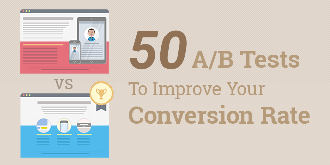
Following are 50 A/B tests for you to run to ensure your sales funnel isn’t clogged up, bent or 404 Not Found!

Compare different colors for your calls-to-action. The results may surprise you. For example, the color red implies “stop,” but it could mean a conversion for you. At least, that’s what Hubspot found by 21% when they compared red to green for their website.
You have very few words to persuade visitors of your website to “Buy Now” or “Learn More.” Split test your CTA wording one word by word. A small change could make a world of difference.
Is bigger better for your website? Split test different sized calls-to-action buttons and find out. Don’t forget to track all results of visitors using different devices, such as smartphones, tablets and computers.
As with size, the shape of your calls-to-action may make a significant impact. Changing the shape may help your calls-to-action buttons stand out without being too large and distracting.
Consider providing your website visitors more than one opportunity to convert by using multiple calls-to-action. This is also a good way to break up content.
Few elements of a landing page are as important as your headline copy. Just like a newspaper’s headlines, your headline must capture interest immediately for visitors to continue reading.
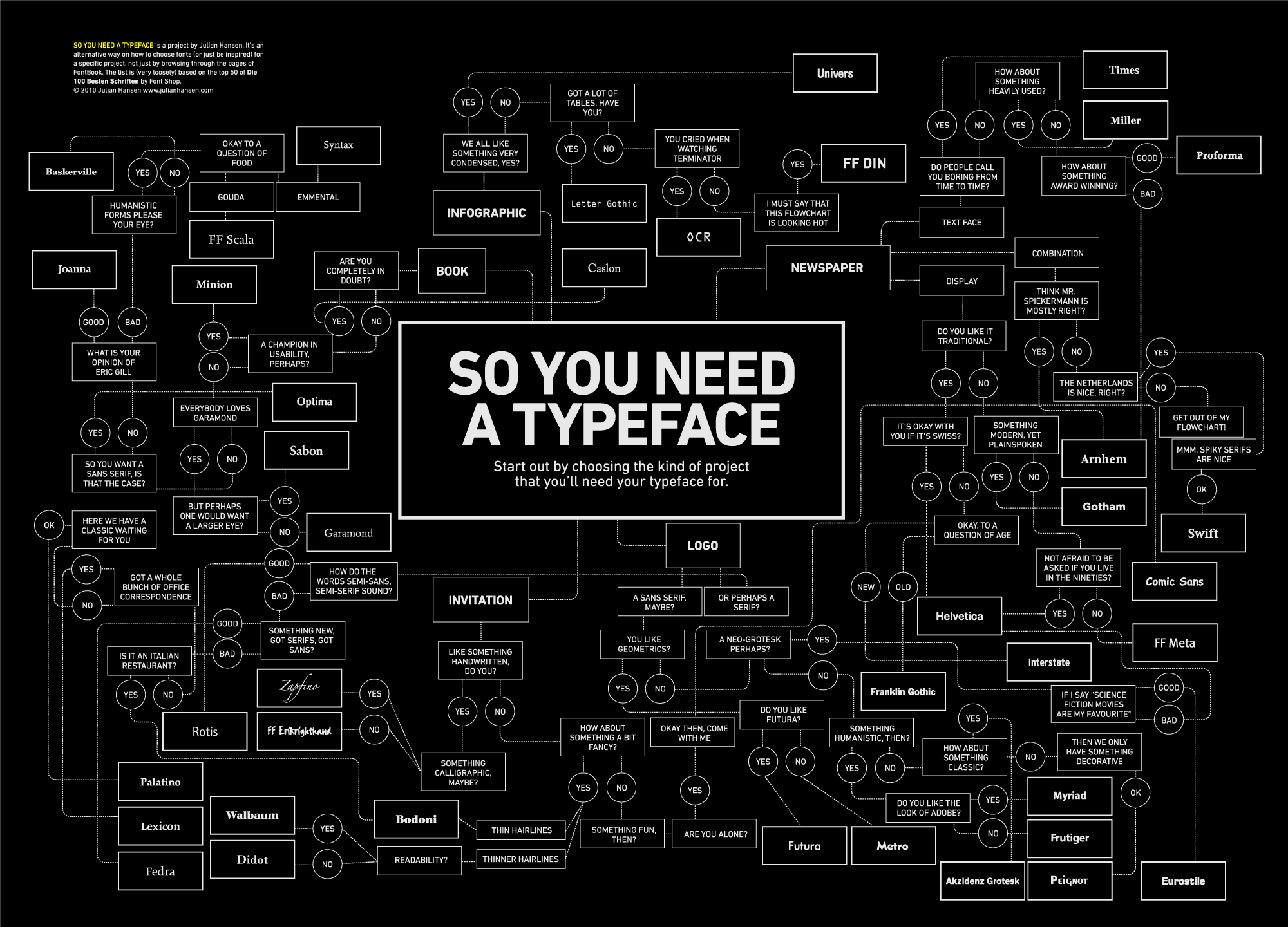
The fonts you choose are instrumental for the success of your website. Though, you want your fonts to be appealing, readability is key. The general consensus is that san-serif fonts are more favorable than serif. Google’s fonts are also a great place to start.
Again, readability is key. Your website may be beautiful, bold or both, but if it’s too difficult to read, visitors may just move on. Split test font colors and track time spent on pages.
Does your company have a definitive copy style or image? Can you sum it up in one or two words, such as professional, authoritative, comical or casual Friday? Make sure your copy is consistent and attractive or creates your market segment.
Copy length correlates to copy style. Short and sweet is generally the rule, but that may not be so with your audience. Test, test, test and write some more! Additionally, don’t feel assigned to use industry buzzwords. Make your own buzzwords!

If you are using stock images, split test them against actual images of your company’s working environment. Authenticity equals trustworthiness.
Another element to introduce to your image’s split testing is professional images vs. casual images of your workplace and employees. Find out what best dressed means for your conversions — blue collar, power lunch, homebody, fit body, casual Friday or corporate road trip?
Do you use a static image, a slideshow or a rotating carousel on your homepage? Split test different approaches and images to see which works best for your audience.
The ease of use and clarity of your navigation menu is supremely important! With mobile searches surpassing all other Internet-enabled devices, responsive navigation is on the rise. Split testing navigation options is imperative!
Adding visual trust signals and icons to your website imparts to visitors that your company is a knowledgeable industry leader and, of course, trustworthy! Trust signals and icons include your phone number, testimonials, social media icons and icons or logos indicating your website is secure (e.g. VeriSign). Split test trust signals in different sizes and locations.
Split test social signals that indicate the number of likes and shares. Social proof conveys trust signals and testimonials in addition to promoting your social media marketing campaign. Also, split test icon graphics.
Top, bottom, side, popup and/or floating: where are your social media icons located on your website? Split test and be sure to pay attention to the devices your customers are using.
Split test different email and newsletter sign-up copy. Try to convey the benefits of signing up. What’s in it for them? Is it worth their time?
There is no more important element in your email marketing campaign than the subject line. If you are simply using the headline of your latest blog or sales event and it isn’t working, break the subject line into sections and USPs (unique selling points). Keep testing.
You may also increase email clicks by redesigning the content. Split test different background colors and layouts for your email campaign. Try short, simple and sleek to compel prospects to click once. Just once!
Convey a sense of urgency of your products or services to your customers. Airlines do this by indicating the number of seats left “at this price.” Amazon often indicates the number of items remaining. Would this tactic or a variation of work for you? Test it out!
Customer testimonials are always great, it lend credence to your website. If you have plenty of great customer testimonials to choose from, split test by displaying different testimonials from different customer. You could also split test the location and style of your testimonials. Make prominent important titles, such as CFO, President, Senior, Director and so on.
Chat boxes are useful tools, but they can also be annoying for visitors. Split test click-to-activate chats or automatic popup chat boxes. Be mindful of refreshed chat options on newly clicked-through pages. (It’s annoying!)
Videos have become an important element of websites and marketing campaigns. However, you should split test videos that auto play or must be clicked to play. Another voice suddenly in the room can be alarming or annoying.

Split test between male and female voiceovers. Which is the better fit for your products and services?
There can be a fine line between sales videos and informational (passive sales) videos. Split test both for your products and demos. Be mindful not to underestimate or disregard the intelligence of your customers.
Are your customers leaving your website at checkout? Split test delivery charges, free delivery and free delivery after a predetermined purchase amount to see what works for you. You may also try “15% Off or Free Delivery” to get customers thinking about the best deal for your products.
Special offers, such as discounted products, may be used to entice customers that didn’t complete the checkout process. This strategy may also be integrated with urgency tactics — “Only 3 Left!” — in your email campaign.
“Free Trial” offers help conversion rates and build your database. Split test “No Credit Card Needed” if appropriate.

If you have tried enticement offers, such as free trials, no risk and money-back guarantees, split test them to see which works best for your products and services. You may find you don’t need any of them.
Are you trying to sell a specific product or just boost sales in general? Feature specific products by labeling them as “Top Picks,” “Customer Favorite” or “Recommended Product” on your homepage and see what happens.
If your website customers are consistently looking for the lowest priced item, label these items as “Best Buys” or “Best Value.” If appropriate for your products and services, try a call-to-action, “Show Best Buys!” for your deep discounted or clearance items.
Streamline choices across your website, from product options, to instructional steps and checkout clicks. Split test one, two and three clicks, steps, visuals and so forth to see which number is your magic number.
Split test different sized images of your products, as well as toggling different formats (e.g. popup, slideshow and mouseover). The better the image(s), the more description is conveyed to your customers.
Split test the amount of discounts that you offer to annual subscribers to see when and what they bite. If the discount is only available to them (or other subscribers), make sure they know it.
Surveys sent to your registered subscriber’s list can be a valuable tool. Test different survey formats. Include questions about holiday shopping well before the holidays arrive if it pertains to your services.
Too many distractions on your website, such as too much information, can divert a customer’s attention. Clear the route to purchase for your website’s visitors by removing distracting content and split test.
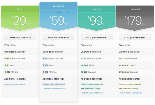
Pricing tables can be valuable tools for conversions if they are used cleverly. Split test between three and four purchasing options on your pricing table. Continue to split test by alternating a featured price “Best Value” incentive to the second, third and fourth options.
Split test pricing. If you aren’t already, round up to a whole dollar amount (e.g. $40 rather than $39.99 or $65 instead of $59.99). These days, clear and simple is often better and more profitable! Whole-dollar pricing may also be perceived as real or actual value, rather than a typical marketing price.
You might think that lower price will definitely result in more sales, but sometimes it’s not the case. Consumers relate higher prices with higher quality products.
You’ll have to find the sweet spot where your product is not priced too cheap that your consumers think that your product has low quality, and priced not too expensive that your consumers aren’t willing to pay so much for it. Split test pricing of similar products and see if sales and profits go up.
Do you use a single-page checkout or a multi-page checkout? Split test them. If you find customers are abandoning their carts with a comprehensive single-page checkout, then make the switch.
Discount code boxes on the checkout page either make your customers think they are losing out on a better deal (which is true), or it sends them on an Internet search for the discount code while abandoning their cart. Try dropping your discount code box. Instead, automatically give logged-in loyalty customers discounts through your email campaign.
Keep your customers in line all the way through checkout by ditching your navigation menu on the checkout page. Split test with pop-out checkout pages. In this way, your customers may toggle between pages without being annoyed.
Any retail store will show you that the checkout queue is a great location for impulse products. Split test: suggest additional impulse-buy products to your customers before, during and after checkout.
If you require customers to register before purchasing, you should split test your alternatives. You may still include checkbox options to sign up for email promotions and subscriptions without requiring registration.
Split test streamlining your opt-in form by reducing the number of boxes (required or not) to as little as possible.
Many studies have shown that consumers expect websites to load in under three seconds. Many abandon websites beyond this small window. Make sure your homepage and landing pages load quickly. Split test reducing various content if necessary.

Split test offering different products or loading different pages to visitors in different regions of the country or world. Keep seasonal weather conditions in mind, too, for product offerings.

Get creative with your 404 “File Not Found” page. At the very least, offer navigation buttons in the body to take visitors elsewhere on your website. Moreover, split test with more advanced pages that are humorous or invoke the image and style of your company.
If your website isn’t friendly to mobile devices, then it is, in essence, being rude to visitors and potential customers using smartphones and tablets. So, the granddaddy of all split tests listed is outdated website design vs. responsive website design. (Hint: the answer is responsive, but you already knew that.)
Related Links:
Updated: 26 July 2026

Subscribe and receive exclusive insider tips and tricks on SEO.
Delivered to you right from the industry’s best SEO team.
Copyright © 2026 SEOPressor. All Rights Reserved.
Powered by Semantics BigData Analytics (SBDA).
