1
Steph W. from SEOPressor

👋 Hey there! Would you like to try out this New AI-Powered App that'll...
...help you check your website and tell you exactly how to rank higher?

88
score %
SEO Score
Found us from search engine?
We rank high, you can too.
SEOPressor helps you to optimize your on-page SEO for higher & improved search ranking.
By vivian on April 26, 2020
In inbound marketing, the philosophy is letting potential customers come to you. Instead of vice versa. But when they land, how can you make them stay? Now, that’s the million-dollar question.
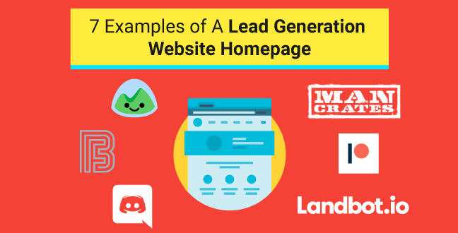
To guide visitors from the top of the funnel to the middle of it, you need to create an awesome lead generating homepage.
It is the process of warming up strangers into potential customers who are interested in your products or services.
Visitors who first visited your homepage may not know much about your brand or your products. They are at the very top of the funnel. At this stage, feeding them information is what you should aim to do. Build a relationship with them and gain their trust. When they trust you enough, they are more likely to buy from you.
“The homepage is your company’s face to the world. Increasingly, potential customers will look at your company’s online presence before doing business with you — regardless of whether they plan to close the actual sale online.” – Jakob Nielsen
The homepage often serves as a starting point. From there, visitors are guided into other pages such as product, contact us, blog, etc.
The point is: Your homepage serves as the first impression and the first chance for you to grab their attention in that short 10 – 20 seconds window.
Does that sound like a fantasy? Well, there are homepages out there that do this, and they do it amazingly well. Why don’t we see how they do it and steal a little inspiration?
*** Special Feature
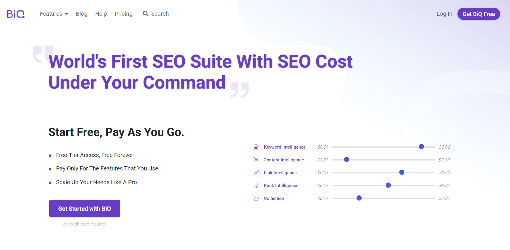
It’s important to have a landing page that allows readers to distinguish the message they are trying to bring across in one glance. And BiQ Cloud has successfully demonstrated it.
Visitors landing on this page will know that BiQ allows users to define their own SEO costs while using the tool. Straight to the point and easy to understand.
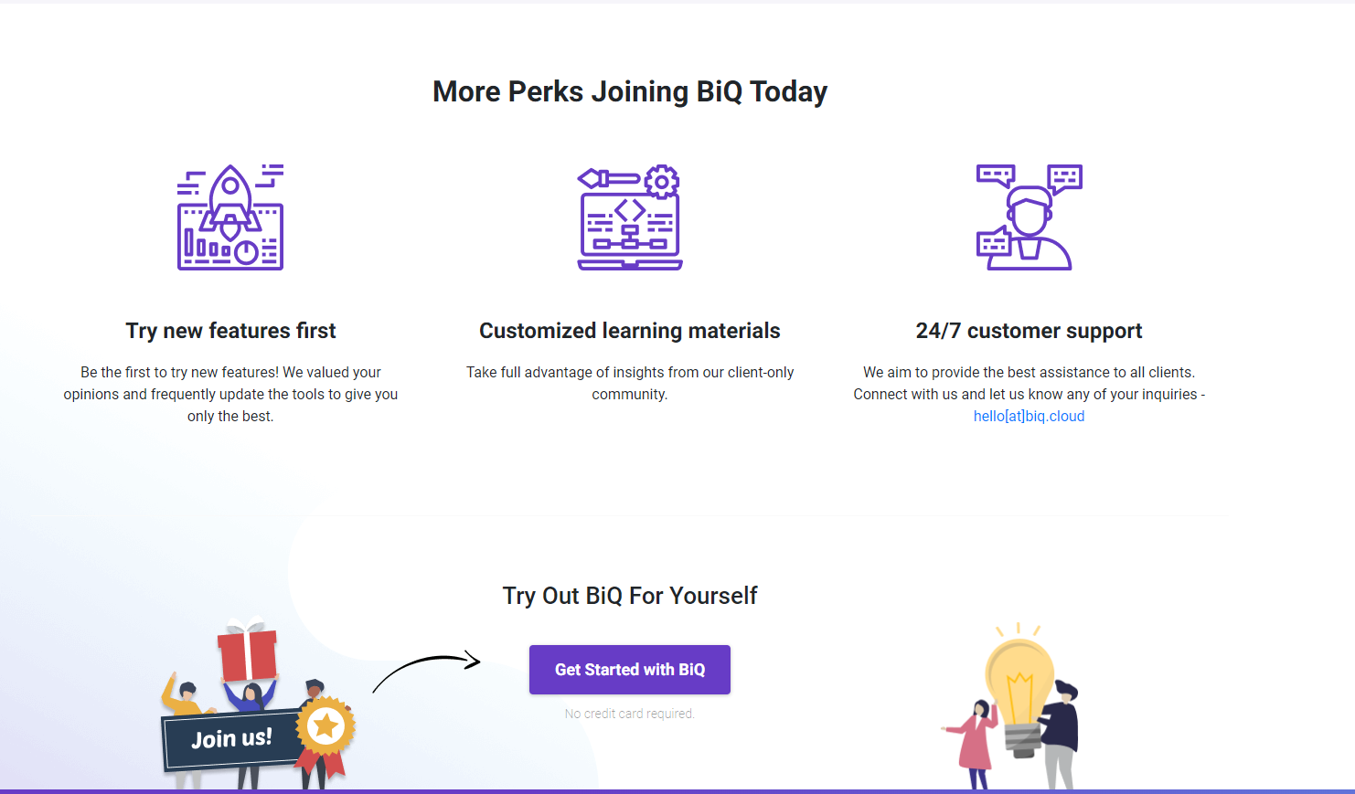
If you scroll to the bottom, you’ll come across a brief introduction to its features and finally there will be another Call-To-Action, prompting visitors to try out BiQ for themselves.
Basically, everything that a landing page needs, BiQ has it incoporated!
Go and take a look at BiQ Cloud’s homepage, maybe you can learn a thing or two from it: https://biq.cloud/
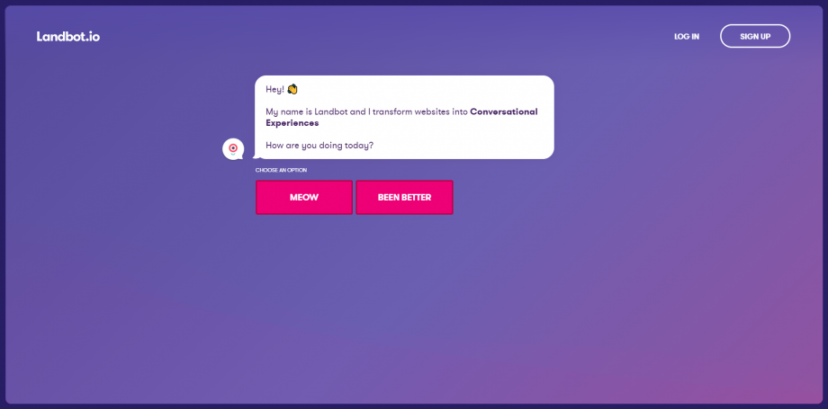
Ever scroll through a homepage, have a once over at a page full of descriptions, and still have no idea what they are selling? I know that frustration. I will also exit that webpage in a flash while sighing how they wasted my time.
Landbot does no such mistake. They tell you what they do, by showing you exactly what they do. On their homepage, you talk with a Landbot yourself. You are persuaded to sign up for a chatbot service by a chatbot.
Impressed? Register up now. Voila, lead generation nailed.
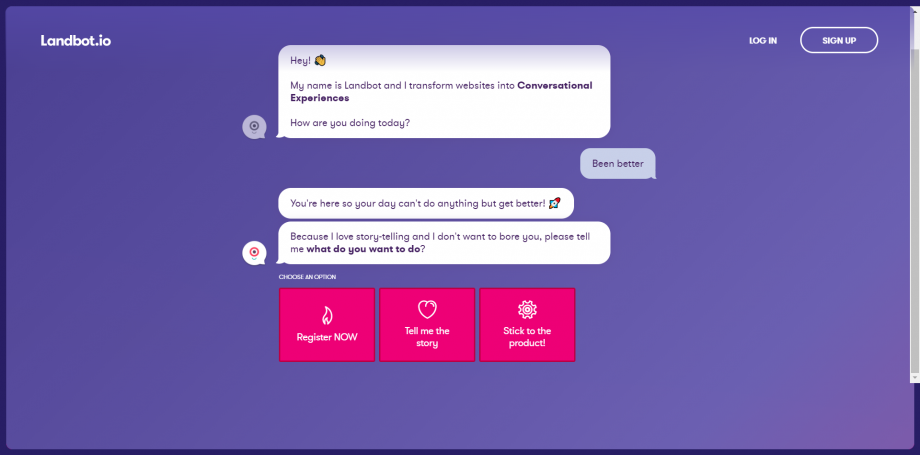
What they did right: They show you what they do, tell you what they are, ask you to sign up in a dynamic and unique way. And it all takes less than a minute.
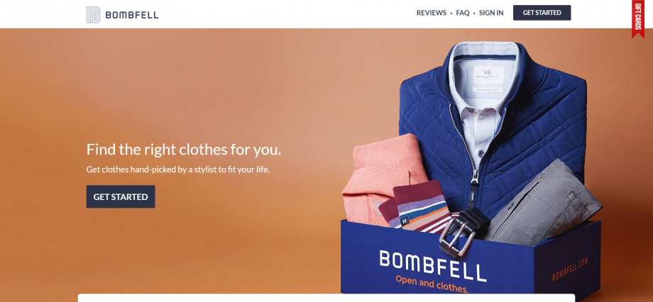
One-liner is important. It gives visitors the most impactful and relevant information in one sentence, in one second.
Bombfell did it. Compact, beautiful, and simple.
The background photo showcased what exactly their product is. Paired with a clear call-to-action.
And that’s just above the fold.
Scrolling down, there are more headers with precise and short sentences guiding visitors through the process. When you get to the end, there are more CTA that urge visitors to leads.
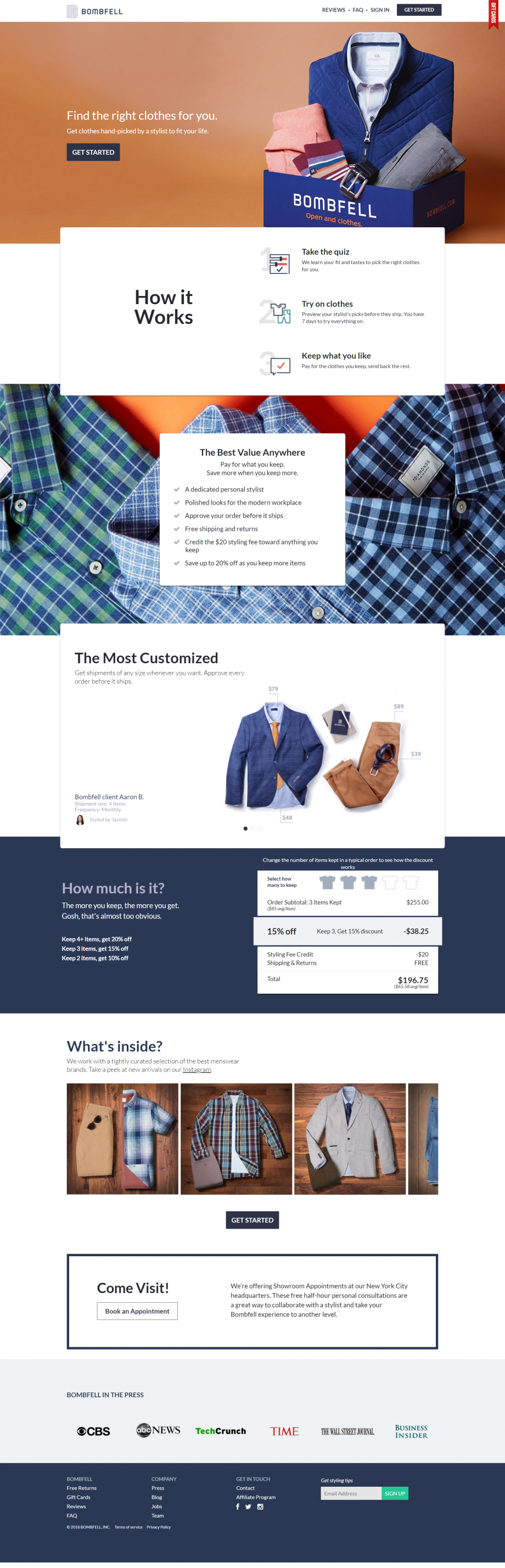
Here’s the trick: If a call-to-action doesn’t work at first, doesn’t mean it won’t work at the end. Put a call to action at the head and the end of your homepage.
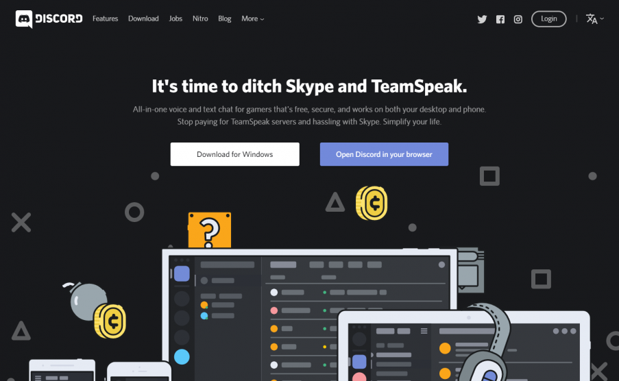
Sometimes you need to show a little character to spark interest. Discord did just that.
Discord knows exactly who its competitors are. They even addressed it directly on their homepage.
Their intent is clear: ditch them, join me, I’m better, click here to start now.
The brilliance here is how they target the pain point. Their visitors are most probably already users of their competitors. They are here to seek an alternative.
Why they need an alternative? Discord said it loud and clear. They know exactly what will drive users away from their competitors and use it into their persuasion.
The point here is: You need to know your targeted audience, you also need to know your competitors. Use your knowledge to target pain point and generate leads.
Also, learn more about how to use emphatical storytelling to improve your sales letter writing.
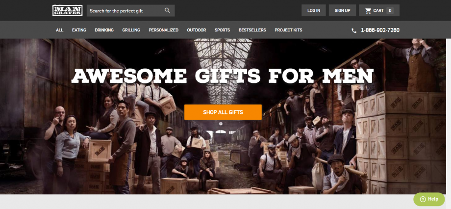
Here’s another example that is full of character.
When you have a business with such clear intent and clear targets in mind, you can go all out, all at once.
One-liner slogan paired with a clear call-to-action. The classic lead generation combination. Classic and efficient.
Scrolling down, visitors are presented with a brilliant copy that showcases the philosophy of the brand. They build an animated image in the visitor’s mind. While stressing again and again that they sell perfect gifts for men.
You are presented with more call-to-action and more enthusiastic, emphatic, and persuasive copy while you scroll to the end of the page.
Their trick is: Embrace the brand identity that was built specifically for your targeted audience. Talk to your potential customers directly and empathize with them.
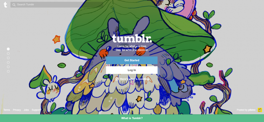
Tumblr with its 555 million monthly visitors is one of the major social media sites on the internet.
One special thing about Tumblr’s homepage is: they proudly feature a random visual creation by one of its users.
Accompanied by two simple call-to-action buttons at the center.
Scrolling down, visitors are presented with how the site works. They talk to visitors like they’re talking to a friend at school. Casual, simple, no-brainer, and really, just whatever.
One thing that they stressed throughout is how simple you can use it, and how diversely you can use it. They personified themselves as a welcoming figure of a community and casually show you the ropes.
Charmed? Sign up now and join the community. There, another successful lead generation.
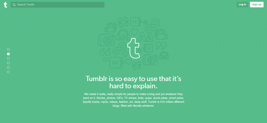
What they did: Talk to the audience not unlike talking to a friend, be friendly, be helpful. The last thing you want to do is posed as some intimidated figure and scare them out of your homepage.
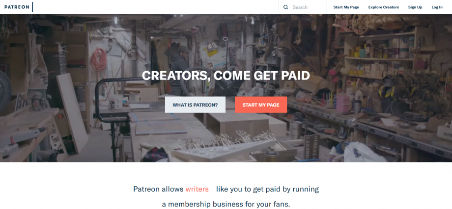
A patron is a person who supports with money, gifts, efforts, or endorsement an artist, writer, museum, cause, charity, institution, special event, or the like.
Patreon homepage sums itself up using 4 simple words. Creators, come get paid.
It’s a platform for creators and what they do is help them get paid. Concise and catchy.
Now, that’s what I call a powerful one-liner.
They address the targeted audience then attack their pain points directly. Who wouldn’t be appealed by getting paid for their creative work?
Directly under the powerful slogan, there are two call-to-action buttons. The “start my page button” in red – which creates a sense of urgency.
Scrolling down, visitors are presented with more information on their operation. Endorsement from active users and last but not least, another call to action paired up with 4 simple words: let’s get you paid.
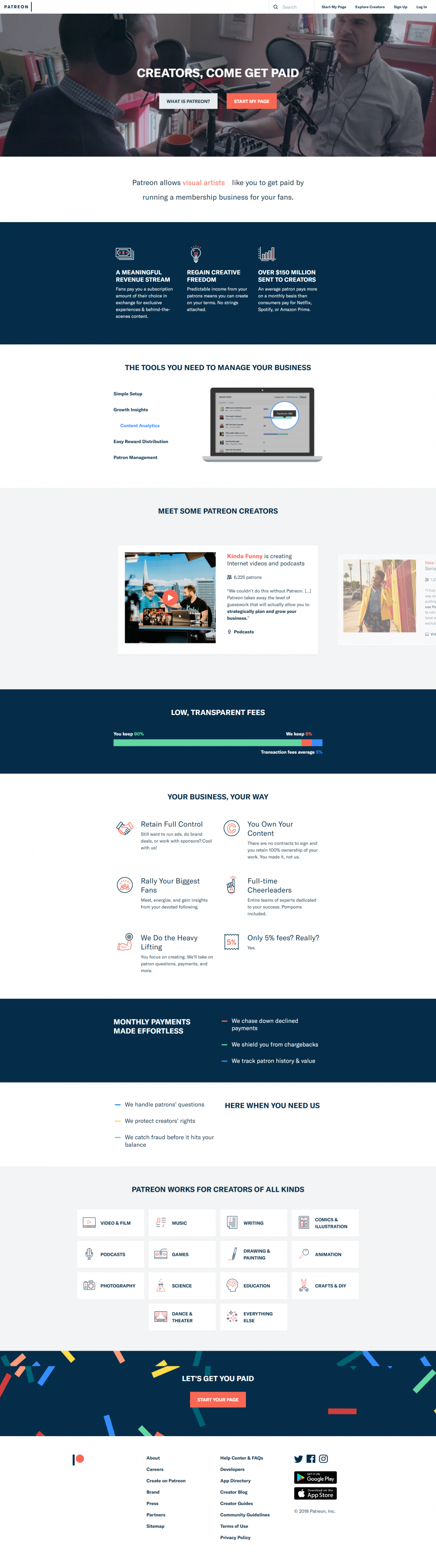
Their brilliance: Using the least words to create the most powerful and compelling partner to your call-to-action button.
Get more inspiration on crafting your CTA with our best practices here.
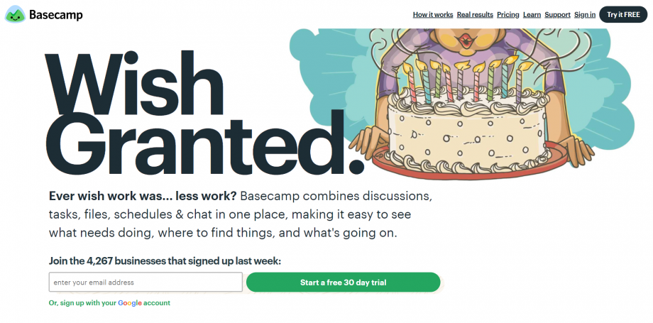
The moment someone clicks on their homepage, they’re presented with numbers.
This amount of people signed up last week, you should too. Are you still not convinced? Here are some testimonials from our users. And here’s more data on how our business grows.
Start a free 30-day trial. The call-to-action says.
Well, instead of just telling you how good they are themselves. They are using data and testimonials to back them up.
For software that is targeting businesses, they know hard facts are more convincing than crafty words. And if the amount of businesses signed up is anything to show, they are really killing that lead generation.
How they did it: Utilize cold hard data, cause customers’ heart is just as rock hard when it comes to budgeting. Regardless of how good your product works.
Updated: 14 July 2026

Struggling with internal linking?
Wish you could...

Automate internal linking
Use optimized anchor text
Fix 18 issues like orphan pages
Get link reporting and analytics


Save thousands of dollars (it’s 100x cheaper)
Zero risk of Google penalty (it’s Google-approved)
Boost your rankings (proven by case studies)
Rank High With This Link Strategy
Precise, Simplified, Fast Internal Linking.

Subscribe and receive exclusive insider tips and tricks on SEO.
Delivered to you right from the industry’s best SEO team.
Copyright © 2026 SEOPressor. All Rights Reserved.
Powered by Semantics BigData Analytics (SBDA).

