Steph W. from SEOPressor


...help you check your website and tell you exactly how to rank higher?

80
score %
SEO Score

Found us from search engine?
We rank high, you can too.
SEOPressor helps you to optimize your on-page SEO for higher & improved search ranking.
By vivian on May 25, 2017

Having great ecommerce website design can make all the difference when it comes to attracting customers. Your web design is, after all, the first thing your readers are going to see when they click through to your site.
Eye-catching colors and easy-to-read text are only the beginning! So let’s go through each design element, with some examples of the websites doing it oh-so-right.
Figuring out how you want your website to look is tricky, but it’s super rewarding in the end. Ecommerce website development is all about clean, accessible, and well-thought out design, and here are all the elements that we at SEOPressor always make sure to take into account!
Users visit your site for one reason and you want to help them get there as quickly as possible. The more clutter on your web page, the more likely your visitors will be slowed down, giving them time to change their minds. When in doubt, keep it simple!
Unnecessary ecommerce design elements to avoid here is overloading with multimedia content. Videos are great, but try not to go with more than one per page and using graphics that don’t have a clear function. We always try to avoid cluttering our site with too many products. Instead, you should make use of clear, well-segmented product categories pages. Don’t be afraid of that white space!
Colour and Typeface
We’ve learned how important colors are in branding, and about the psychology of color, but when you go about choosing your color scheme, make sure you don’t go overboard. One or two bold, simple colors offset with white is always striking.
The golden rule: keep typefaces simple. A complicated, hard-to-read typeface can turn readers away. We make sure to use an easy-to-read sans-serif font on our page and in no more than three different sizes.
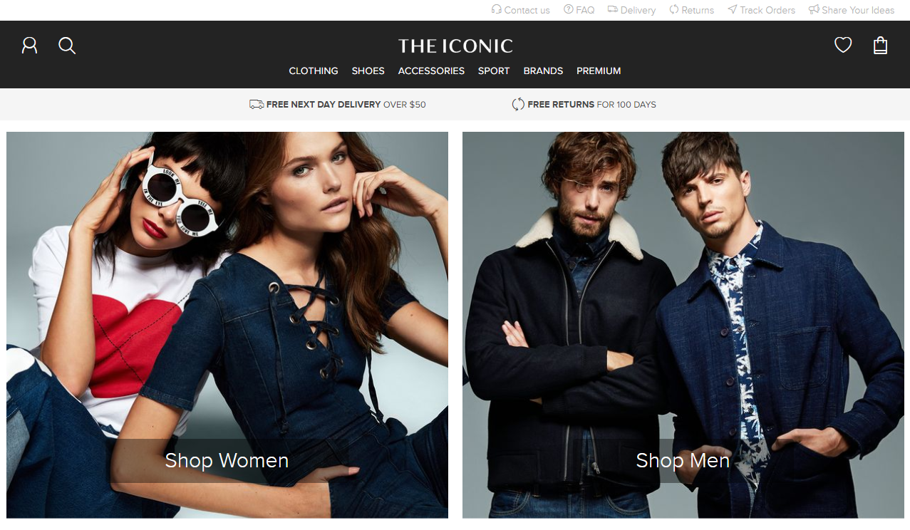
A great example of a popular website keeping it simple is the Iconic.
Design is all about communication, and visual hierarchy is all about influencing the user experience with website elements like these:

Colour
Dominant, contrasting colors (like red or black) are great for grabbing attention, so this could be the perfect color combo for a call-to-action or elements you want to emphasize.
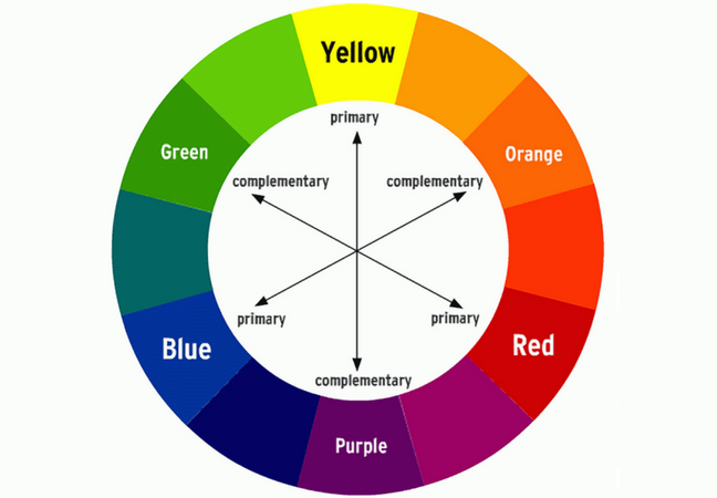
For sections lower on the visual hierarchy, a popular option is to choose different shades of your brand logo color.
Size
It goes without saying that big is noticed first. However, if certain elements are too big, they can overshadow the rest of your website content and risk making the page unbalanced. But here’s a way to help steady this balancing act: use larger text and images to showcase a promotion or featured product. If it’s something that you know a customer is going to be looking for, like a drop-down menu or an ‘About Us’, then there’s no need to go too overboard with size.
Position
A super important ecommerce website design element when it comes to creating a hierarchy. Here, we think about white space and proximity to help separate the more important elements from the others. If you have lots of content on your site, you can create hierarchy by spacing out the low-hierarchy information away from your focus elements with white space. Easy!
As they say, consistency is the key.
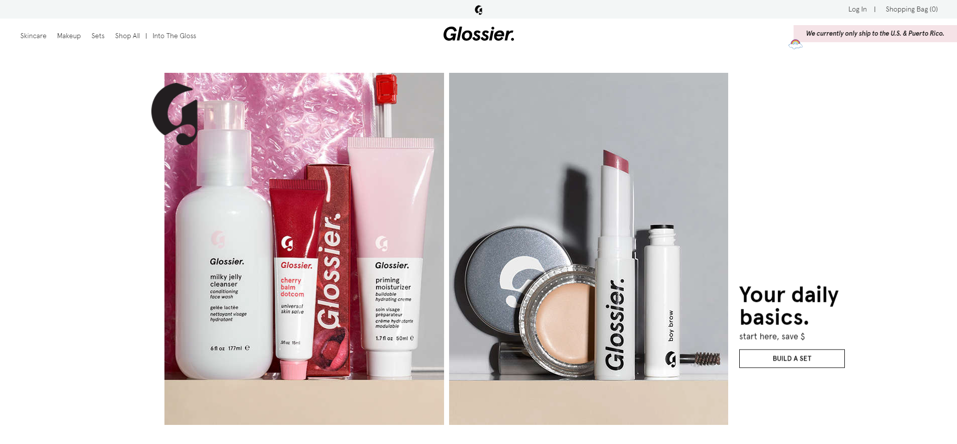
Your web page is the face of your company, and it’s important to make sure that image is consistent so that when your users think of a certain aesthetic, they think immediately of your brand.
Once you’ve chosen your color schemes and typefaces, stick to them throughout. Backgrounds should also stay the same, especially so changing backgrounds don’t distract from your content. For the same reasons, it’s also super important to keep the tone of your writing consistent.
You know I love a short and simple tip in these posts.
Check out how Helm designs their product photos for some inspirations.
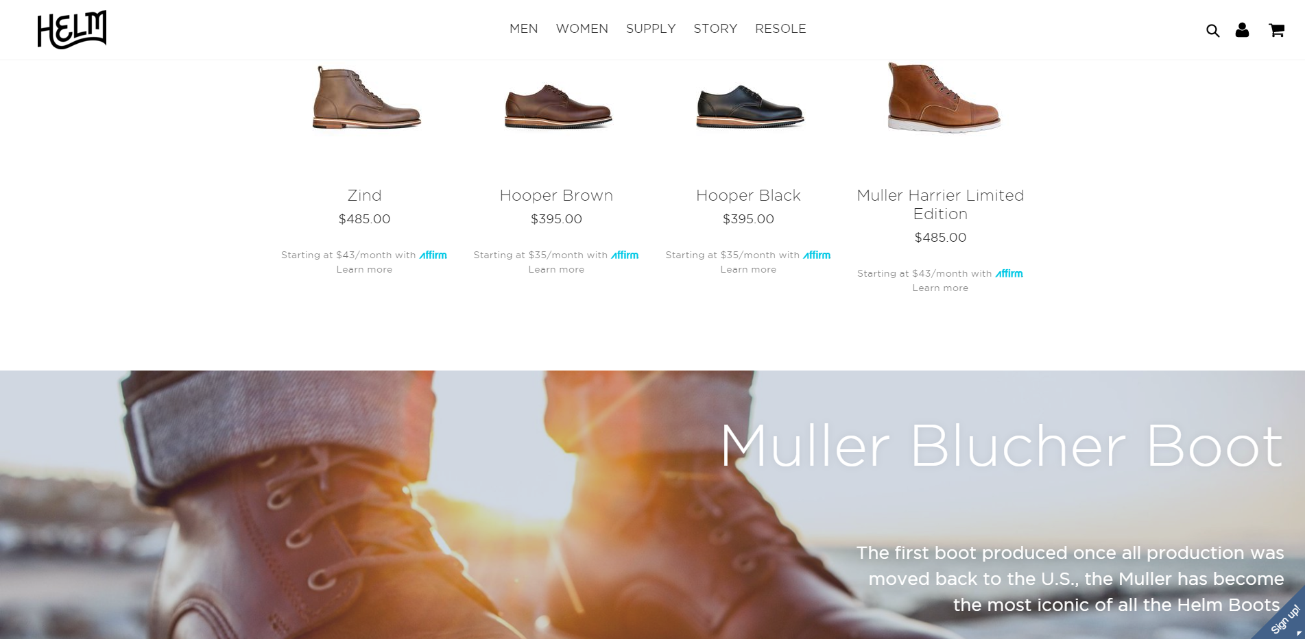
It’s been shown that users are more likely to pay attention to a product and make a purchase when the website uses high-quality images. The quality of the images will reflect the quality of your website and a beautifully composed photo of your product can make all the difference.
Now we’ve got the visuals covered, let’s get to the technical side of how to design an ecommerce website:
The best ecommerce website design makes it easy for users to get where they want to go, without thinking about it. This is called ‘intuitive design’, and here are the guidelines we follow to make sure nobody gets lost on our pages:
A site like ASOS ticks off these boxes:
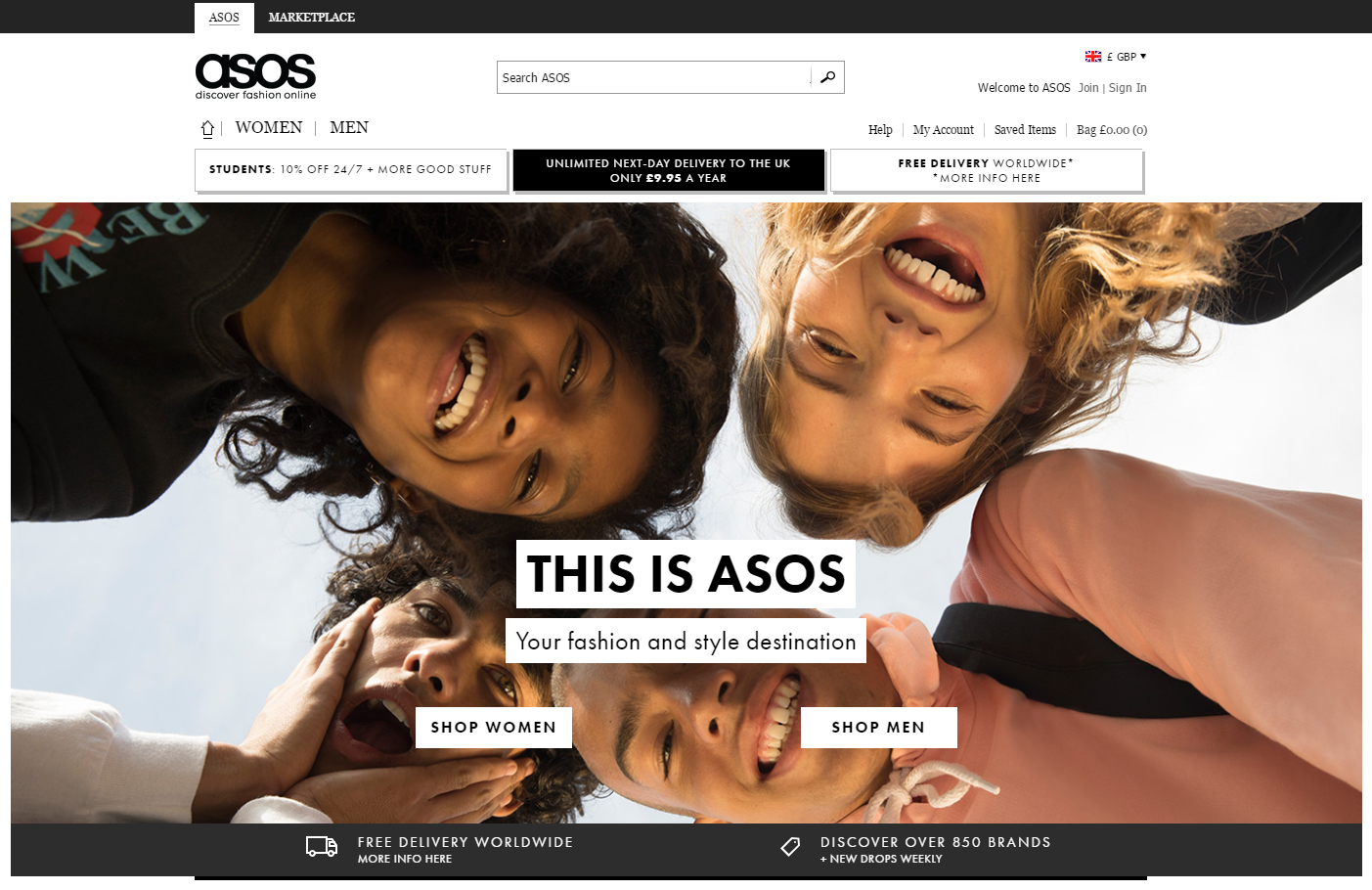
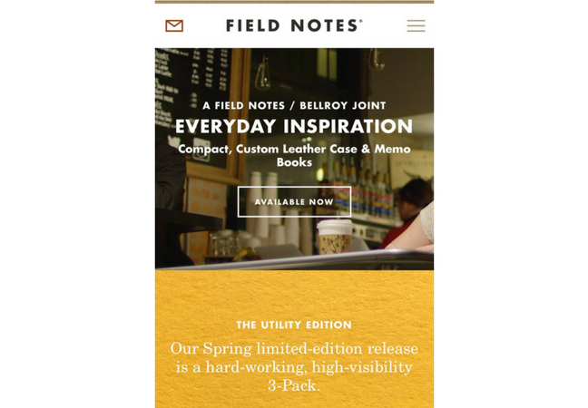
Making your web page compatible across multiple devices is super important.

Responsive site design means that whatever the content and whatever the device, my website will be resized and reshuffled to fit a user’s screen perfectly.
I’ve found that responsive design is the ticket to an accessible site. Responsive site design means that whatever the content and whatever the device, my website will be resized and reshuffled to fit a user’s screen perfectly.
No matter how unique you make your ecommerce website design, it’s best to stay conventional when it comes to the basics. Here is my number one website essentials checklist:
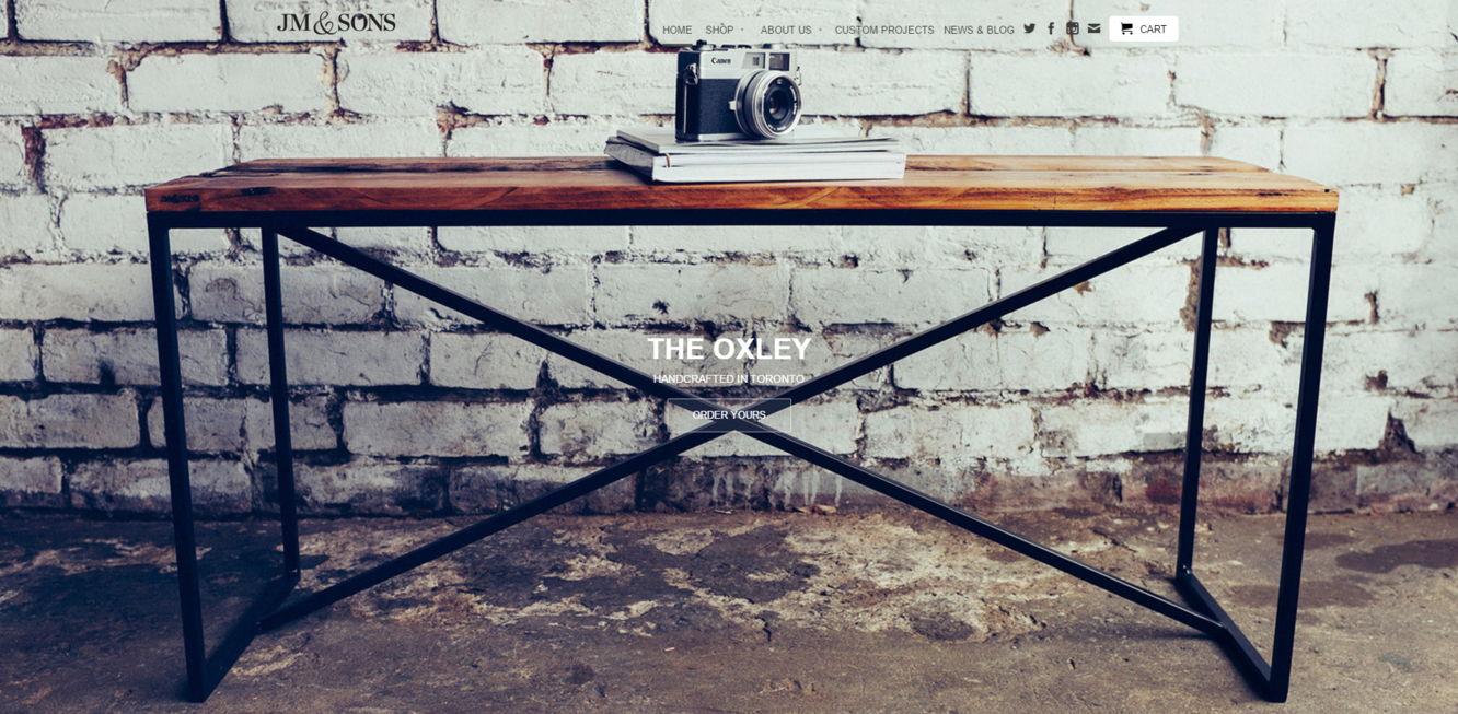
JM and Sons, which uses hugely visual ecommerce website design.
As we all know, trust plays a huge factor in the success of any ecommerce company and the number one way to promote trust and gain credibility is by being as clear and transparent as possible.
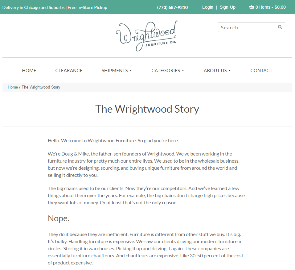
In your ‘About’ page, be as straightforward as you can. If there’s a story behind your company vision, this is a great place to include it! If your company sells services, include a pricing page too, because a pricing page often increases the legitimacy of an ecommerce site, which will build customer trust.
Check out Wrightwood Furniture as a great example for building credibility with an ‘About’ page.
In the same way, make it clear which items are available and which are out of stock. Keeping on top of your product inventory will build your company credibility. (Quick tip: for SEO purposes, if a product goes out of stock, it’s better to label it ‘out of stock’ rather than removing and then re-uploading it.)
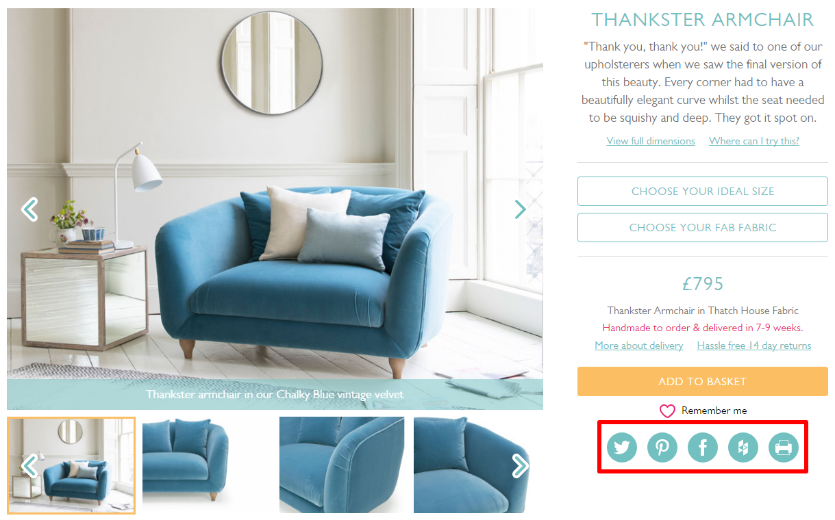
Carefully-placed social media buttons are a must-have in ecommerce website development. Choose somewhere that won’t dominate the page, but still is noticeable. The top right-hand and bottom right-hand corners are great placement options.
Just look at how Loaf includes social media buttons on each product page so that users can easily share individual products across their social media networks:
As an ecommerce site with plenty of images, you’ll want to take advantage of these other ecommerce platforms.
One example, Pinterest is often an underestimated marketing tool, but insiders know that being on Pinterest gives you great internet presence, and boosts your Google-ability. If you have beautiful, high-quality images, a simple click, and pin of your product can make your business known to thousands more.
Considering product previews in your ecommerce website design is great for when visitors are hunting down a certain product. A quick preview that doesn’t require a user to click through makes browsing a whole lot easier, and also means a visitor is more likely to stay on your page longer.
If you’re looking for inspiration and for a site that goes the extra mile, PaletteApp has great interactive product previews.
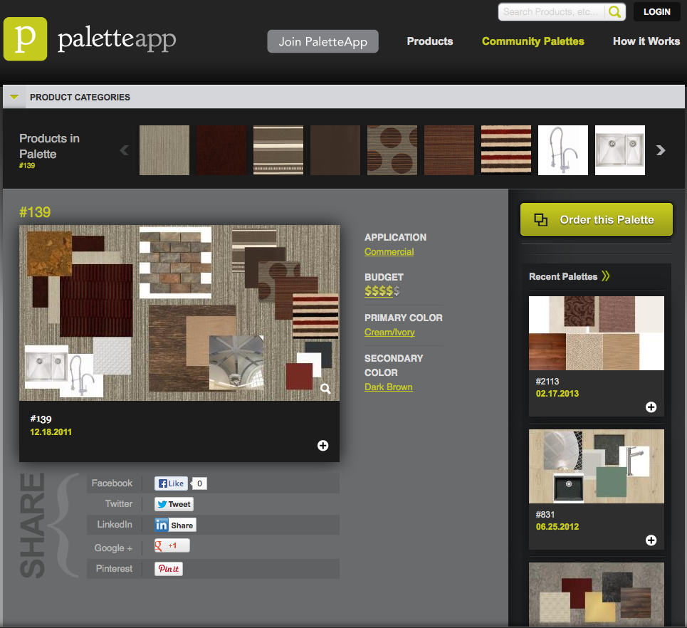
By adding a preview to your category and search pages, whether a larger version of the image or a detailed 360-degree view, you can engage your user’s attention by making the most use of your product’s visuals.
When your ecommerce website design is good to go, the next step is adding a newsletter signup form so you can get to building that email list. This element is a super important one to keep your customers engaged and returning to your site again and again.
When developing your signup form, make sure it matches your color scheme and aesthetic. A visually beautiful form that engages your audience means that they won’t immediately see a pop-up and close it straight away (we’ve all been there).
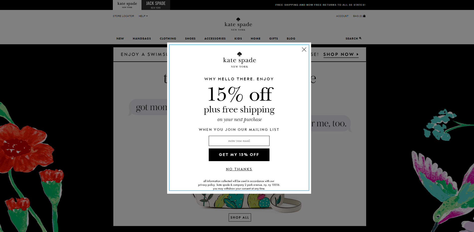
You can read all about making your form stand out from the rest in our email marketing campaign guide.
Phew! We’ve covered the most important elements of ecommerce website development, but I wanted to save my personal favorite insider quick tips for last. Here we go:
So there you have it! The top visual and technical elements you can use to create the best ecommerce website design for your business. And, if that’s not enough and you’re ready to go an extra step further, here’s how you can use your beautifully-designed website to boost sales.
Which of these are the most important elements for you? Or is there one we’ve missed on that you know works, and have an insider tip you’d like to share? Drop a comment down below, and let’s get this conversation started!
Related Links:
Updated: 27 April 2026


Save thousands of dollars (it’s 100x cheaper)

Zero risk of Google penalty (it’s Google-approved)

Boost your rankings (proven by case studies)
Rank High With This Link Strategy
Precise, Simplified, Fast Internal Linking.
