Steph W. from SEOPressor


...help you check your website and tell you exactly how to rank higher?

81
score %
SEO Score

Found us from search engine?
We rank high, you can too.
SEOPressor helps you to optimize your on-page SEO for higher & improved search ranking.
By winniewong on June 22, 2015
If you’ve created a website, you probably realize that designing a website takes a lot of thought.
But one page that we often overlook when creating a website is the FAQ page. What we don’t realize is that the frequently asked question page is actually the most efficient page in converting sales. Having a well-written FAQ page can actually help convert visitors to customers, especially if they are still sitting on the fence because of some question or doubts about your product.
It’s a great feeling for them to know someone anticipated their question in advance and provided the answer. Setting up an effective FAQ page is more than just posting a bunch of questions and answers.

It may seem like having your selling points on one page is enough, but there are a couple of reasons why they should be on your FAQ page as well as elsewhere on the site.
First, people don’t always read every word on a page and may have missed the information.
Second, repetition never hurts when it comes to trying to convince someone to do something. By repeating information they may have read elsewhere, it refreshes the point in their mind.
Lastly, people are unpredictable when it comes to knowing what pages they will view and in what order.
By placing the important selling points on this page, you are sure to get people who may not have visited other pages yet.

Regardless of the product or service, people are going to have objections.
For example: Your price is higher than competitors, you don’t offer as many colors and numerous other objections, etc.
Use your FAQ page to answer these objections before they are made. You can explain that the quality is greater or that you offer a certain feature that is far better than color choice.
Answer the objections and point out all the great features at the same time. Doing this here, you can avoid sounding too pushy in regards to a sales pitch. You are simply pointing out why you differ from your competition.
People can’t become customers if they can’t find you. You want to be as close to the top of Google or Bing search results in order to get the most traffic.
Naturally, FAQ pages are search engine friendly due to its nature of being wordy, packed with useful information and having high keyword density.
Just take SEOPressor’s FAQ page for example. Even though the page was done a long time ago and hasn’t been updated since, it is still bringing us a handful of quality search traffic every month.
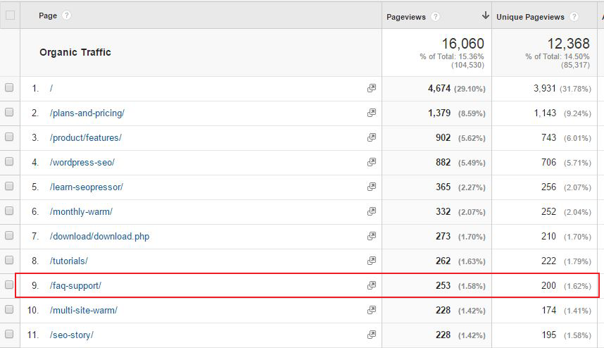
Now imagine if we made some design improvements to the page and increase the number of questions on it (which we are doing right now), I’m confident that we’ll be able to ramp up those monthly organic traffic by a significant amount.
So, you’ll want to make use of this advantage to get more organic traffic, and hopefully convert them into sales.
This can be done easier with an FAQ page that is interesting and optimized. Search engines are more likely to give a higher ranking to a page that is informative and provides easily-retrieved information.
This is exactly where having a number of relevant questions comes into play. You can provide more variety in regards to information, making it more interesting, here.
Another thing that helps in regards to search engine ranking is that you can word questions and answers to include your keywords naturally. The more often you can include the keywords naturally, the more likely it will be for search engines to pick up your page.

The last thing you want your visitors to do when looking for an answer is to give up searching for them because it is so difficult to locate the answer.
It is important to keep your page organized in a way that will make it easy for visitors to find what they seek.
One way to do this is to group your questions in categories that will help direct those seeking answers. If there are a large number of questions, making the questions clickable with the ability to expand and show the answer will help keep things easier.
Don’t make your page too “busy” and include plenty of white space to make it appear more organized.
Lulu’s Help is the perfect example of an organized FAQ.
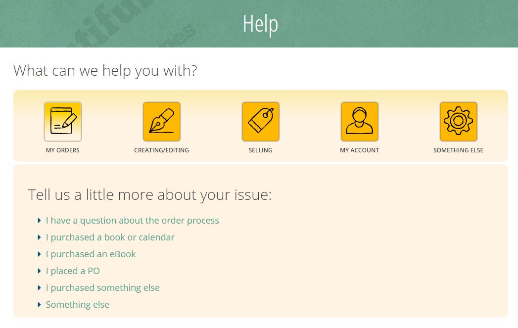
Notice how there are five main categories to choose from across the top. Once you click on a category, more choices appear in a drop-down menu.
This narrowing down continues through several stages until your question is targeted. The page is simple, straight-forward, easy to navigate and organized in a way that makes finding an answer easy.
![]()
Easy navigation is always a big plus.
By including relevant links in your answers, you help visitors find pages that they might miss, discover things that they didn’t know they were looking for and make it simple to find your main page, contact page, and ordering page.
You can also add links to pages that may provide more in-depth answers, making sure that the visitor is thoroughly satisfied that their question is answered.
Take a look at this GoDaddy page.
It gives brief answers, but the questions are clickable and take visitors to a page like this one.
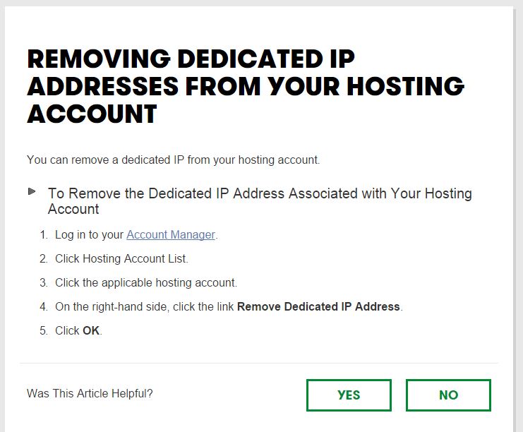
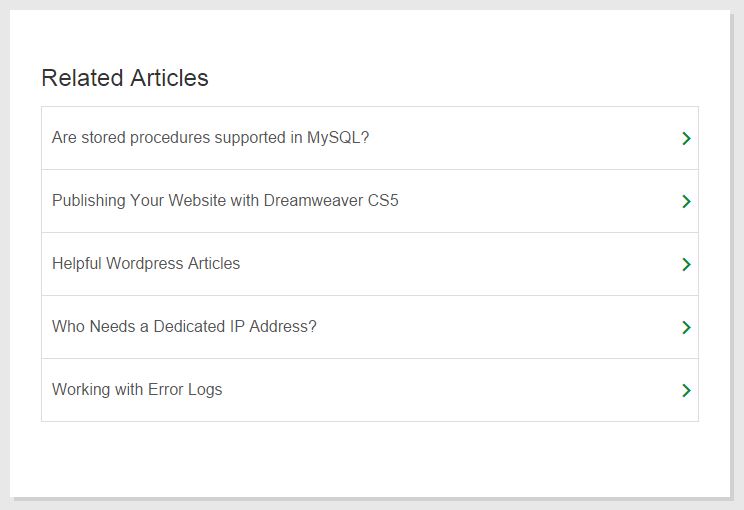
Notice how the answers are not only more detailed, but they also include a list of relevant articles to help users find more information with ease.

If you don’t ask, the answer is always no. When it comes to getting people to spend their money, this is often the case.
What happens after your visitors have read through your FAQ page and is convinced by you? A person may simply leave a site, but if you add a call-to-action on your FAQ page, it is more of an incentive to make a purchase.
People are psychologically conditioned from birth to do what is asked of them and a call-to-action will strike many on a subconscious level and encourage them to take that next step.
Threadless adds a CTA on it’s pages. When you click on one of the questions, you are taken to a page like this one.
Not only does it answer the question in a simple manner–and uses both charts and video to make it easier, but you will notice the links to important pages easily visible on the left. At the bottom of the page, they invite visitors to email the answer and also to subscribe to their mailings.
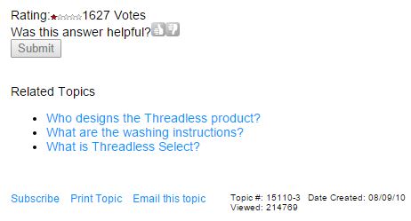
While the CTA isn’t a “buy this” button, it directs the visitor toward taking a step forward by leaving an email contact.
Don’t just put up an FAQ page and then forget about it. Your FAQ page is the easiest place for you to add any new information, products or services that you want to bring attention to.
So make sure you update your answers whenever you have a new product feature or a new company policy.
It is easy to come up with a question or two that can be linked to this new content. Search engines love new information and if you can regularly add new questions and answers or update existing answers to your page, you increase the chances of it being scanned and of your new content being found and indexed.
While you want to answer as many questions as possible in advance, you want all the answers to actually be valuable.
Don’t include questions that are not likely asked by visitors or questions that don’t add valuable insight into you, your company or your product. In this case, more does not equate with better.
What counts is making every question valuable. You also don’t want to include so much that people can’t find the information they are looking for without wading through hundreds of unrelated questions. You don’t want your visitors to become so overwhelmed that they go elsewhere for the answers they seek.
When we talk about overdoing, design is also being concerned. The designers of Bet Your Follower might have overdone it with their choice of color.

Reading white text on dark background from the screen is especially strainful and difficult on the eyes. A page that is meant for reading such as a blog page or FAQ page is recommended to have light background and dark text.
As a general rule of thumb, you should keep the design elements of your FAQ page to a minimal. An FAQ page shouldn’t be clouded with designs that the information are being drowned in it. Remember, any design element that doesn’t serve a purpose is just noise.
This should be common sense. When a person comes to your FAQ page, they are looking for some sort solution or clarification. Hence, you’ll want to solve their problems and not have them leave your FAQ page with more questions.
This is even more important if your industry involves a lot of specialized terms that the average visitor may not understand.
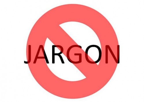
It is safe to assume that your visitors have basic knowledge about the product or services you provide. Don’t talk down to them, but also assume they don’t have everyday knowledge of technical terms or industry jargon and avoid these as much as possible. If a term that may be unfamiliar can’t be avoided, provide a brief explanation and then continue.
Short sentences work better than long, complex ones. It helps if you read your answers out loud before posting them. You will get a better idea of how they flow and if they seem a bit complicated to understand.
Read “How To Write In Conversational Tone To Increase Readership”.

Besides organizing your frequently asked questions into subfolders for easy navigation, adding a search bar in your FAQ page helps a ton. This is especially important if you are running a complicated or new business model where people tend to have more questions, hence your FAQ page will be crowded.
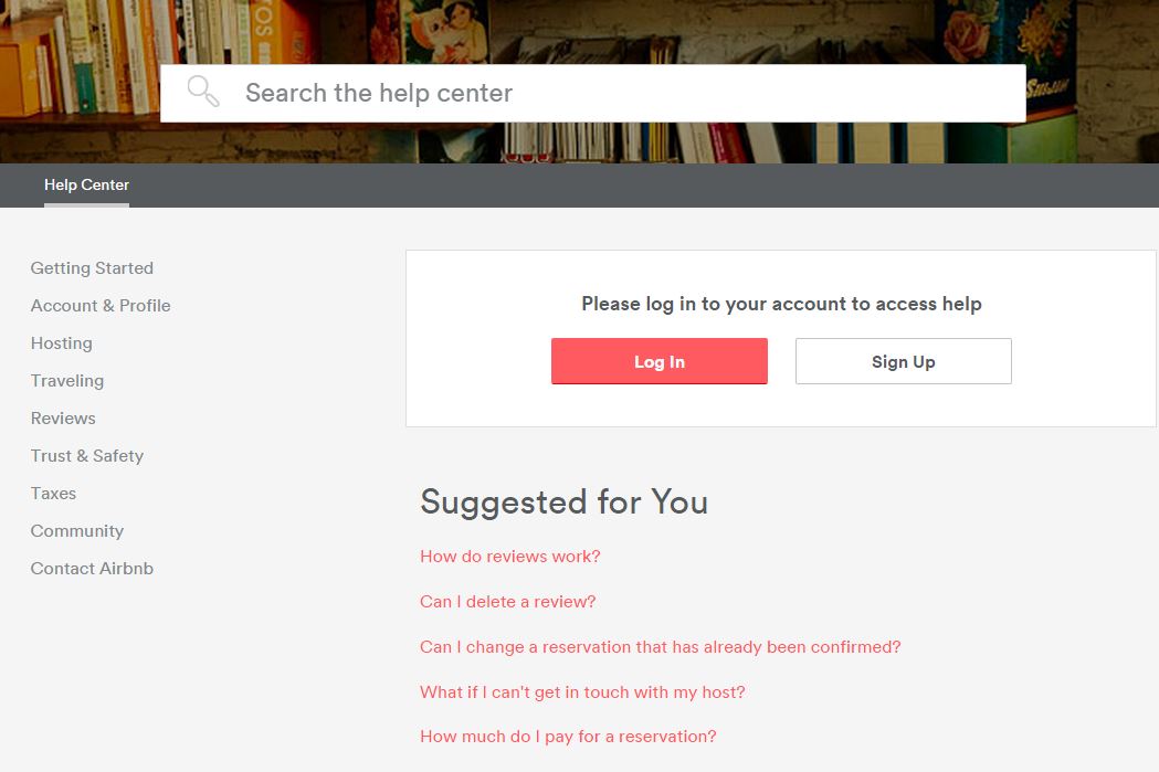
Take for example Airbnb’s FAQ page. They have a search bar right on the top that is impossible to miss. Since they have so many questions and answers, it is difficult for readers to locate what they’re searching for even though the questions are all well organized into folders and subfolders.
By providing a search bar, you make it easier for visitors to find the information they most seek.
This conveys the message that their time and convenience is important to you and helps build the trust necessary to want to do business with you.
It helps eliminate the frustration that can send them elsewhere. With search enabled, you also can provide more information, knowing that it will be easier to find than simply scrolling through the page.
A well-organized and informative FAQ page can be one of the best tools in your marketing toolbox. Don’t neglect it.
Following even a few of the above hints will help increase the effectiveness of your FAQ page. And if you put all of them in action, you are well on your way to having a great FAQ page that increases your organic traffic as well as conversion rate significantly.
Related Links:
How To Create The Perfect About Page For Your Business Website
How Does a Small Blog Adopt Brand Strategies to Build Strong Community?
Tricks To Beat Banner Blindness: Never Let Your Ads Be Ignored Again
[This blog post was originally written and published by Zhi Yuan on June 22, 2015. It is most recently updated by Winnie on Jun 02, 2020]
Updated: 2 April 2026


Save thousands of dollars (it’s 100x cheaper)

Zero risk of Google penalty (it’s Google-approved)

Boost your rankings (proven by case studies)
Rank High With This Link Strategy
Precise, Simplified, Fast Internal Linking.
