Steph W. from SEOPressor


...help you check your website and tell you exactly how to rank higher?

82
score %
SEO Score
Found us from search engine?
We rank high, you can too.
SEOPressor helps you to optimize your on-page SEO for higher & improved search ranking.
By winniewong on January 28, 2016
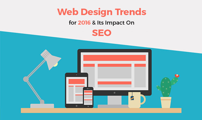
Web design trends are like snow, they come and go every year. Some of them last longer and some of them doesn’t. But no matter how cool they are, they will eventually fade away.
The thing about web design trends is, they are usually not that good for your SEO. You see, designing website is the job of a designer, and normally, designers don’t really care about SEO. And you can’t blame them because they are paid to make a website look cool and beautiful, not paid to make a website rank well. That’s what people pay SEO agencies to do.
Which explains why most of the design trends are not really SEO friendly. To help you identify which of these trends are beneficial for your website’s SEO and which of them are harmful, we’ve compiled the following list of web design trends below and analyzed them.
One page website was one of the biggest trends in recent years and it’s a not hard to see why. They’re easy to navigate and straightforward for the users. Additionally, it allows you to focus on optimizing for just a few keywords. Today, however, Google has drastically increased the importance of internal link profiles.
The point is, when you have just one page, it’s impossible to have any internal links – so you’re missing out on one of the important factors of good web design.
Additionally, Google rates the importance of a website by the number of pages indexed. As long as your pages aren’t spammy, the more of them you have indexed, the better. Obviously, a single page website cannot do very well with this metric.
Finally, having a single page website also mean that your readers have to load all the content available every time they open your website, which will increase the page load time significantly. And having a long page load time is harmful to your SEO and increase the exit rate of your website.
The verdict? One page website might be trendy and cool, but they have no place in SEO.

You’ve known about the importance of mobile optimization for several years now. Well, 2016 is the year you must make your website mobile friendly. Statistics show that more people are using their Smartphones and Tablets to search Google than are using desktops.
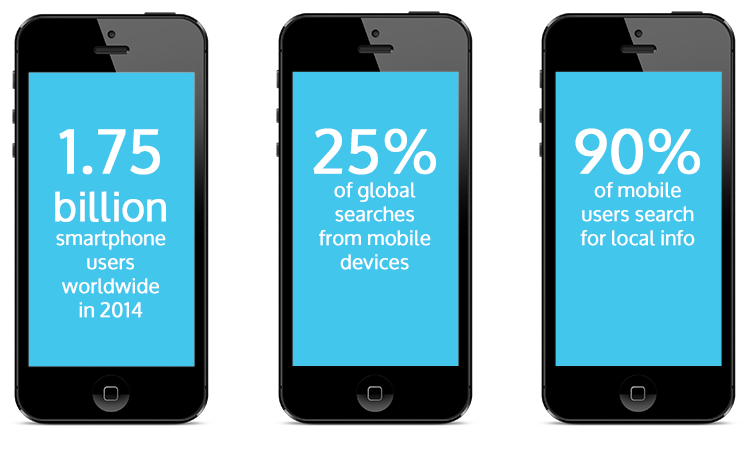
The first thing you must do is make sure your website theme is responsive so that the template alters its size as the screen gets smaller. People will navigate away from your page if they have to do a lot of scrolling, and you’ll lose business.
One of the best things you can do to increase your on-site metrics is to embrace a minimalist design. The top websites started doing this just a few years ago, and have since touted the benefits it has for SEO.
People want useful content quickly; when you have too much going on, this distracts them from the goal. Much like procuring great content, having an easy-to-navigate page will be good for SEO for a long time.
There are several ways to do this, and most of them incorporate good design. For example, Search Engine Watch states that using a Gaussian blur technique can speed up your page load times by almost one-third. This was first discovered by Facebook programmers and involves making your background images load in steps.
So, once someone lands on your page, the foreground loads quickly, and the background loads in steps. It’s a cool visual effect that also helps content render much more quickly.
Just think about what annoys you when you visit someone else’s website. There you are, just getting into reading, and a pop-up replaces the text, asking you to enter your email address before you even know if the on-page content is worth reading through. I don’t know about you, but I navigate away from such pages immediately.
The lesson here is, don’t badger people to sign up without offering them a concrete reason why. Let them read the page first, to see if you’ve actually provided useful content – then, add an opt-in form at the end.
At the very least, program your page such that an on-page pop-up appears after a minute or two – enough time for your readers to have checked out the bulk of your content. The immediate opt-in took root last year; in 2016, it’s time to leave such practices behind.
You’ve seen the feature – Pinterest, Tumblr, Facebook and just about every other social media website have them. Instead of having single pages end and begin, the infinite scroll saves readers time by putting a lot of content on a single, very long page. Social media is huge and growing steadily larger; it makes sense to incorporate one of their most successful features.
Furthermore, the mobile environment incorporates scrolling pages almost exclusively. Since most people conduct searches using their mobile devices these days, it makes sense for your website to be easily navigable. Scrolling pages look better – when done right – and allow the user to focus on the content you want them to see.
Tile design is one of the most popular design these days, you’ll see it almost everywhere. Tile design was made popular by Microsoft when they introduced Windows 8.
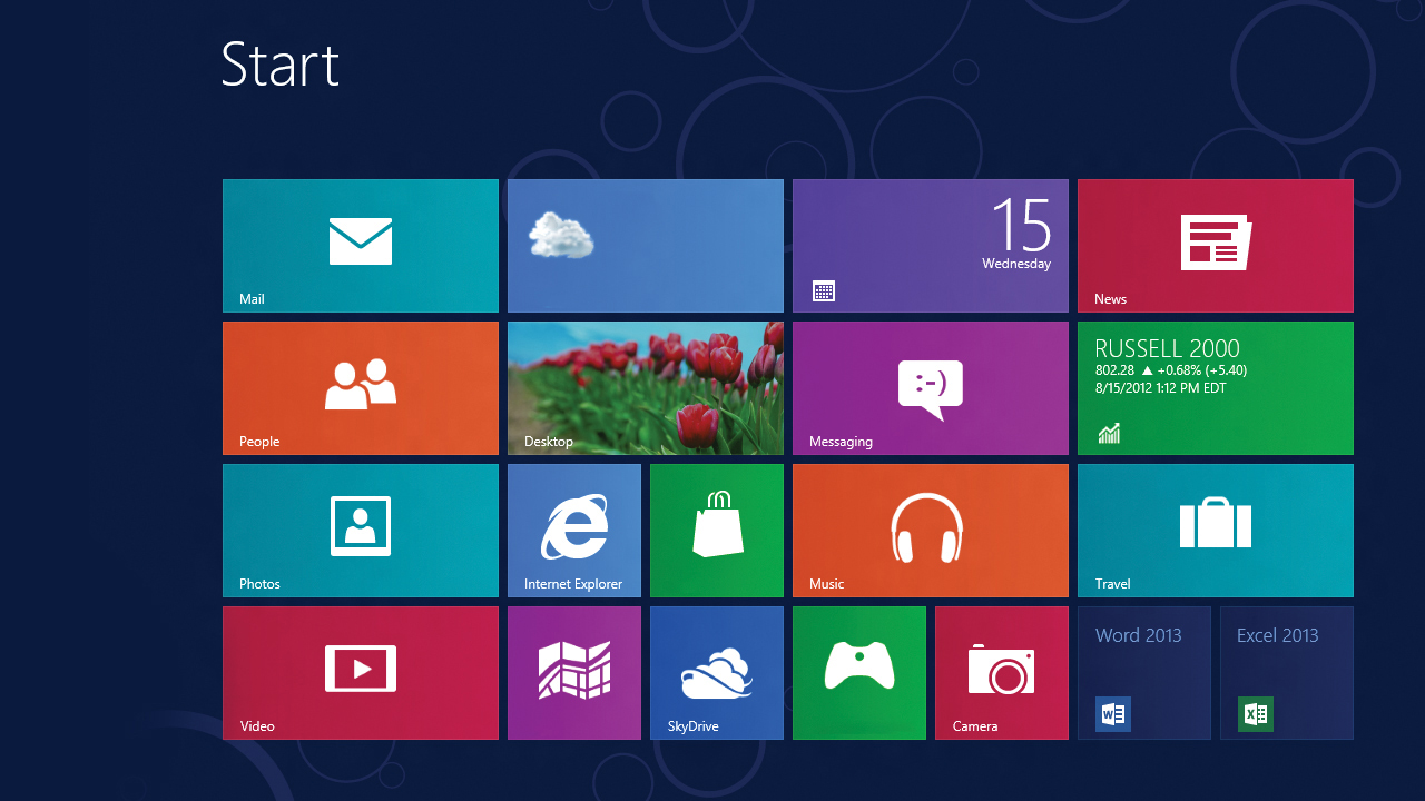
Billions of people still visit websites using traditional computers, and the so-called board design is growing in popularity. Basically, your site looks like a collection of cards. There’s a prominent image, and text beneath it.
To get an idea what this looks like, visit almost any popular news website, or Pinterest. It makes for easy site organization for you, and easy navigation for your viewers. To have the best of both worlds, find a WordPress theme that displays the board design when viewed on a desktop computer, and switches to an infinite scroll when viewed on a Smartphone.
Content is king – always. The only thing that changes is how you provide it. These days, it is becoming more and more important to tell your visitors what to do, without wasting time with long, winding intros. If you can fulfill a need, then you’ve got a great chance at repeat visitors.
One technique is to tell write as though you’re telling a story to the person sitting next to you. Plenty of websites talk about what they can offer; can you convey a similar message in a storytelling format that resonates with your readers?
Think of how you implemented certain SEO methods, yourself, and relay the results to the audience, for example. If you’re selling a product, explain what the product does immediately, and how they need it.
The same thing goes for the carousel. Why? Because metrics show that people simply don’t read them. For some reason or another, readers tend to skip over banners in a slideshow. It may seem like a shortcut to you, because it lets you squeeze more information into a space; but the numbers do not lie – no one wants to scroll through them.
Additionally, the code for carousels takes extra time to load, so ditching them increases your page load times – which is always good for SEO.
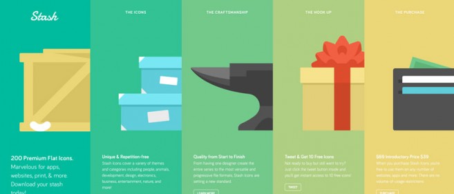
The number one reason for this is image size. Flat images are a part of the minimalist movement in SEO web design, and for good reason. The smaller images mean your site loads faster, for one. Secondly, flat pictures translate much better to the mobile environment. When going from the desktop to the Tablet, you want categories and buttons to scale appropriately – and flat design incorporates this seamlessly.
Flat design also has an appealing simplistic quality. All those drop shadows and extra design elements are gone, allowing the content to dominate. An attractive image gets the ball rolling by prioritizing content and eliminating extra code.
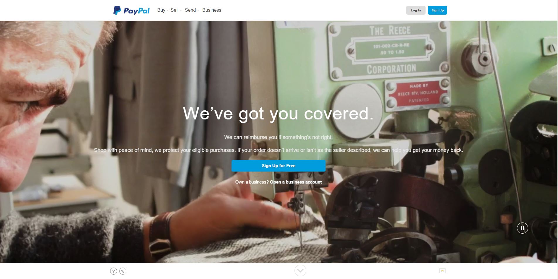
As evidence that this works, just check out PayPal.com. You’ve noticed the video in the background of the site, and how it draws and keeps your attention, right? This tactic works across any industry when it is relevant to the services you provide. In terms of SEO, it keeps people on the website for longer periods of time. Fact is; people would rather watch something than read – just look at the popularity of YouTube.
This final SEO design trend is related to content marketing and human psychology. Even though you may have many things you want your visitors to do, it is imperative that you present to them as few options as possible.
Sheena Iyengar of Columbia Business School gave a TED talk on the importance of smoothing out the decision-making process for consumers. Help them narrow down the choices available, and you’ll see your click rates go up for your most important services.
Secondly, Google’s latest update appears to downgrade sites with too many subcategories. This is a response to peoples’ interaction with the search engine, so it makes sense to start providing them with what they want. Decide what’s most important, and diminish the number of actions it takes to get there.
In conclusion, always think of your readers first, and implement the SEO web design that optimizes your website for them. Keep abreast of your Analytics, so that you can see what works and what doesn’t. Although SEO is dynamic, one thing never changes: Google will reward sites that produce content that the audience is interacting with.
Related Links:
Updated: 26 March 2026


Save thousands of dollars (it’s 100x cheaper)

Zero risk of Google penalty (it’s Google-approved)

Boost your rankings (proven by case studies)
Rank High With This Link Strategy
Precise, Simplified, Fast Internal Linking.
