1
Steph W. from SEOPressor

👋 Hey there! Would you like to try out this New AI-Powered App that'll...
...help you check your website and tell you exactly how to rank higher?

78
score %
SEO Score

Found us from search engine?
We rank high, you can too.
SEOPressor helps you to optimize your on-page SEO for higher & improved search ranking.
By allysa on October 1, 2015

If you’ve had a website up since at least the beginning of the year, then you probably remember how online marketers were scrambling all over the place in preparation for the release of the Google mobile-friendly algorithm update.
It was released on April 22nd of 2015 and while it certainly changed the online marketing landscape, it wasn’t the seismic shift that everyone thought it was going to be, nor did it end up becoming the “mobilegeddon” that everyone anticipated.
Sure, mobile optimization became more important than ever, but it didn’t exactly cause websites to crash and burn because they weren’t fully mobile-friendly either.
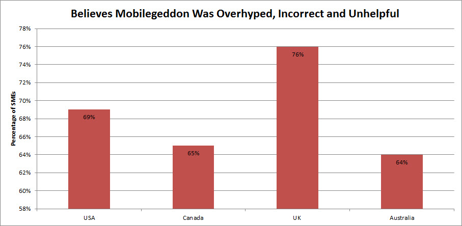
According to a survey by Koozai , the majority of SMEs believe that Mobilegeddon was overhyped.
[bof_display_offer id=7549]
One of the biggest worries about “mobilegeddon” was that Google was going to start ranking mobile-friendly websites higher on their search results pages, leaving non-mobile-friendly websites behind in the dust. This was expected to be particularly damaging to smaller businesses that didn’t have the resources to create a responsive website design or a separate mobile version of their website.
This isn’t exactly what the Google mobile-friendly algorithm update does. Yes, the algorithm does rank mobile-friendly websites higher now – but only for mobile searches, which – once you think about it – is completely logical.
Google Mobile-friendly Algorithm recognizes and labels mobile-friendly sites and prioritize them in mobile searches.
Websites that doesn’t target mobile users – for example, websites that publishes long, in-depth research papers – aren’t going to be punished. Their ranking will remain the same for searches done via desktop or laptop. However, their ranking will drop for searches done on mobile devices. This won’t affect websites whose audiences aren’t searching for them on mobile devices.
Think of regular search (done on desktops and laptops) and mobile search (done on mobile devices such as smartphones and tablets) as two completely different types of searches. The algorithm update, so lovingly nicknamed as “mobilegeddon,” only affects the mobile search. So how does Google determine whether a website is mobile-friendly? According to Google, they look for the following:
Websites that use mobile-friendly software. Some software, such as Flash, won’t render properly on mobile devices.

Mobile-friendly sites doesn’t require you to zoom-in or scroll horizontally to read the contents.
| For more tips on making your website mobile-friendly: “10 Simple Ways To Make Your Website Mobile-Friendly”. |
|---|
You might be breathing a sigh of relief knowing that your regular search ranking won’t be affected, so that all that hard work put into your online marketing strategy won’t go to waste, but that doesn’t mean that you don’t need to worry about your mobile search ranking.
There’s a very good reason why Google released its mobile-friendly algorithm update, after all – Google understands that more and more of its users are performing search queries on mobile devices. Just consider some of this data concerning mobile use:
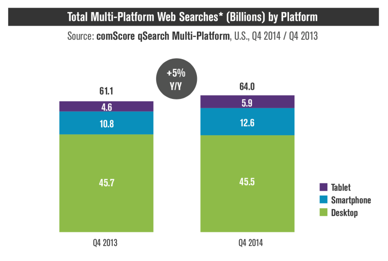
Mobile queries (tablets + smartphones) were roughly 29 percent of total search volumes.

Mobile users most of the time are already on the move and their search are related to what they are trying to accomplish that very moment.
Not only are more and more people buying smartphones, a large majority of those smartphone users are performing search queries using their mobile devices in addition to or instead of their desktops. Keeping all of this data in mind, it only makes sense that Google would adjust its mobile search so that mobile users are provided with better search results. Mobile users are not going to want to waste their time clicking on ranked websites that aren’t mobile friendly, after all.
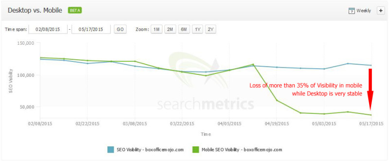
Even though desktop search ranking remains stable post-Mobilegeddon, a drop of ranking in mobile search can hurt you if they contribute to a lot of your traffic.
Hopefully, you now have a basic understanding of how the new Google mobile-friendly algorithm update might affect you. Even so, you might want to consider implementing a mobile strategy since mobile marketing shows no signs of slowing down (unless you aren’t dependent on mobile traffic, in which case you can keep going about your business).
While Google may have released a few tips on how it judges mobile-friendly websites, it’s a good idea to dig a little deeper in order to figure out what really affects your website’s mobile ranking. It’s recent algorithm update isn’t the first time it’s implemented some kind of mobile ranking into its algorithm.
The following are three patents published by Google that will inform you a bit more on how you can optimize your website for mobile in the most effective manner possible:
Blending Mobile Search Results
(Published in September 2013)
This patent explains how normal search queries and mobile search queries are different from one another – something that many bloggers and marketers didn’t understand on the eve of “mobilegeddon.”

Mobile queries prioritizes mobile results and vice-versa.
It is with this patent that we come to understand some of the traits of a website Google use to evaluate its mobile-friendliness besides the obvious ones announced by Google such as:
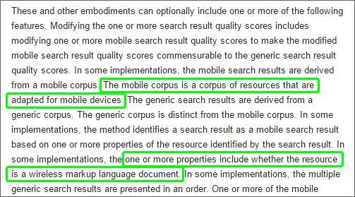
Trait’s of a mobile-friendly website according to this patent.
This patent reinforces your need to optimize your website for mobile search in order to reach a mobile audience, although it also recognizes that you don’t need to optimize your site for mobile use if you’re not interested in chasing a mobile audience.
Mobile to non-mobile document correlation
(Published in March 2015)
This patent explains that even though Google will prioritize mobile-friendly websites for queries performed on mobile devices, sometimes Google’s still depends on the ranking of the regular, or desktop version of the website to rank it.
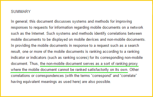
Google might still use the desktop version of a site to rank it in mobile search results if it lacks in some ranking signals Google need.
Why? Because there are mobile websites that are simply too simplified that it is lacking in some important factors in order to be properly scored and ranked by Google. This actually have both a positive as well as a negative aspect to it.
On the good side, we understand that if the mobile version of your website is too simplified and is lacking in ranking factors, Google still have a backup algorithm that lets it rank based on the desktop version of the website. This means that the mobile version of your website might still have the chance to get a good ranking provided the desktop version possess a good ranking as well.
On the negative side, it tells us that oversimplified mobile websites are actually an issue to Google that they need to create a workaround for it. Compared to desktop ranking, mobile-search algorithm are relatively new and might not be as advanced. Despite the workaround, it might still negatively affect your ranking if you oversimplify the mobile version of your website so it’s wise to avoid that.
Another thing to consider is that you waste the potential to rank higher in mobile searches even though your website might be more relevant to mobile users just because it’s oversimplified. With this in mind, it’s a good idea to give more attention in properly developing the mobile version of your site.
It’s better to invest a little bit in the development process rather than resorting to some free/cheap apps or services that automatically generates a mobile-website without taking into consideration proper design and remove too many elements of the original site.
Identifying relevant portions of a document
(Published in August 2011)
This patent explains that because the screen sizes of certain mobile devices are limited, Google may omit less important parts of a search result in order to maximize the use of space. So in some cases, Google may elect not to show the title and show a snippet of the content that contains the keyword from the user query instead. What does this mean for you?
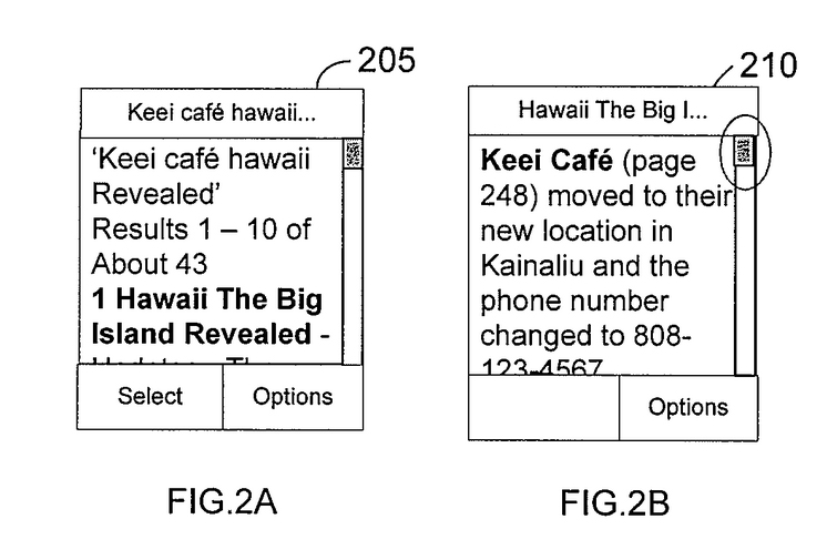
Given the smaller screen size of mobile devices, Google might omit some elements of your search results, such as the title.
It means your contents shouldn’t depend solely on the titles since Google may decide not to display them for certain search queries. It also means that you shouldn’t overuse your target keyword. This is because if Google decides to use a snippet from your content, it will choose a snippet containing the keyword. You’ll want to make sure that whenever your keyword is used throughout your content, it is used appropriately and in-context, or else your snippet won’t make sense to the user.
While this patent might describe an older problem before the age of mobile devices with wider display, what we can take notice from this patent, is that mobile search results are displayed differently compared to desktop results.

Mobile and desktop results are displayed differently and requires different optimization.
Difference between mobile and desktop results at a glance:
This opens up a whole new option of optimizing the elements displayed in search results to maximize click-through-rate. As shown by one of our earlier experiment, even a slight change in the snippet can make a huge difference in the amount of traffic gained.
“Mobilegeddon” may not have had the impact that many people were afraid of, but it did make marketers and bloggers more aware of the importance of mobile optimization. Google has known that mobile use was going to take off for years now – it’s why they have made several algorithm updates concerning mobile search years before “mobilegeddon.”
However, the most recent Google mobile-friendly algorithm update was major in that it will help ensure that mobile users are provided with the best user experience possible via Google’s search engine. This is the bottom line and one that you need to consider. If you want to reach a mobile audience, you need to make sure you optimize your website for mobile use not only to rank higher on mobile search – but also to give your audience a better website user experience.
| How big brands design their mobile-friendly websites: “20 Beautiful Examples of Mobile-Friendly Websites in 2015”. |
|---|
Updated: 29 March 2026

Struggling with internal linking?
Wish you could...

Automate internal linking
Use optimized anchor text
Fix 18 issues like orphan pages
Get link reporting and analytics


Save thousands of dollars (it’s 100x cheaper)
Zero risk of Google penalty (it’s Google-approved)
Boost your rankings (proven by case studies)
Rank High With This Link Strategy
Precise, Simplified, Fast Internal Linking.

Subscribe and receive exclusive insider tips and tricks on SEO.
Delivered to you right from the industry’s best SEO team.
Copyright © 2026 SEOPressor. All Rights Reserved.
Powered by Semantics BigData Analytics (SBDA).

