1
Steph W. from SEOPressor

👋 Hey there! Would you like to try out this New AI-Powered App that'll...
...help you check your website and tell you exactly how to rank higher?

Actionable SEO tips, tutorials, and insights to help you rank higher.
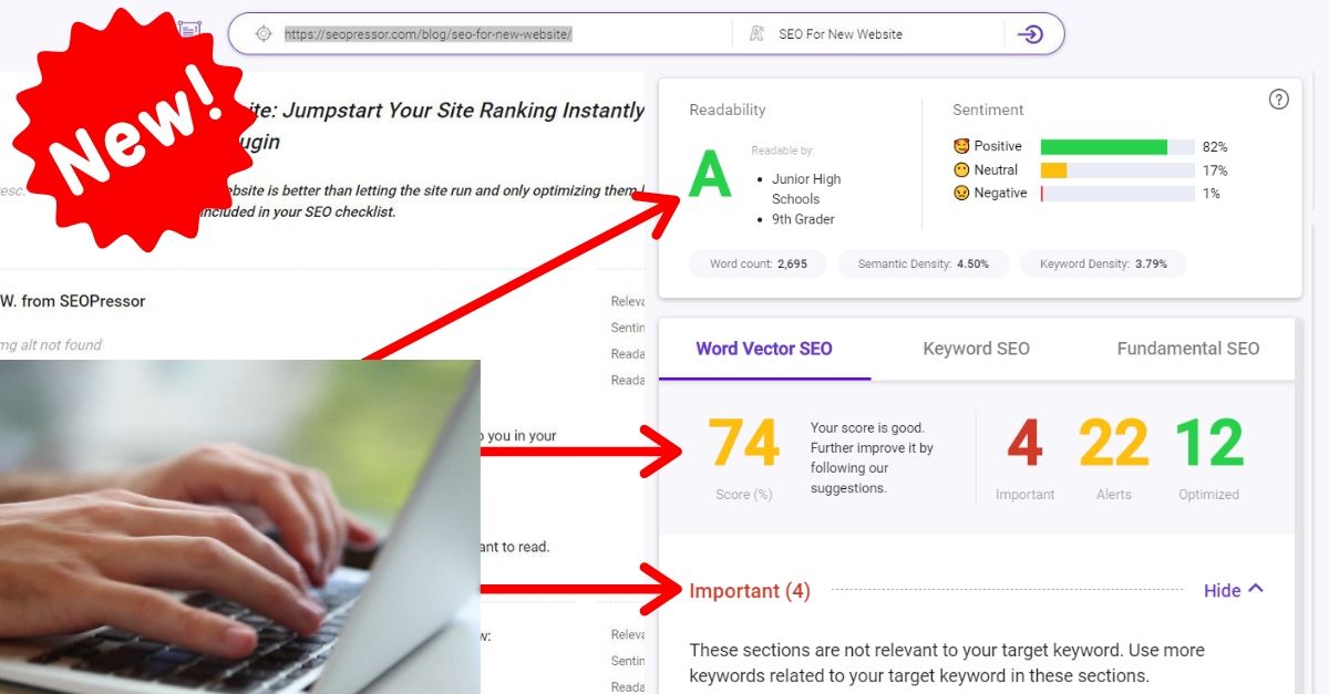
85
score %
SEO Score
Found us from search engine?
We rank high, you can too.
SEOPressor helps you to optimize your on-page SEO for higher & improved search ranking.
By winniewong on May 18, 2020

Mobile-friendly websites are now becoming important more than ever. We’ve heard it so many times, optimize your website for mobile devices or risk losing out on a big chunk of mobile traffic.
With Google’s mobilegeddon update, the effects are even more prominent as mobile search now takes mobile-friendliness of a website as a ranking factor.
If this is the first time you’ve heard of this advice and you have not optimized your website for mobile devices yet, fret not, we’ve a complete guide to creating a mobile-friendly website that you can unlock here.
[bof_display_offer id=35086]
To inspire you with the best mobile websites design, here’s a list of 20 beautiful mobile-friendly websites.
BiQ Cloud is the latest revolutionary SEO tool that advocated democratized pricing! This means instead of being bounded by a high-cost monthly subscription, you “pay only for the SEO features you use!”

• Font choice and size are easy to read on small mobile screens
• Buttons are in perfect sizes for touch-based devices
• Clear cut images and copies
• Good amount of white spaces
• Clear and obvious CTAs
• Good usage of accent colors
Tesla has been at the forefront of the automotive industry (IMO) and it’s good to know that their website doesn’t suggest otherwise.

• Font choice and size are easy to read on small mobile screens.
• Buttons are sized adequately for touch-based devices.
• Art direction of images suits the design of the website.
• Good amount of white space.
• Clear and obvious CTAs.
• Good usage of accent colors.
Alexa Ranking: 1, 769
Bloomberg is synonymous to business and you would probably expect a boring and conventional website from them. However, their recently redesigned and revamped website is beautiful yet practical.

Bloomberg added much zest to its conventional design with a good dosage of bright and strong colors. The striking blue applied to a conventional font that’s similar to Helvetica provides a tinge of freshness to their rigid design.
Other striking colors are also used throughout the website to differentiate news from different categories. Overall great use of colors.
Alexa Ranking: 334
MailChimp is a company that provides email marketing service. One of the reasons for its success is its great design across their website and email templates.

Good flow of information, telling what you need to know in a way that is easily understandable and fun.
Options to expand a card to know more about each feature is a really good idea especially on mobile-devices where pixel space is limited. UI/UX plays a role in SEO too so that has to be considered.
Alexa Ranking: 457
Microsoft is the giant when it comes to computers. They are the largest software manufacturers and it’s fair to say that they’ve put a lot of thought into user interface (UI) and user experience (UX) for their mobile website. Their flat design and card style layouts from their software are imported into their web design as shown below.

In case you haven’t notice, most of the websites shown here are using flat design and card styled layout. It is the latest trend in web design and it is also one of the more important ones.
Microsoft was one of the big tech companies that started this trend and now nearly everyone is doing the same. The reason why flat design and card styled layouts are so popular is that it fits much better on the small mobile screens.
Alexa Ranking: 31
Abduzeedo is a blog about design.
There are all sorts of articles for those who want to look for design inspiration. You will also find very useful tutorials here for the most used applications, with a special selection of Photoshop and Illustrator Tutorials.

The slick design of this mobile website definitely stands up to its brand being a community for designers and the like.
Alexa Ranking: 40, 030
In case you do not have a dictionary app on your phone and you need to look up the meaning of a difficult word, there are many websites you could go to, such as Merriam-webster, Collins or Cambridge dictionary. However, my recommendation would be the Oxford dictionary just because it is slightly better designed for mobile devices.

Getting the definition of a word is a breeze with Oxford’s dictionary. All the extra knowledge presented in the lower part of the mobile page are also interesting enough just to keep you staying on the page to learn more.
There’s even a language test where you can test your English proficiency and work your brain a little. These are great ways to keep your audiences on your page and improve your SEO score.
Alexa Ranking: 3,067
When it comes to design, Nike never fails to impress.

Nike let their product do most of the talking via brilliant images. Pair those with some kickass copy and you get a powerful message that shouts “Buy Me!”
One thing that is unique from Nike’s mobile website is, to fit in two shoe pictures in one row, they flipped the photos of their shoes vertically so that they fit better in the narrow space of a mobile screen. I call that innovative.
Alexa Ranking: 464
Threadless is a crowdsourced graphic tee store. All its T-shirt designs are crowdsourced and picked by the public. Designs with the best scores voted by public will be printed and sold.

Threadless relies a lot on the feedback of their community. The more the community participates by submitting designs, voting and scoring designs, the better their products are.
Voting and scoring designs are really easy with their endless scrolling voting page. You can easily lose track of time scoring designs after designs on their mobile website.
Alexa Ranking: 14,745
Most game websites have over the top graphics and flashy animations on their landing pages, those are great on the desktop but not so much for their mobile websites. Animated pictures are heavy in file size and are not easily scaled which is why they are not suitable for mobile-devices.

Pokemon is a favorite among most people, and their mobile website also functions great on your palm sized devices.
The Featured Pokemon section is easy to navigate as you can slide each card horizontally to reveal other Pokemons.
Alexa Ranking: 6, 144
Weight Watchers is a company that offers various products and services to assist weight loss and maintenance.

Each fold on their mobile website is clearly defined with colored or plain backgrounds. Headlines are big and clear, definitely a pleasure to read on all the small mobile screens.
Alexa Ranking: 4,143
Apartment therapy is an interior design magazine.

Apartment therapy’s web design is as beautiful as its interior design inspirations. Clean and spacey.
Their choice of using a serif font is also a great one as it complements well with the entire design and makes their mobile website look classy.
Alexa Ranking: 2,119
Lego is the most popular toy in the world that is enjoyed by both kids and adults. Having two ends of age groups as their target audience, they have to strike a balance in appealing to both.

Among the 20 mobile websites featured here, Lego is the only website that features drop shadows. If they could go easy on their drop shadows, their website would look less busy and cleaner. Aside from the drop shadows, Lego doesn’t disappoint with it’s fun and vibrant design.
Alexa Ranking: 1,289
Fast Company is that talks about business, design, ideas, and even cultures. They inspire new breed of innovative and creative thought leaders who are actively inventing the future of business.

Their mobile site features full-width images with headlines underneath. Simple, clean and effective design. No fluff, just how readers like it.
The font used for the headlines is thinner compared to the desktop version, also, the headlines are only capitalized on the first letter of every word instead of every word in the desktop version. These tweaks for their mobile website enable more words to fit in each line and greatly reduce the space needed while keeping the website look neat.
Alexa Ranking: 2,533
Everyone knows MTV love to use vibrant and psychedelic colors that resonate with their brand. Fortunately, these colors are kept to a minimum for good measure for the sake of a good design.

MTV is hugely popular among teens and it is easy to see why through their mobile site. Their headlines are very short, in fact, most of the time it is just random keywords + random keywords. They don’t even bother to capitalize their headlines, because that’s how teenagers text with their friends yo’.
Alexa Ranking: 4,143
Mashable is a news source for younger crowds and as you can see, their headlines and design are worked towards appealing to their target audience.

When it comes to news for youngsters, social shares are an important indicator of whether the news is worth reading or not. Mashable got that right by displaying the shares together with the headlines.
The endless scrolling means you can easily browse news after news stay on their mobile page for much longer than you should.
Alexa Ranking: 278
Airbnb is a website that allows people to list, find and rent lodging. The founders of Airbnb are design graduates, and from the looks of their website, it is obvious that they have put a lot of emphasis on User Interface and User Experience.

Airbnb is smart in using large folds to accommodate attractive pictures of travel destinations to encourage interest. For a mobile website that has so many features and so complicated, using Airbnb is surprisingly easy and intuitive.
Alexa Ranking: 315
Popular Science is a monthly magazine for science and technology related topics. Their mobile website is a great example of good mobile-friendly web design.

Love how they accentuate the featured news with a bright red background for its title. Most magazines have moved on to using card styled layouts for each piece of articles but not Popular Science. Each piece of article is separated by a subtle dotted line but it is just as good as having cards.
Alexa Ranking: 5,197
Etsy is a peer-to-peer e-commerce website focused on handmade or vintage items and supplies, as well as unique factory-manufactured items.

Etsy’s mobile website is beautiful with its earthly toned colors. If you are into vintage and handmade stuff, be warned, you’ll be compelled to spend many unnecessary dollars here on items that are picked by their editors or items that are recommended for you.
Alexa Ranking: 144
Society6 is a peer-to-peer shop for artistes to sell their artwork.

Shopping on Society6 is really easy with all the filters they provide. Shopping for nice stuff is also easy as they feature beautifully designed products that are liked or purchased the most by other consumers. Good business strategy to sell us more products.
Alexa Ranking: 4,492
Strava is like a social network for runners and cyclist where they can log in where they’ve run or cycled.

Mixing full fold images with card-style layout, their mobile website is never boring and always effective.
Alexa Ranking: 1,441
Do let me know if you have any better mobile website design.
This post was originally written by Zhi Yuan and published on Oct 5, 2015. It was most recently updated on May 18, 2020.
Related Links:
Updated: 21 July 2026

Subscribe and receive exclusive insider tips and tricks on SEO.
Delivered to you right from the industry’s best SEO team.
Copyright © 2026 SEOPressor. All Rights Reserved.
Powered by Semantics BigData Analytics (SBDA).
